
Fixing a logo, not replacing it.
A logo fixing study for Emirian Production: an audit of the logo the company already had, and a precise redraw of its icon, wordmark and lockup that kept the original idea.
- 6problems found
- 1:1icon ratio
- 1typeface
- 2review rounds
01The starting point
Keep the idea. Fix everything around it.
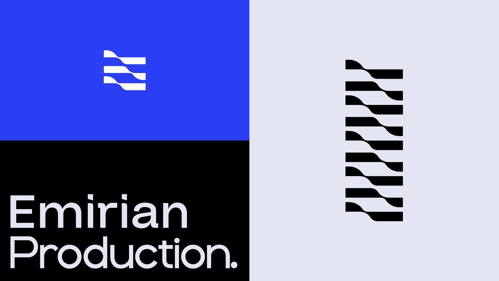
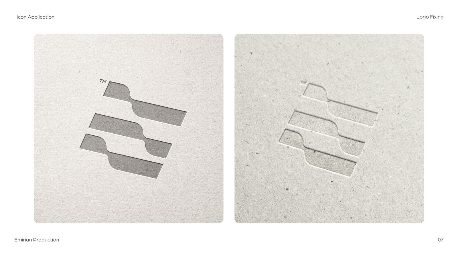
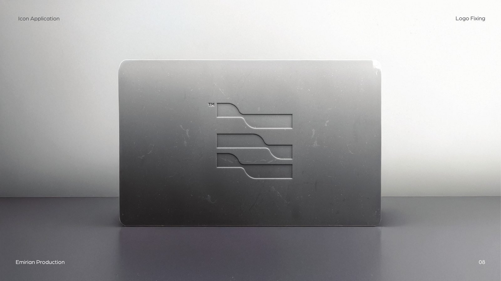
Emirian Production came to us with a logo it already liked: a wavy E built from three stepped bands, and a two-line wordmark. The concept was sound. The drawing was not. Before any brand system could be built on it, the mark had to survive engraving, embroidery and a sign across an exhibition hall. So instead of a redesign, we ran a logo fixing study: measure every part, explain every problem, and redraw only what was needed.
02The audit
Six problems, each one measured.
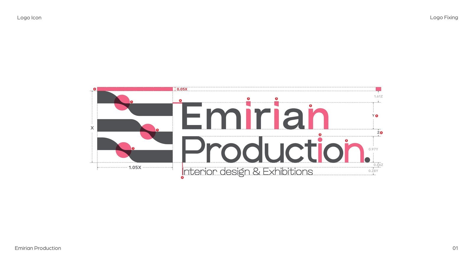
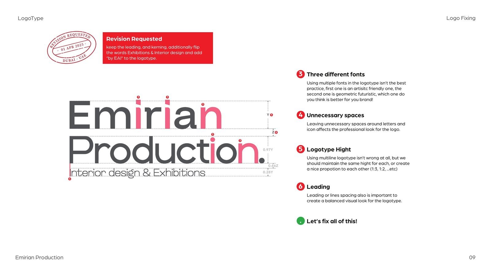
We marked up the original logo and named what was wrong, in plain words and with numbers, so the client could see each issue rather than take our word for it.
- 01
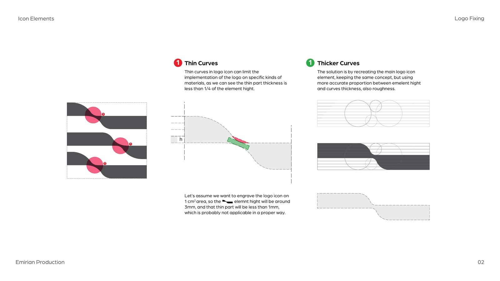
Thin curves
At the turn of each band the stroke dropped below a quarter of its height. Engraved on a 1 cm mark, that part would be under a millimetre.
- 02
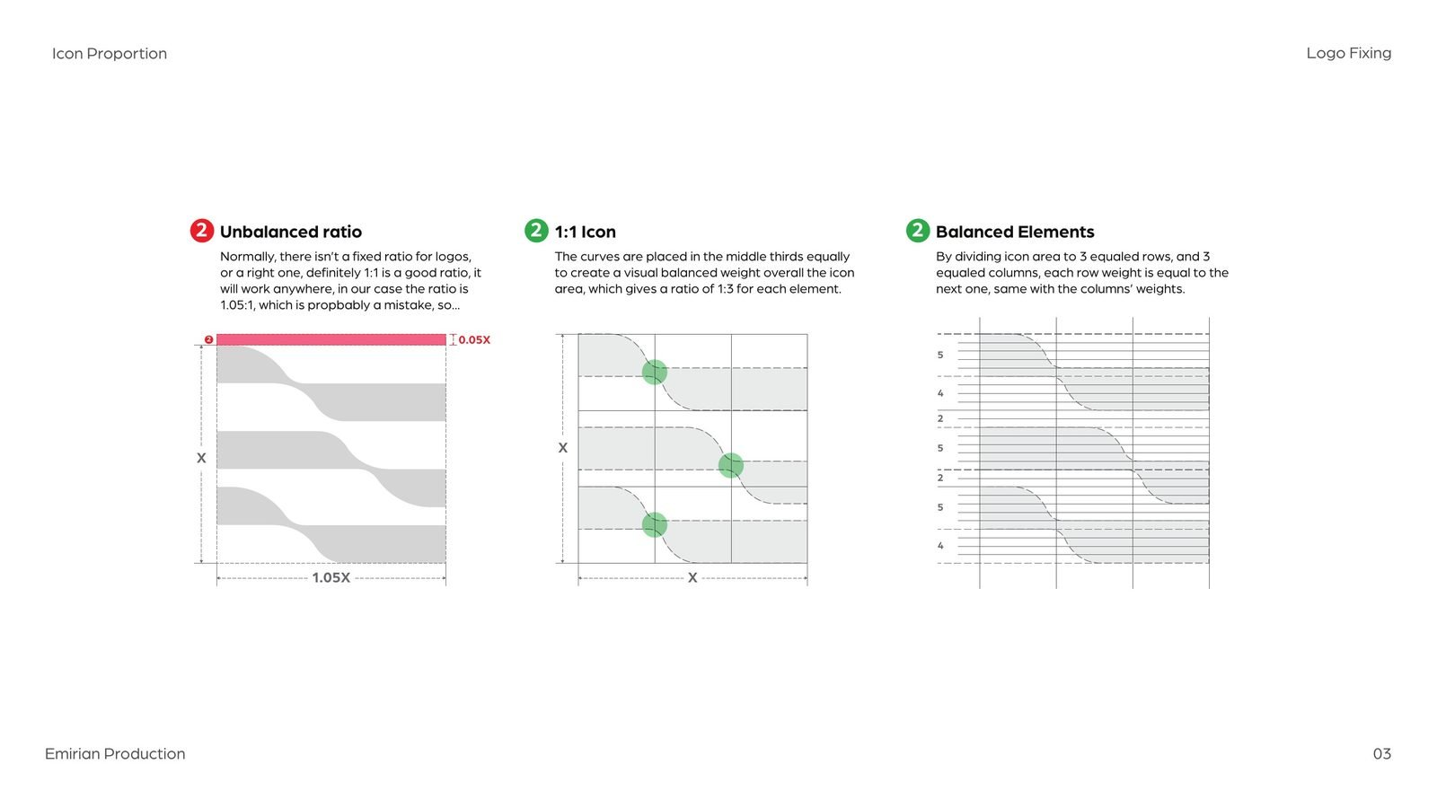
An unbalanced ratio
The icon measured 1.05 to 1: close to square, but not quite, which reads as a mistake.
- 03
Three fonts
The wordmark mixed an artistic face, a geometric one and a third for the subline.
- 04
Loose spacing
Uneven gaps around letters and between the icon and the words.
- 05
Mismatched line heights
The two words and the subline had no proportion to each other.
- 06
Uneven leading
The space between lines changed from line to line.
03The icon
Thicker curves, a true square, and a flag.
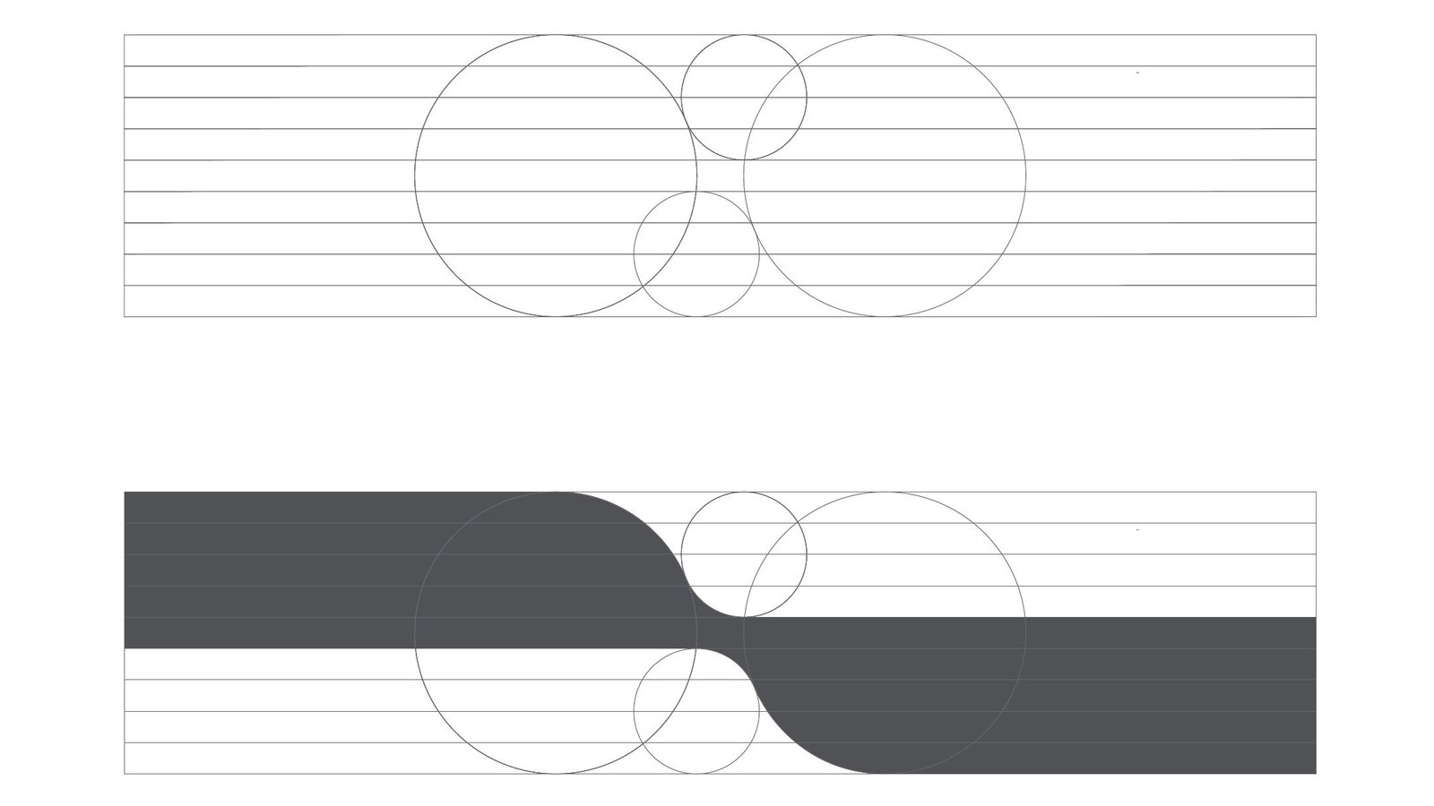
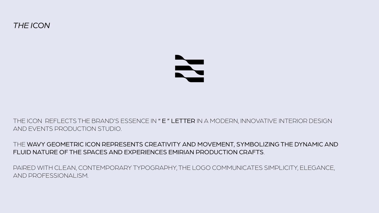
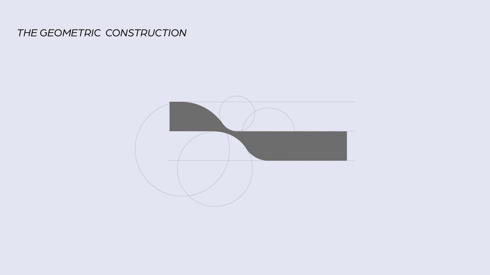
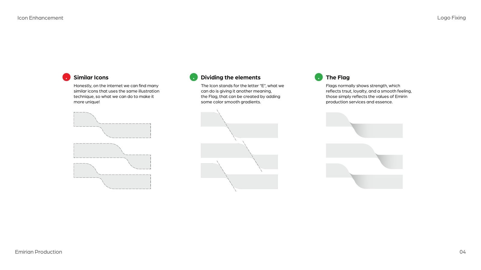
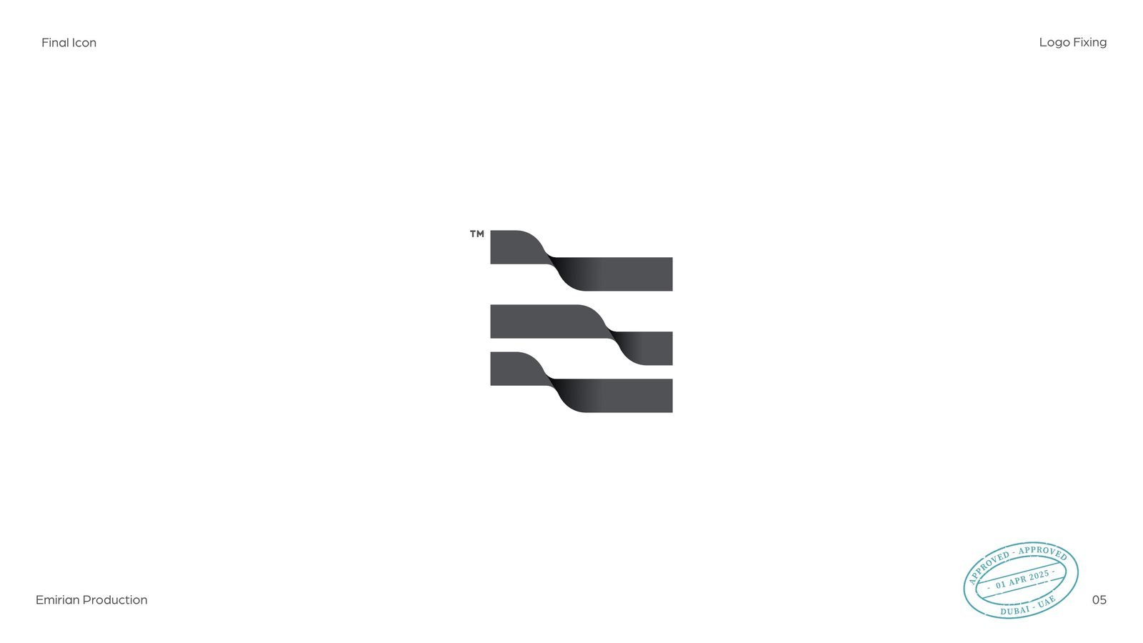
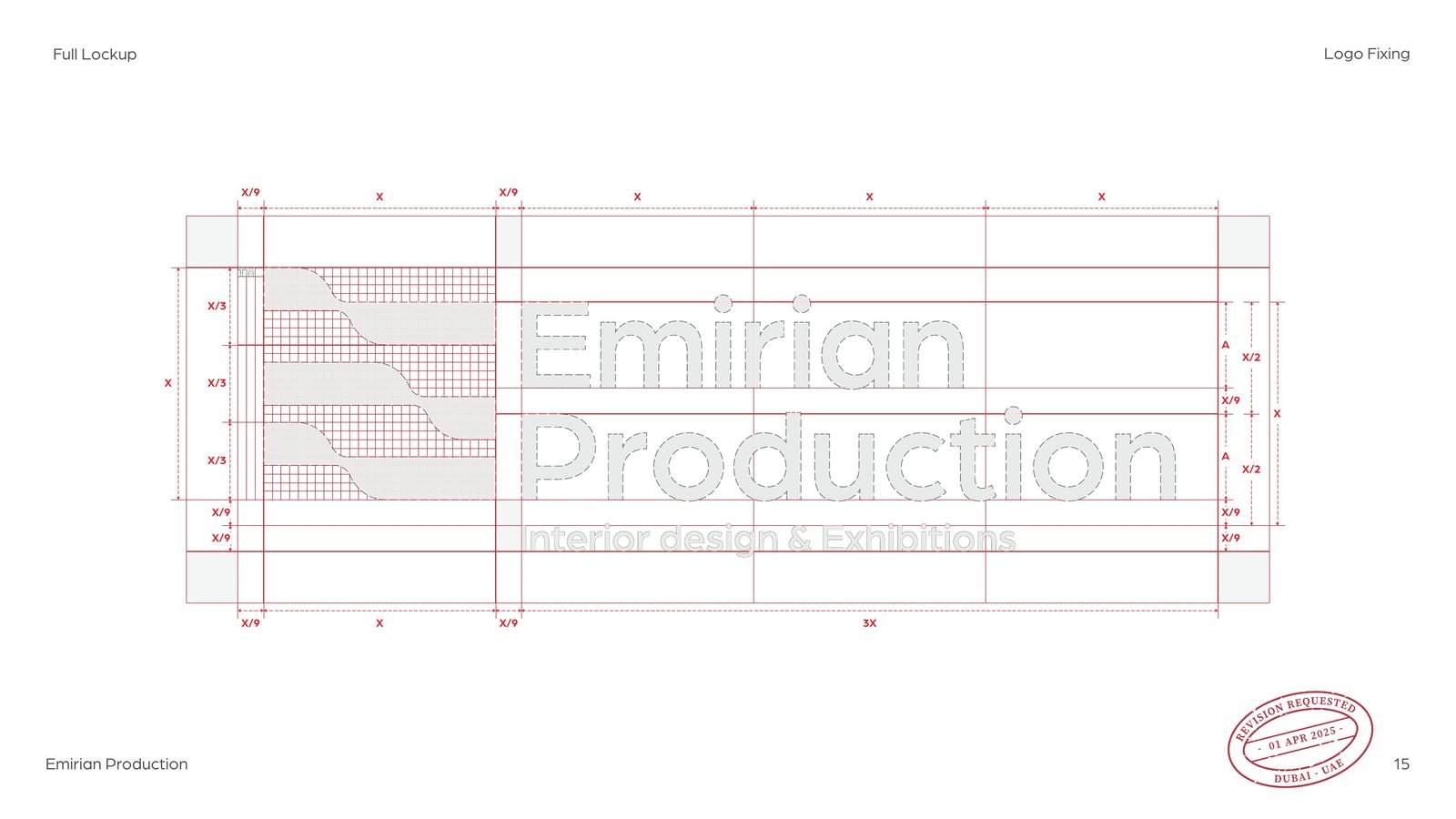
We rebuilt each band on a construction of circles so the turn keeps a workable thickness. The icon became a true 1:1 square, split into three equal rows and three equal columns, with each curve sitting in the middle third. Last, a second meaning: three stepped bands moving together look like a flag in the wind, a quiet sign of strength and trust.
04The wordmark
One typeface, and the maths to hold it.
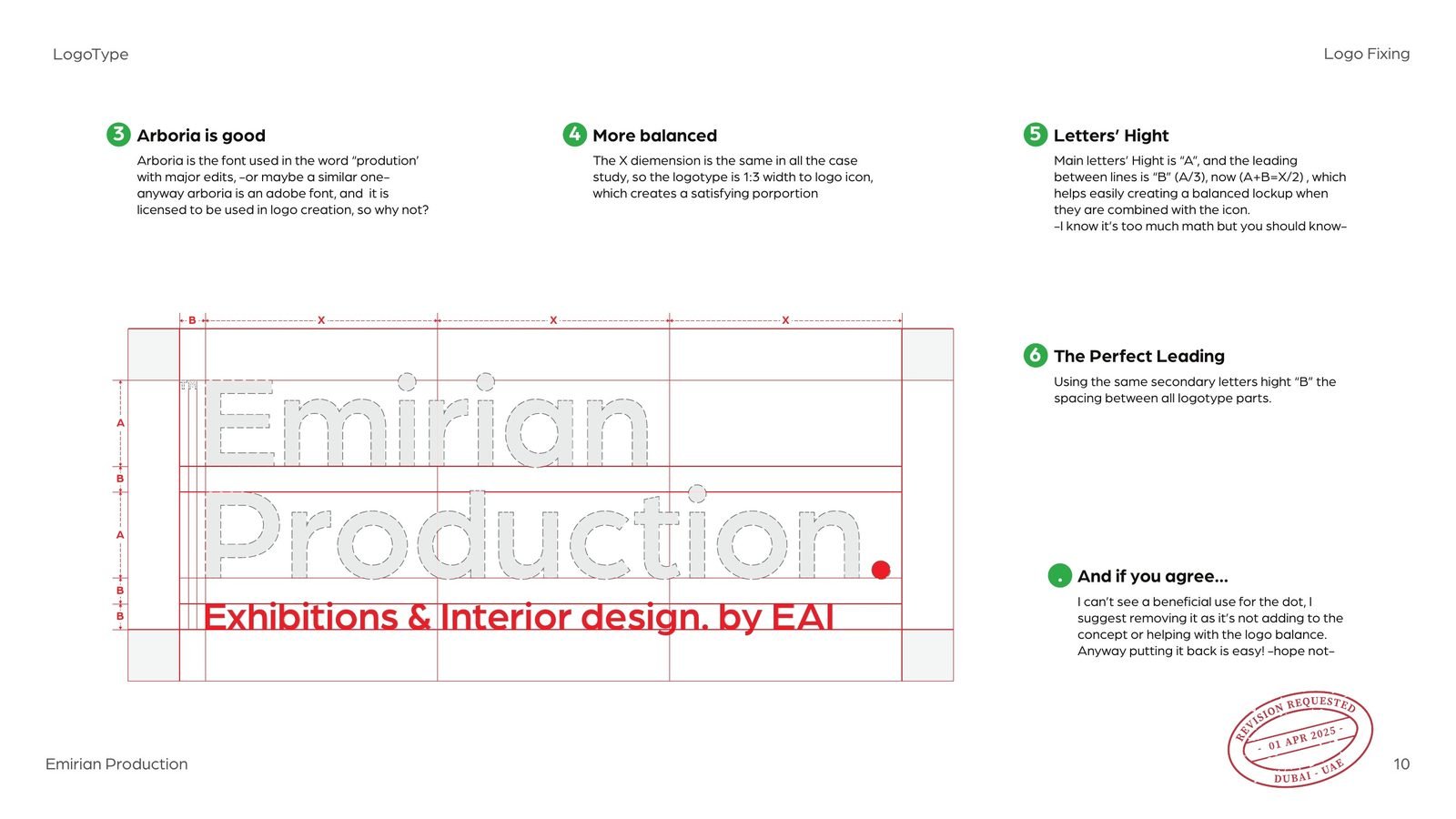
One of the three fonts was already close to Arboria, a licensed Adobe typeface, so we kept one family and drew the rest from it. Then the proportions: the wordmark is one third of the icon’s width, the leading between lines is a third of the letter height, and the two together make exactly half of the icon’s height. The trailing full stop added nothing, so it went.
I know it’s too much math, but you should know.
From the study
05The lockup
Icon and words, locked to one grid.
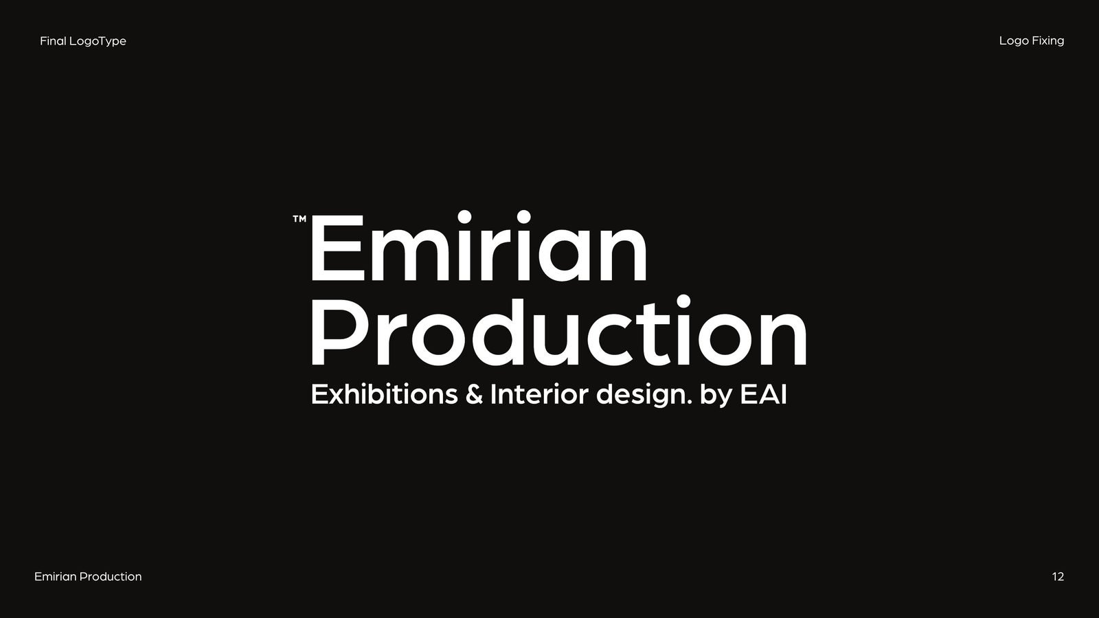
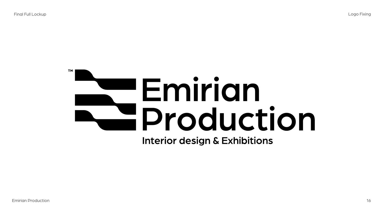
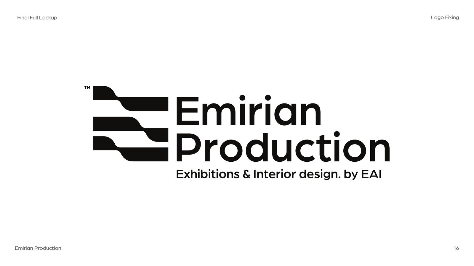
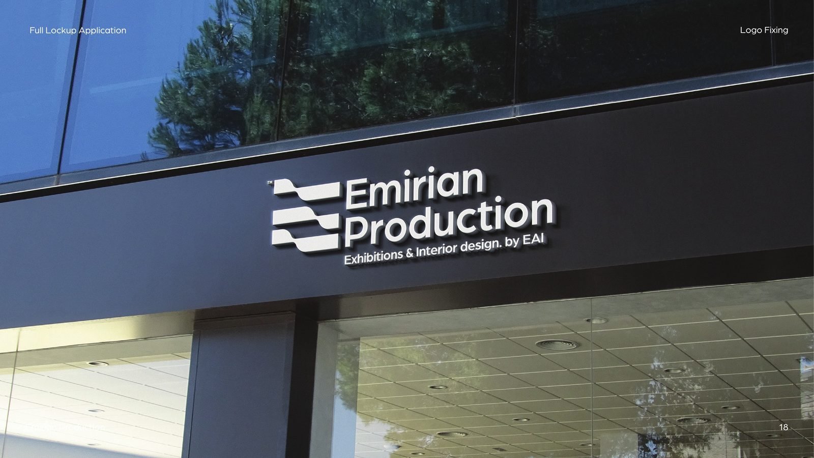
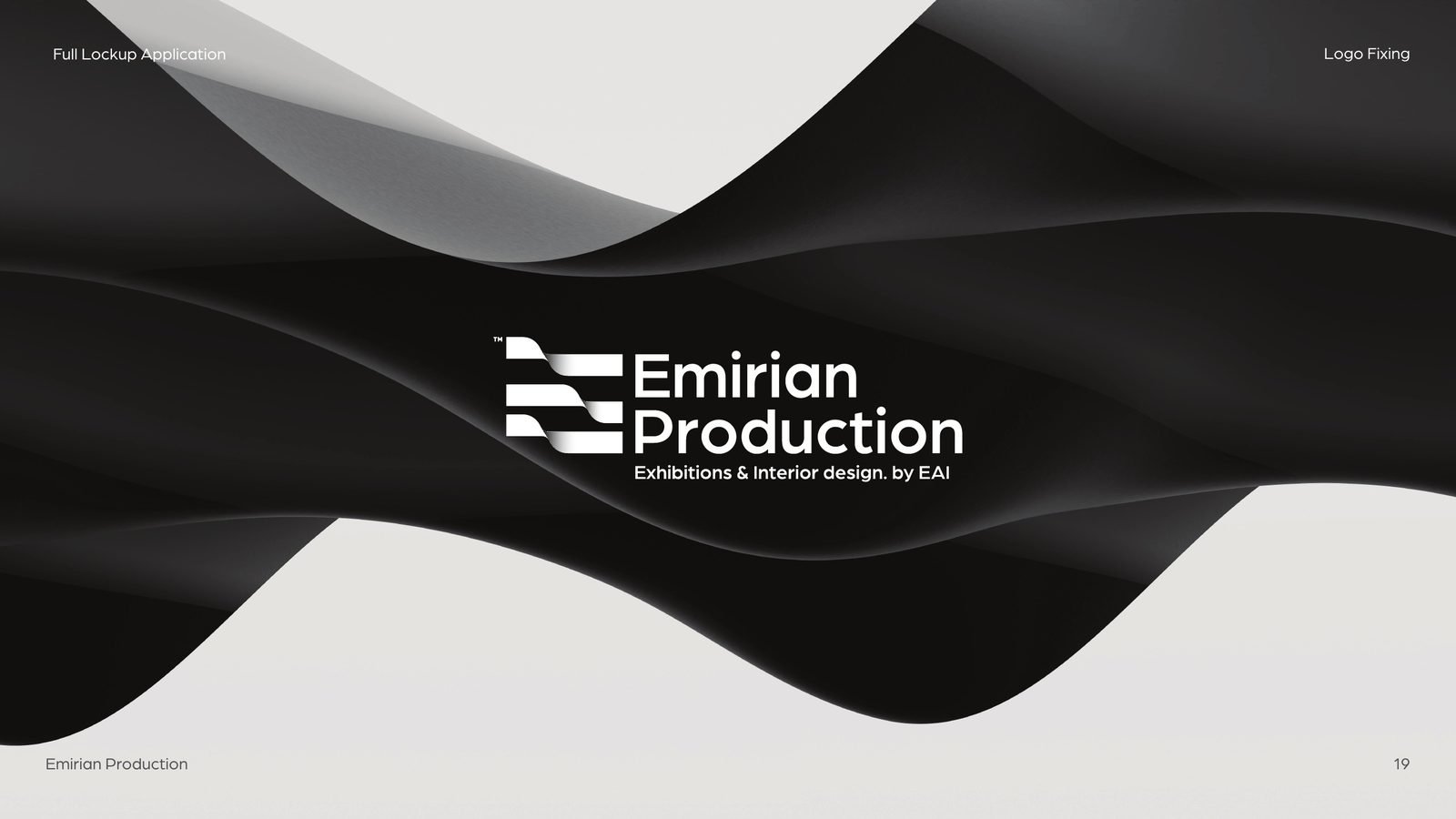
The fixed icon and wordmark come together on one shared grid, so the lockup scales cleanly from a business card to a façade. After the first review the client asked for one change: lead with exhibitions, then interior design, and credit the parent studio. The subline became “Exhibitions & Interior design. by EAI”, and the spacing held.
06What came next
A fixed logo, ready for a brand.
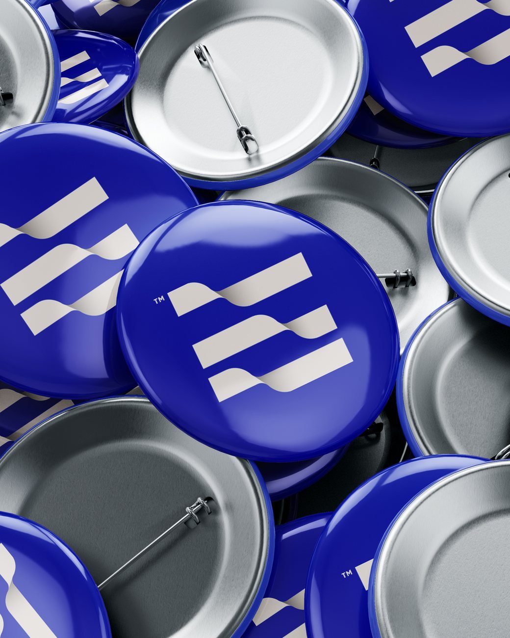
With the primary logo approved, the work moved on to the logo family, the colour, the badge and the full visual system. That story is told in the Emirian Production brand project.
The result
The company kept the logo it knew, now drawn to work in print, metal, fabric and signage. The fixed mark became the base of the whole Emirian Production brand.
- Logo audit
- Icon redraw on a construction grid
- Wordmark redraw in one typeface
- Proportion system
- Primary lockup, light and dark
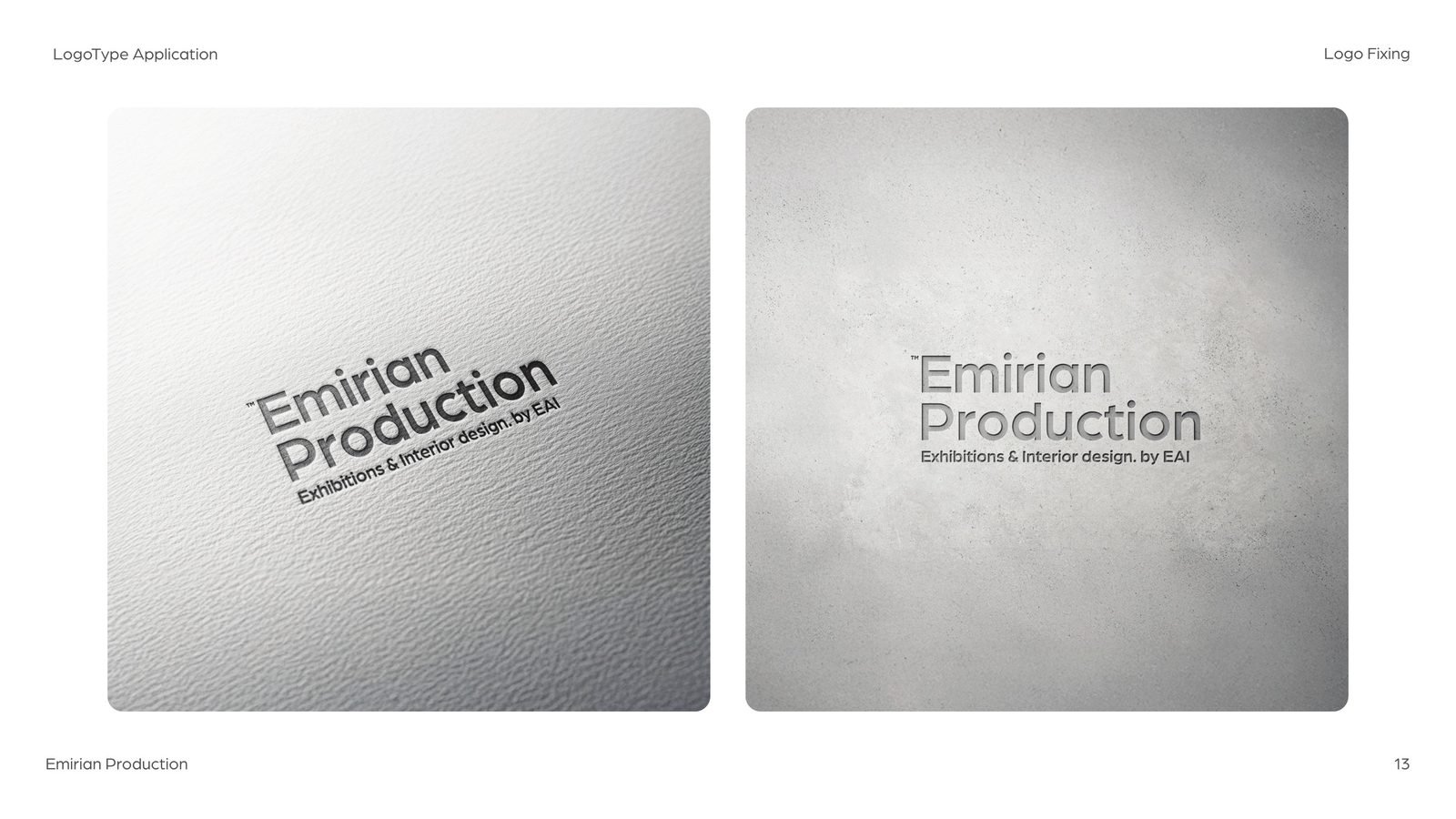
- Application tests
- Revision round
Attached to a logo that isn’t working?
You may not need a new one. You may need it fixed.
We audit existing logos, explain what holds them back, and redraw them so they work everywhere, without losing what people already recognise.
 BOOK A FREE CALLBOOK A FREE CALLBOOK A FREE CALLBOOK A FREE CALLBOOK A FREE CALLBOOK A FREE CALLBOOK A FREE CALLBOOK A FREE CALLBOOK A FREE CALL