
Ready before the red light.
Logo and visual identity for Stand By, a media training centre, from a bilingual lockup to social assets, roll-ups, signage, envelopes and paper bags.
01The mark
An S that never stands still.
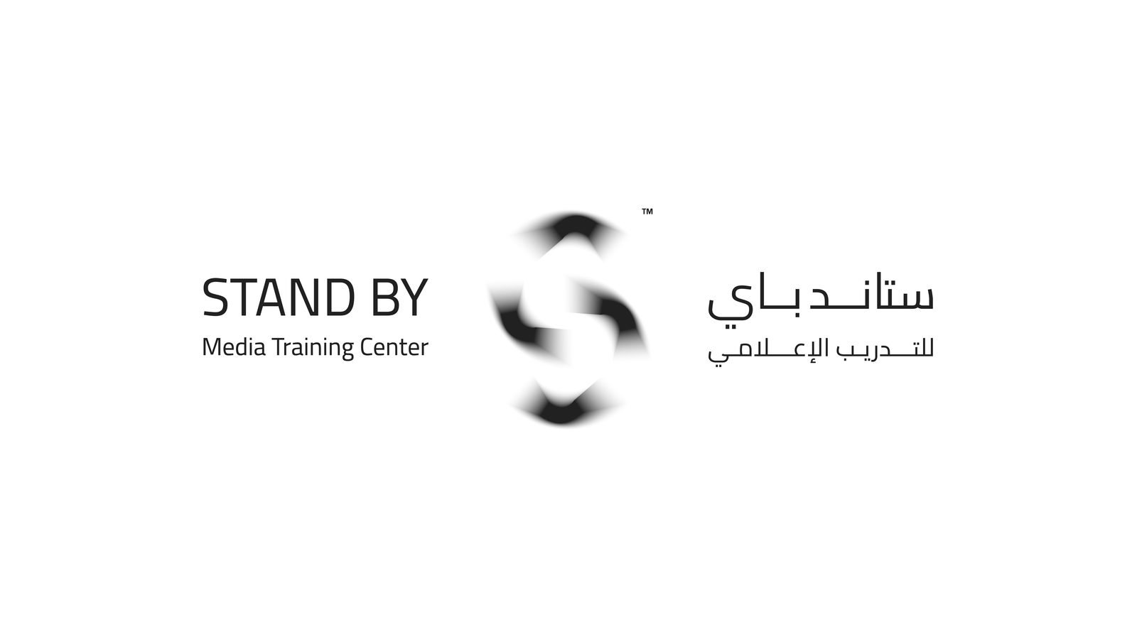
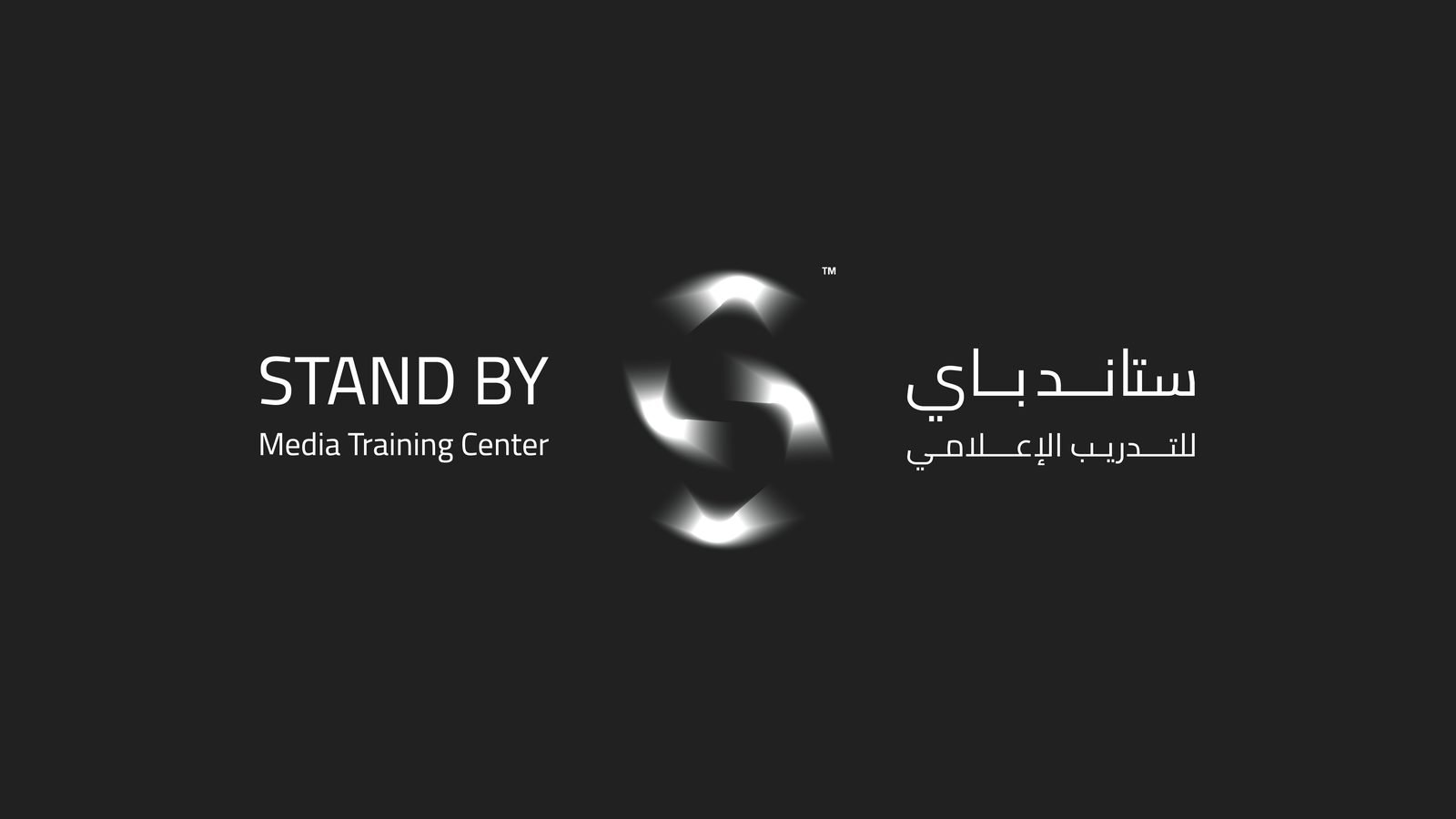
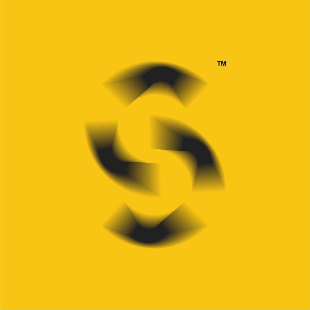
Stand By is a media training centre: it prepares people to face a camera, a microphone and an audience. We drew the S from two turning forms, soft at the edges as if caught mid-motion, and set it beside the name in English and Arabic.

02Colour and light
Charcoal, with a light coming in.
A studio is dark until the lights come on. The palette works the same way: deep charcoal fields with a warm yellow glow rising from the corners, or the reverse. Two colours, used boldly, and nothing else.
Colour
- Stand By Yellow#F8C512
- Studio Charcoal#212121
03At the centre
Visible from the corridor.
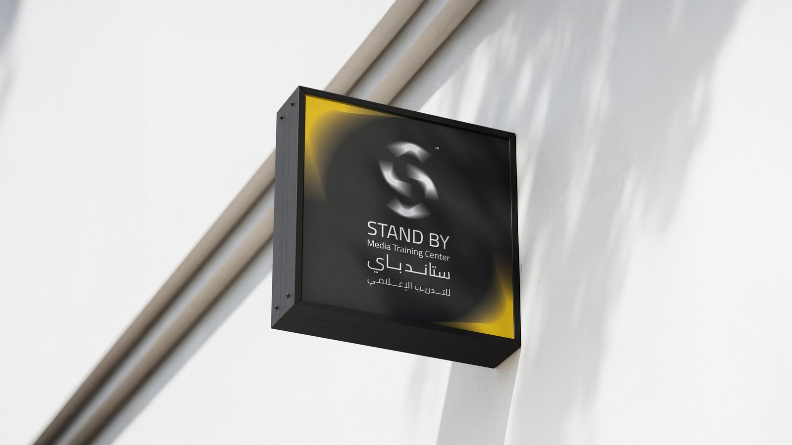
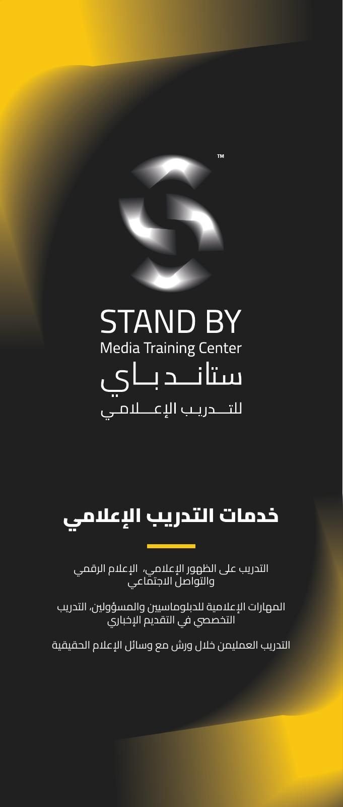
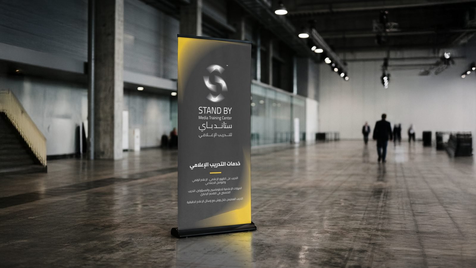
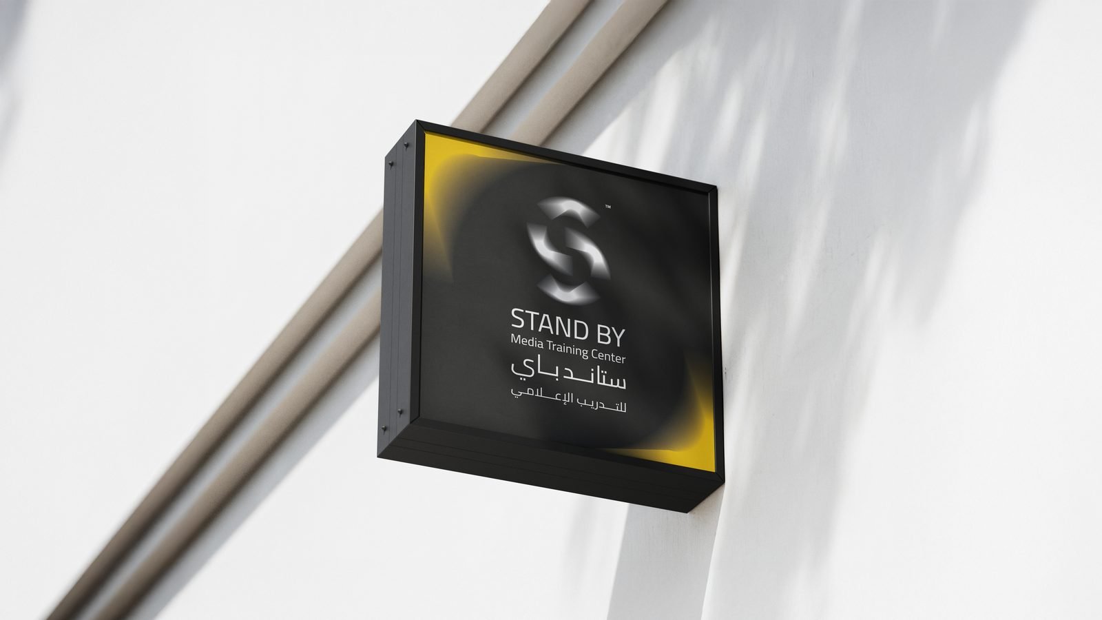
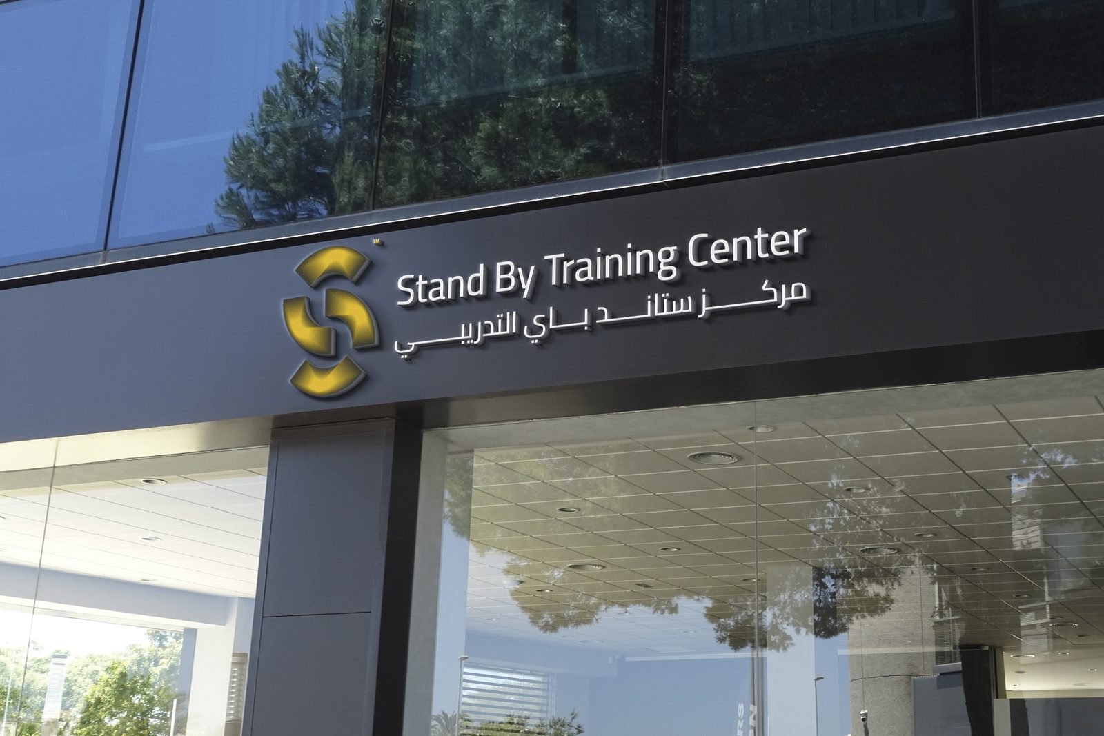
For the centre itself we designed a light-box sign and a fascia, and two roll-up options listing the training on offer: media appearance, digital and social media, media skills for diplomats and officials, news presenting and hands-on workshops.
04On paper
The glow carried into print.
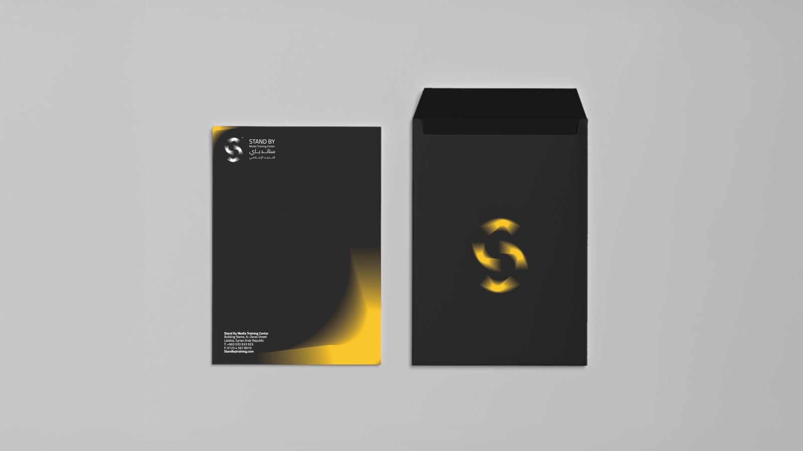
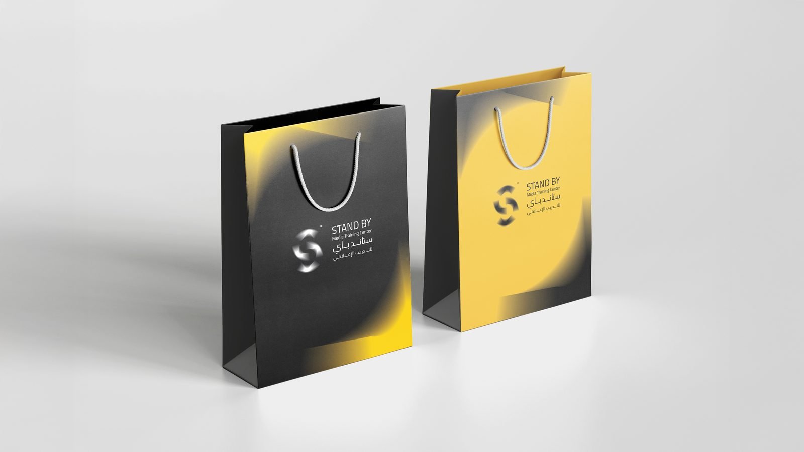
The envelope and the paper bag use the same move: one face charcoal with a yellow corner, the other yellow with a charcoal one, so the pair always reads as Stand By.
The result
A bilingual identity built on one moving mark and two colours, ready for the centre’s walls, its events and its social channels.
- Logo design
- Bilingual lockups (EN, AR)
- Logo versions, light & dark
- Colour palette
- Social profile & cover
- Roll-up banners (2 options)
- Light-box sign
- Fascia sign
- Envelope
- Paper bag
Running a training centre or academy?
People trust what looks prepared.
Training and education teams work with us to look as ready as the people they train.
 BOOK A FREE CALLBOOK A FREE CALLBOOK A FREE CALLBOOK A FREE CALLBOOK A FREE CALLBOOK A FREE CALLBOOK A FREE CALLBOOK A FREE CALLBOOK A FREE CALL