
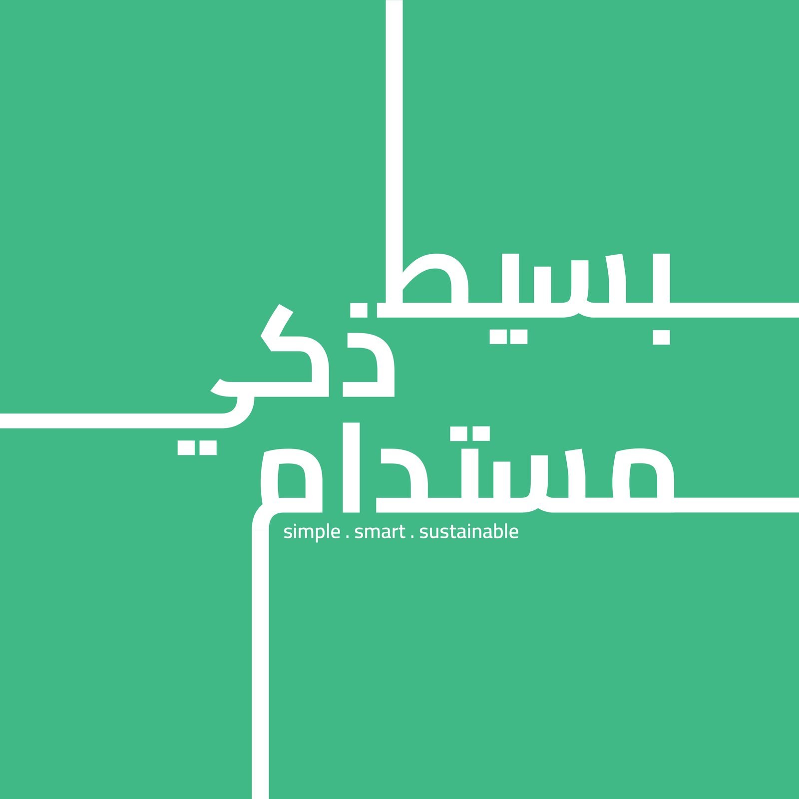
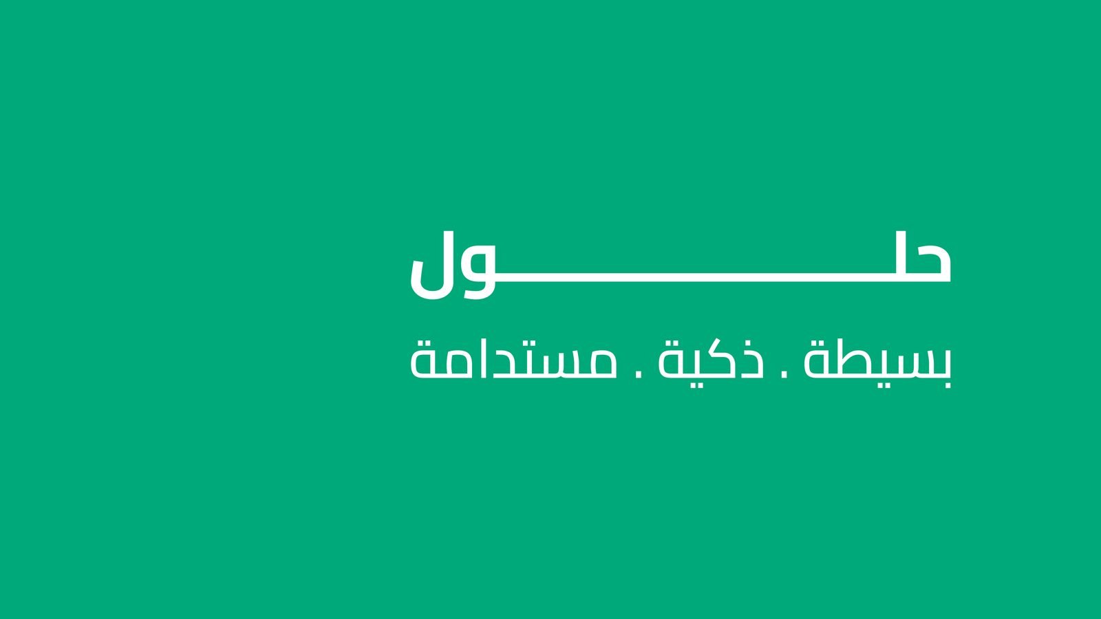
Simple. Smart. Sustainable.
Bilingual visual identity and launch social media for Obal Solutions, a power, monitoring and protection systems company.
01The brief
Technical work, explained simply.
Obal Solutions installs power, monitoring and protection systems, from solar panels to security, for businesses and homes. The brand had to feel modern and trustworthy rather than industrial, and speak plainly in Arabic and English.
Simple. Smart. Sustainable.
Brand line · بسيط . ذكي . مستدام
02The mark
An open frame, ready to connect.
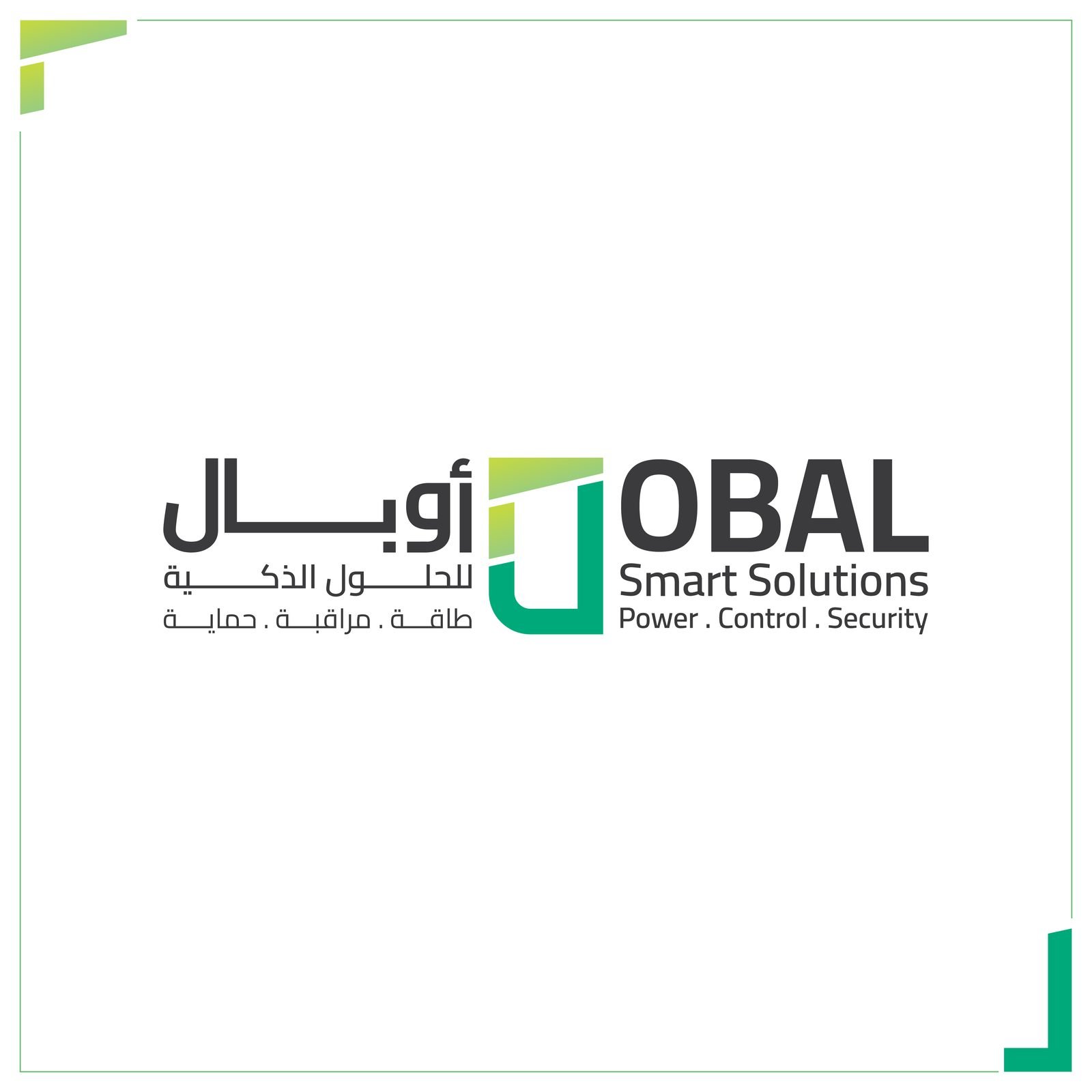
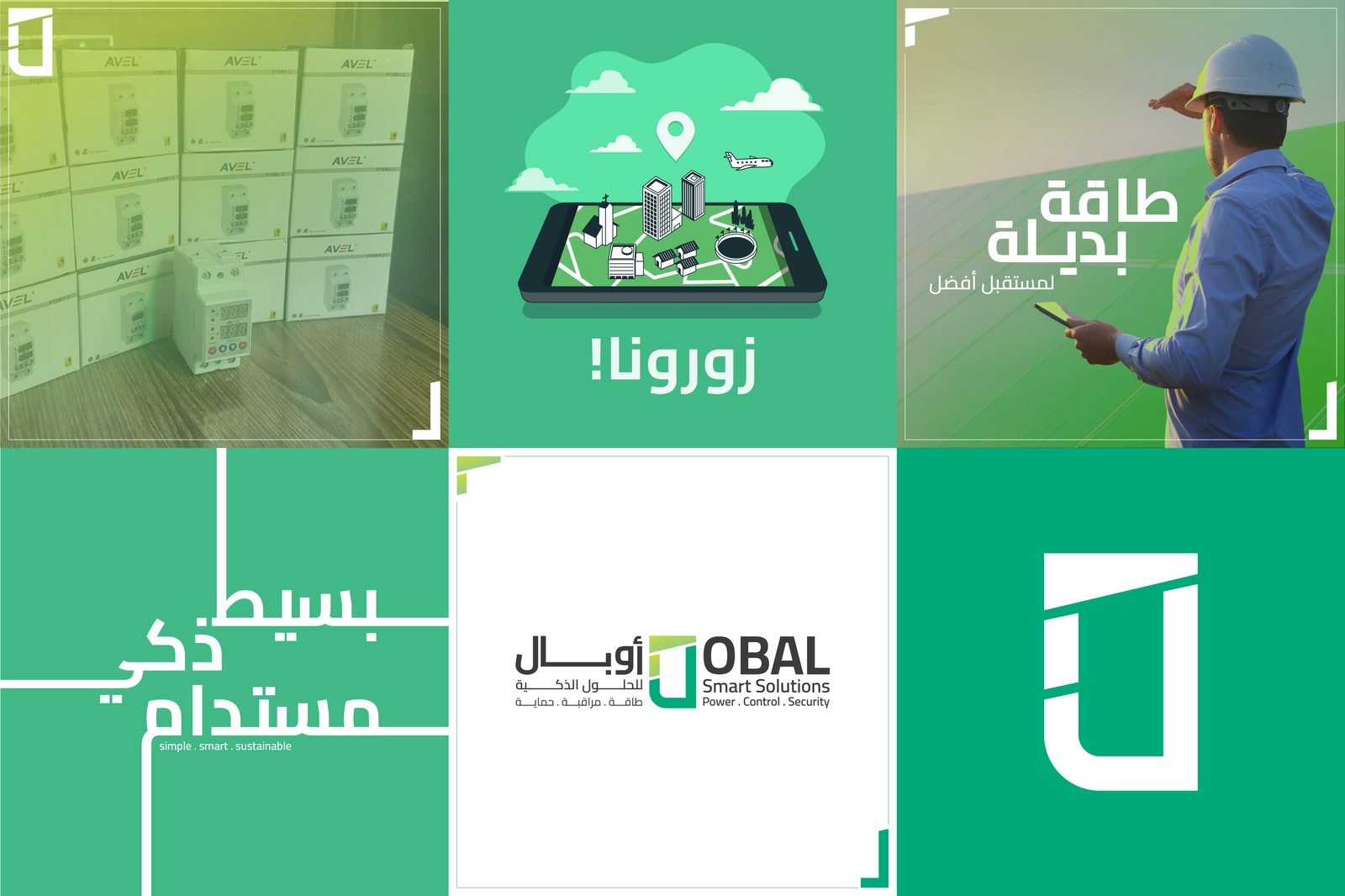
The symbol is a simple open frame, cut by one angled line: a doorway, a panel, a box ready to be filled. Green runs into lime across it for clean energy. Beside it, OBAL and أوبال sit on one baseline with the three services: power, control, security.
03The system
One green, one frame, every post.
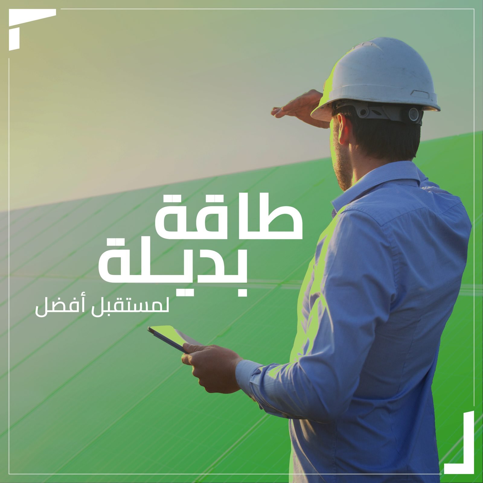
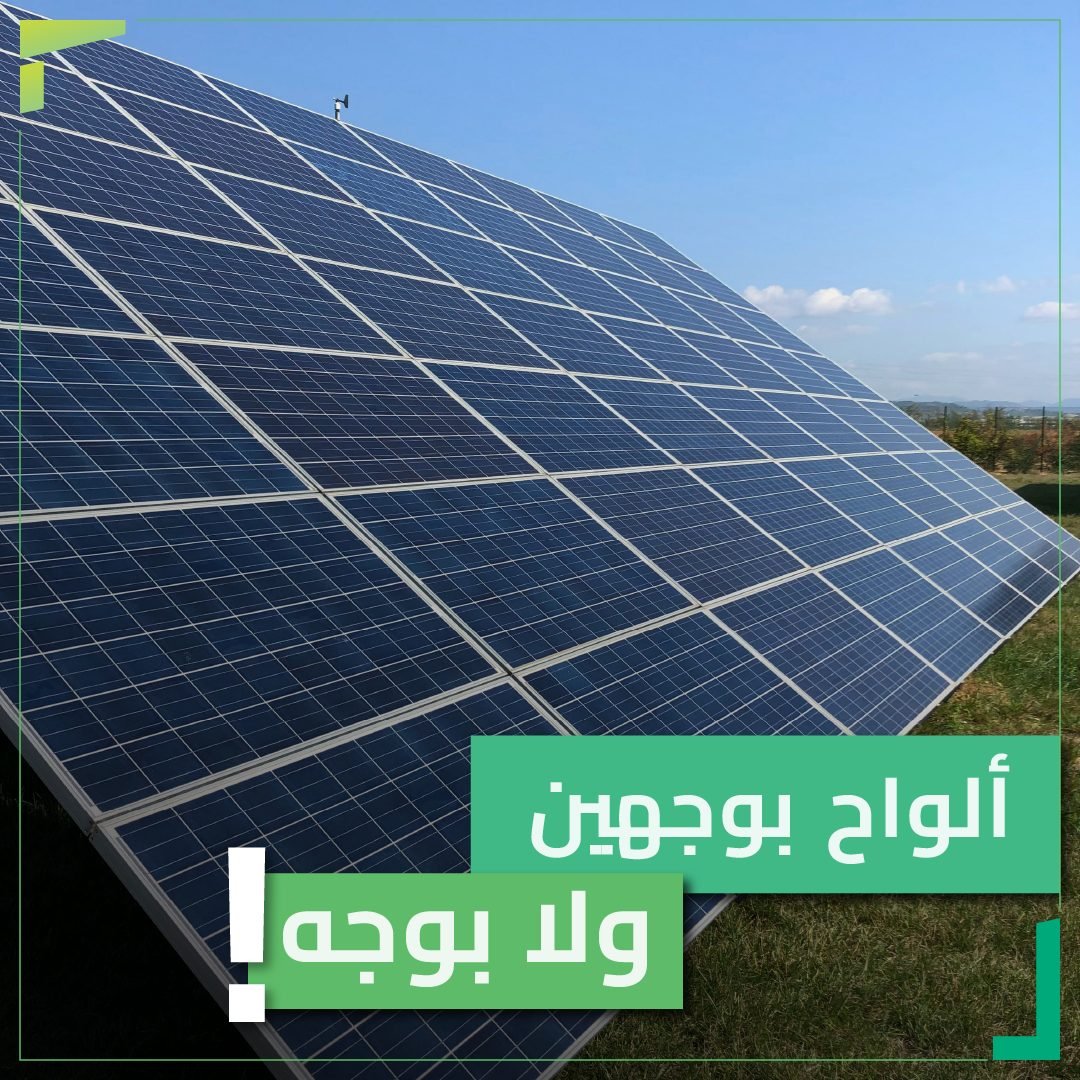
A strong Obal Green, a softer mint and a lime accent, with charcoal for type. Corner brackets taken from the symbol frame every image, so a photo of a solar field or a site visit reads as Obal at a glance.
Colour
- Obal Green#00A97A
- Mint#40B888
- Lime#C4D843
- Charcoal#3B3B3D
04In the feed
Plain words about real equipment.
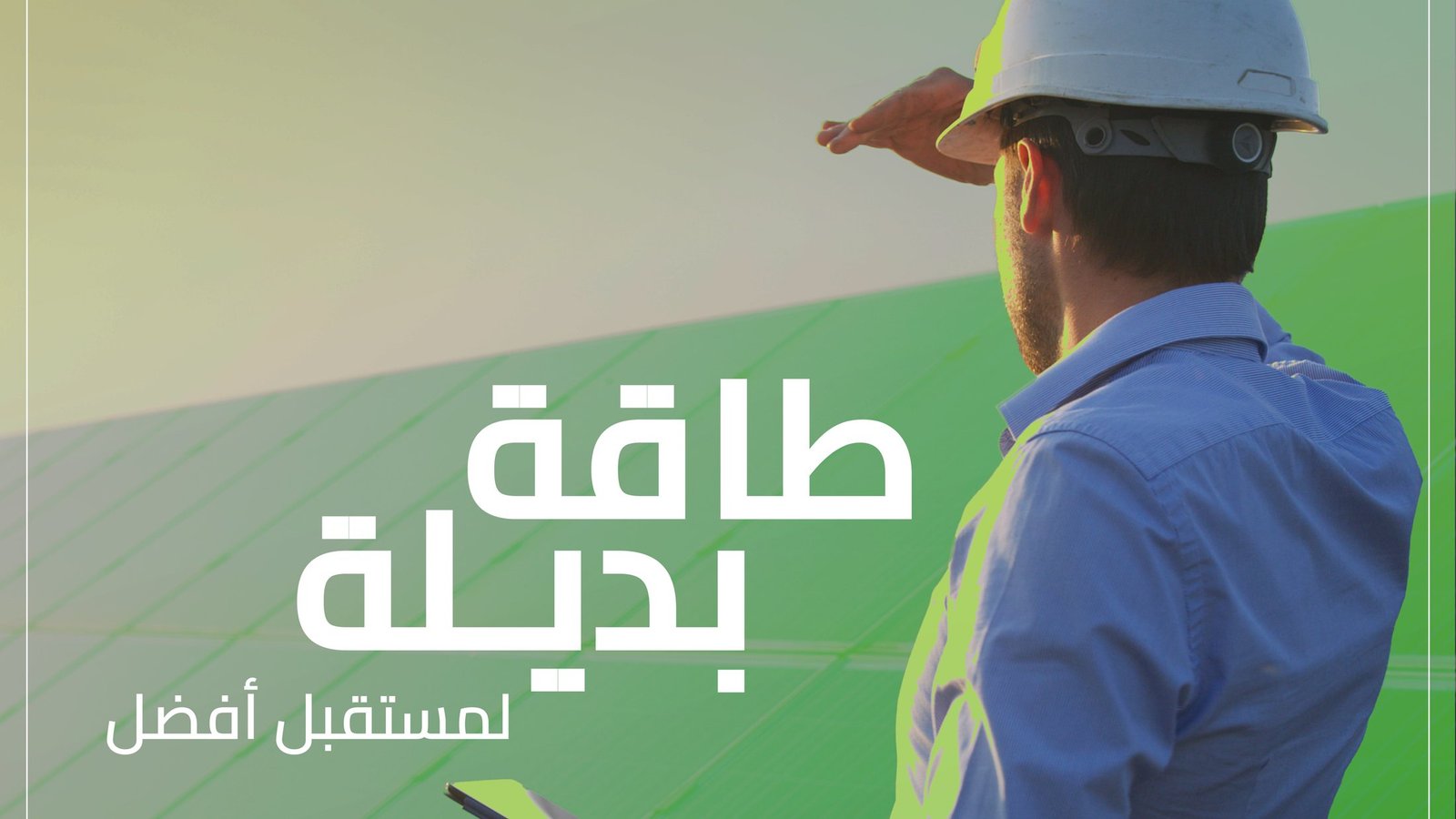
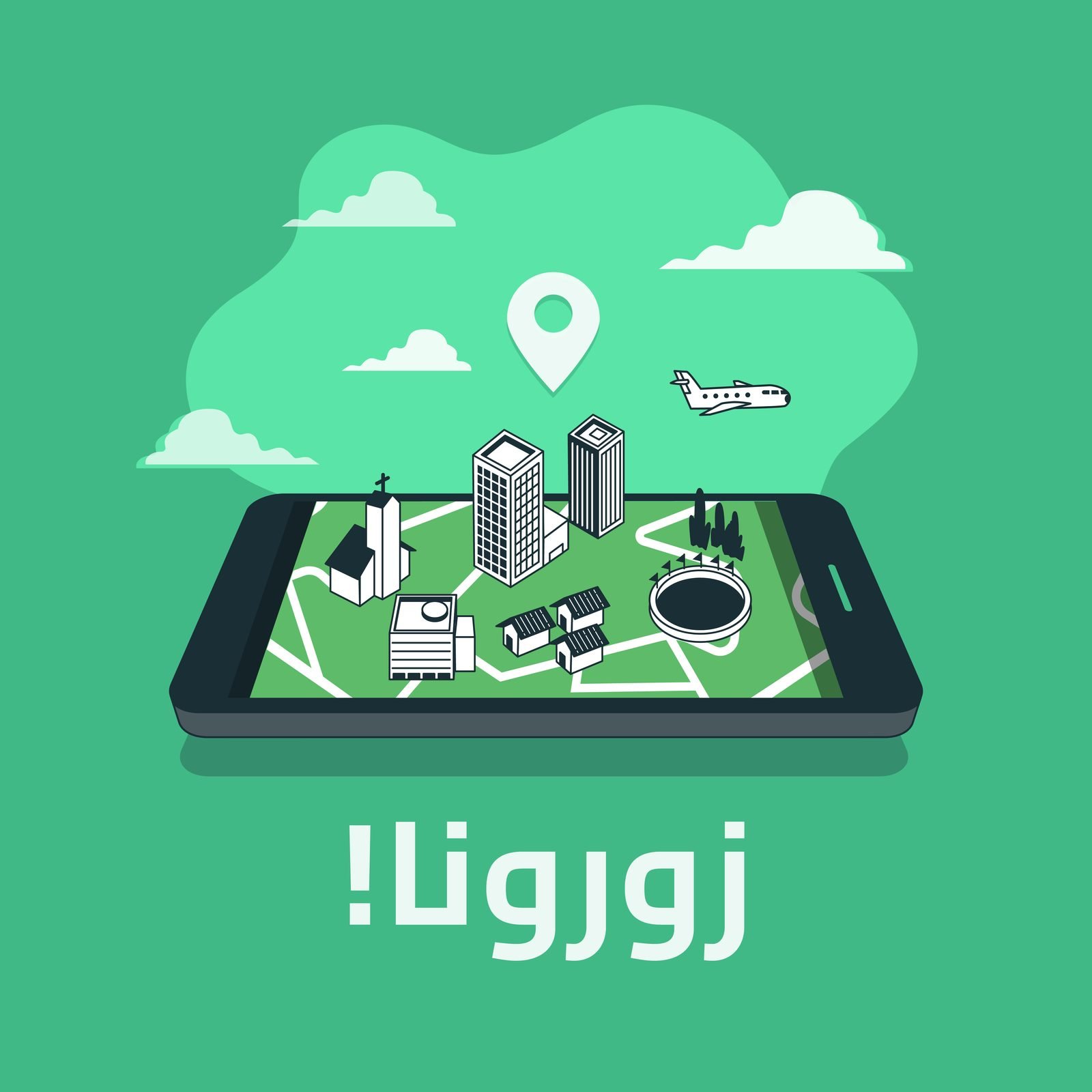
Launch posts introduce the services with short Arabic headlines: alternative energy for a better future, a visit-us invitation, and the case for bifacial solar panels.
The result
A clear, modern identity that makes a technical company feel approachable. One symbol, one green and a simple frame carry it from the logo to every post.
- Brand line, EN & AR
- Logo & symbol
- Bilingual lockup
- Colour palette
- Image frame system
- Facebook cover
- Launch posts
- Instagram grid
Running an energy, engineering or industrial company?
Complex work deserves a brand people understand at a glance.
Energy and industrial companies work with us to look as reliable as the systems they install.
 BOOK A FREE CALLBOOK A FREE CALLBOOK A FREE CALLBOOK A FREE CALLBOOK A FREE CALLBOOK A FREE CALLBOOK A FREE CALLBOOK A FREE CALLBOOK A FREE CALL