
From supplier to partner.
Brand strategy, logo, identity and company profile for MarkAce Giftings, a corporate gifting company repositioning itself as a strategic partner.
- 15elements explored
- 4ideas in one mark
- 3logo lockups
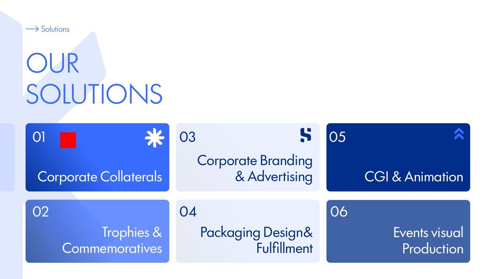
- 6service lines in the profile
01The brief
From supplier to partner.
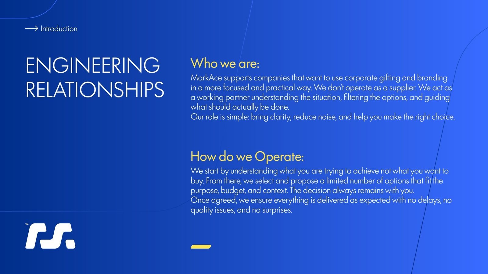
MarkAce had years of experience in corporate gifting, but the market saw it as a pair of hands: someone to fill an order for 500 pens. Before any drawing, we wrote a strategic roadmap to move the brand from supplier to the partner companies trust with their relationships.
A supplier
Sells products, competes on catalogue size and price, and hides the source to protect margin.
A partner
Engineers relationships, curates the few items that matter, and is open about sourcing and cost.
Stop selling things. Start selling outcomes.
Strategic roadmap
- 01
The Sage
Strategy, data and honesty: the adult in the room.
- 02
The Magician
The unboxing moment that turns an object into a memory.
- 03
The consultancy look
Editorial layouts, sharp type and room to breathe, not a cluttered e-commerce grid.
02Concepts
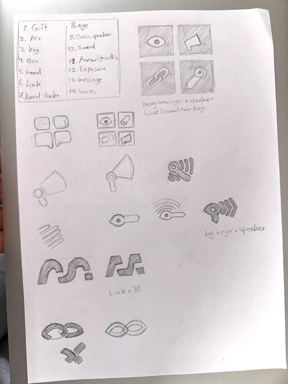
Fifteen ideas, sketched by hand.
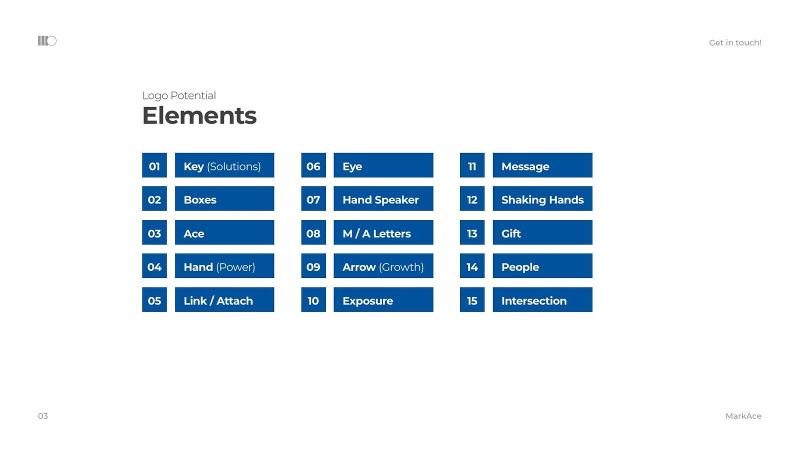
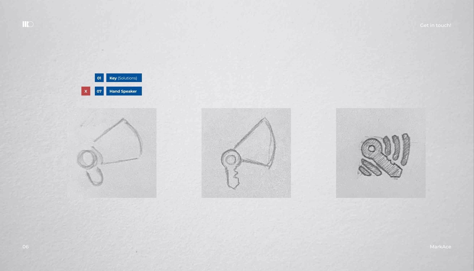
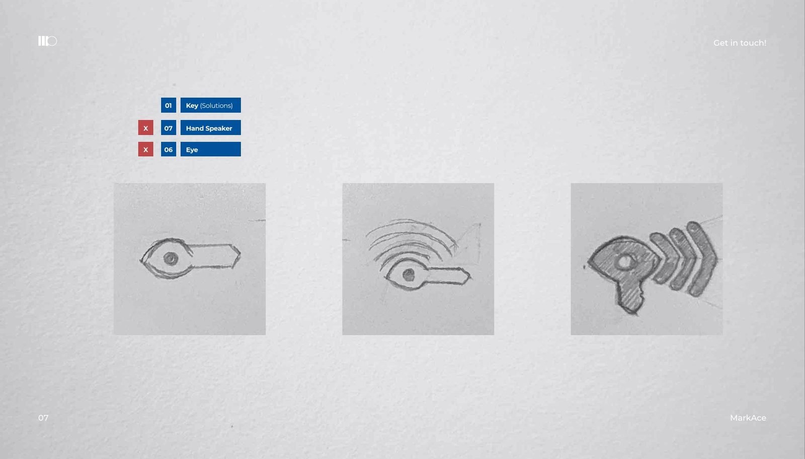
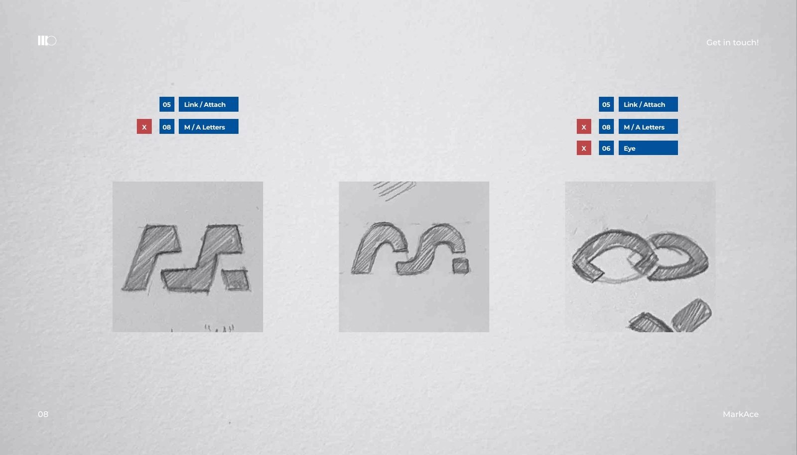
We listed fifteen elements that could carry the brand, from the key, the gift box and the handshake to the link, the arrow and the letters M and A. Then we combined them on paper until one shape held the whole story.
03The mark
A link that reads as M and A.
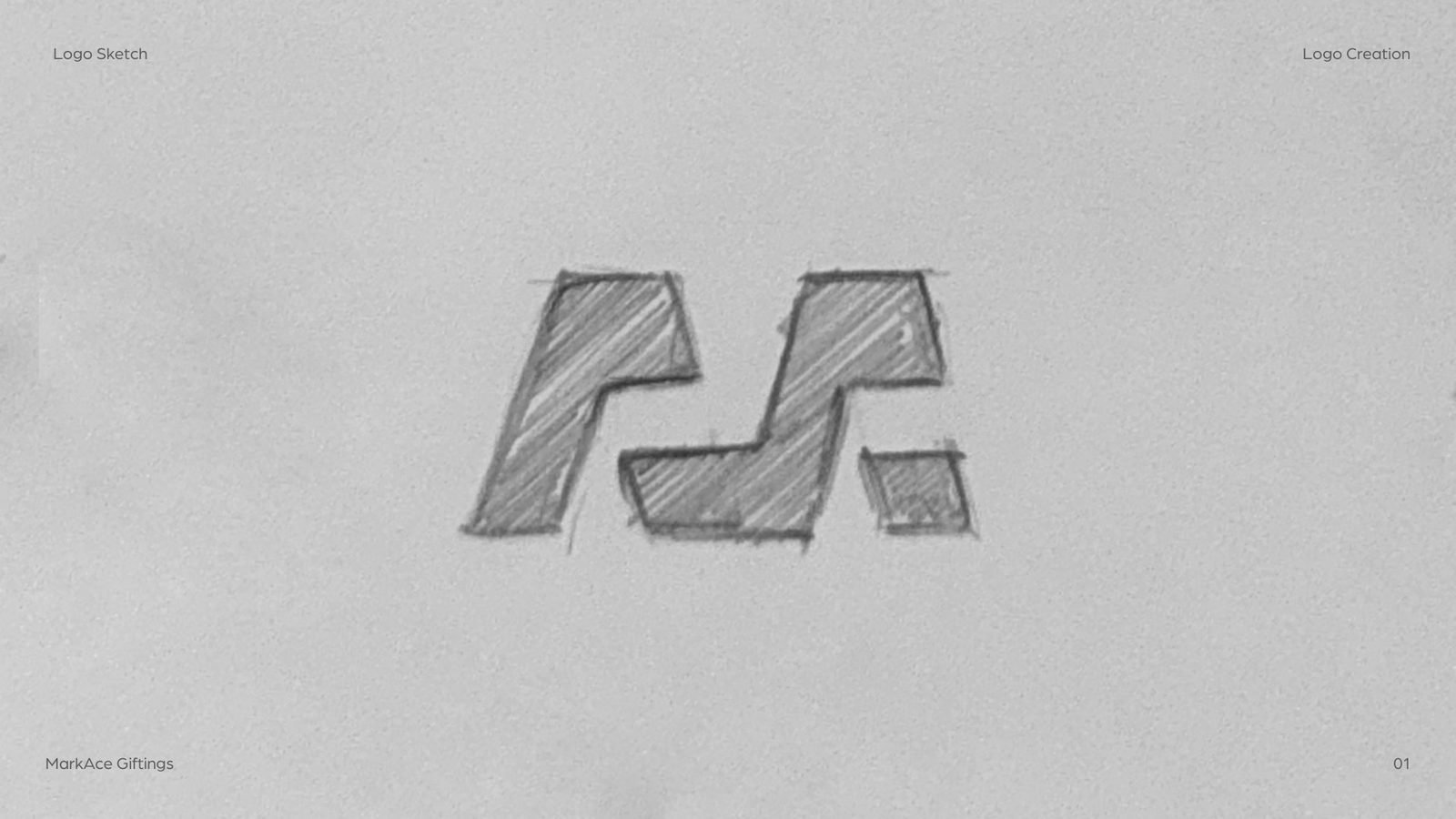
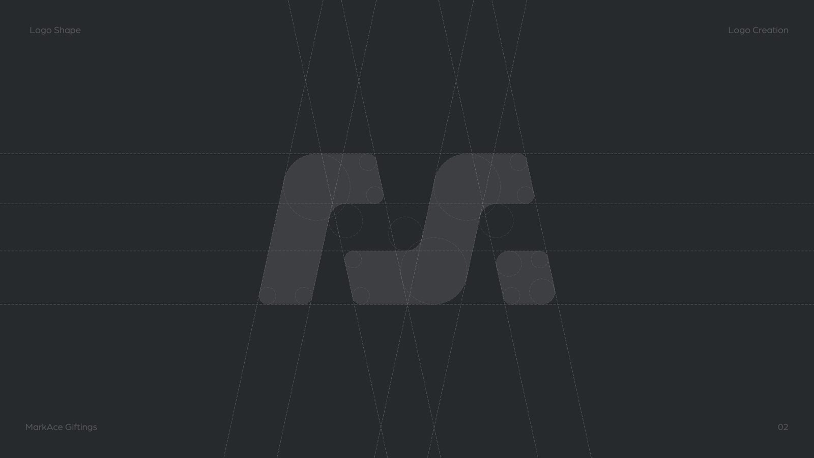
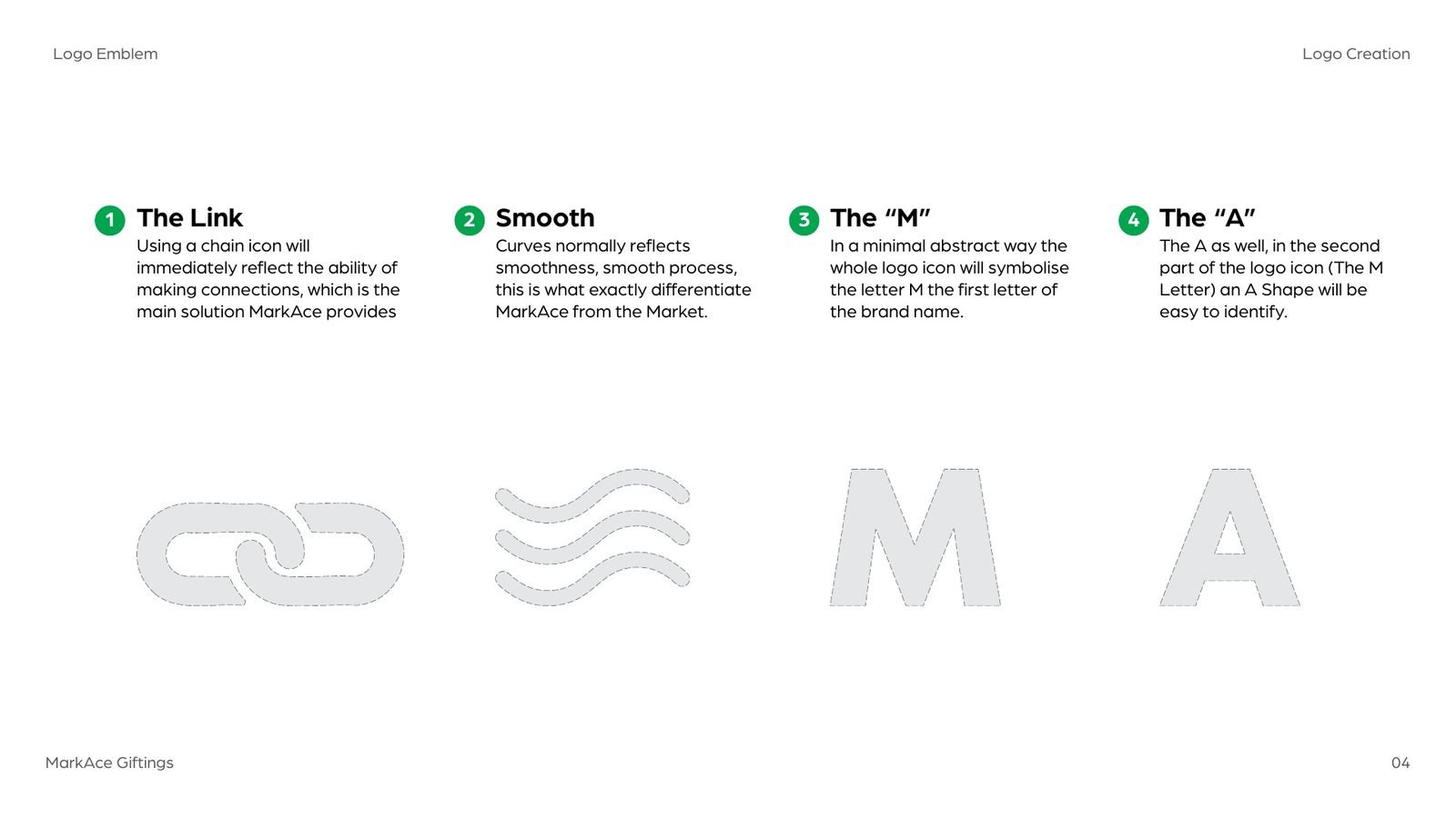
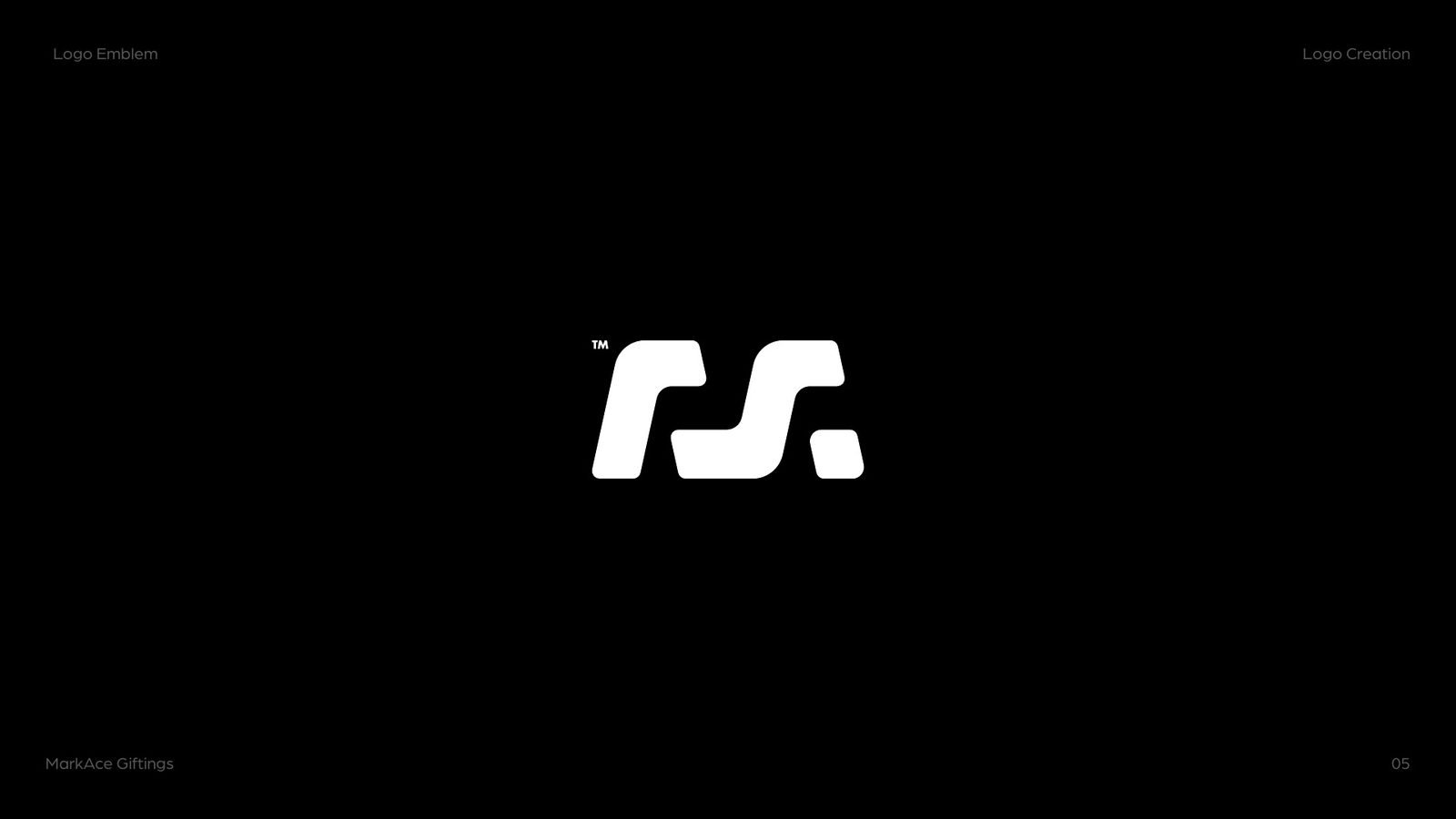
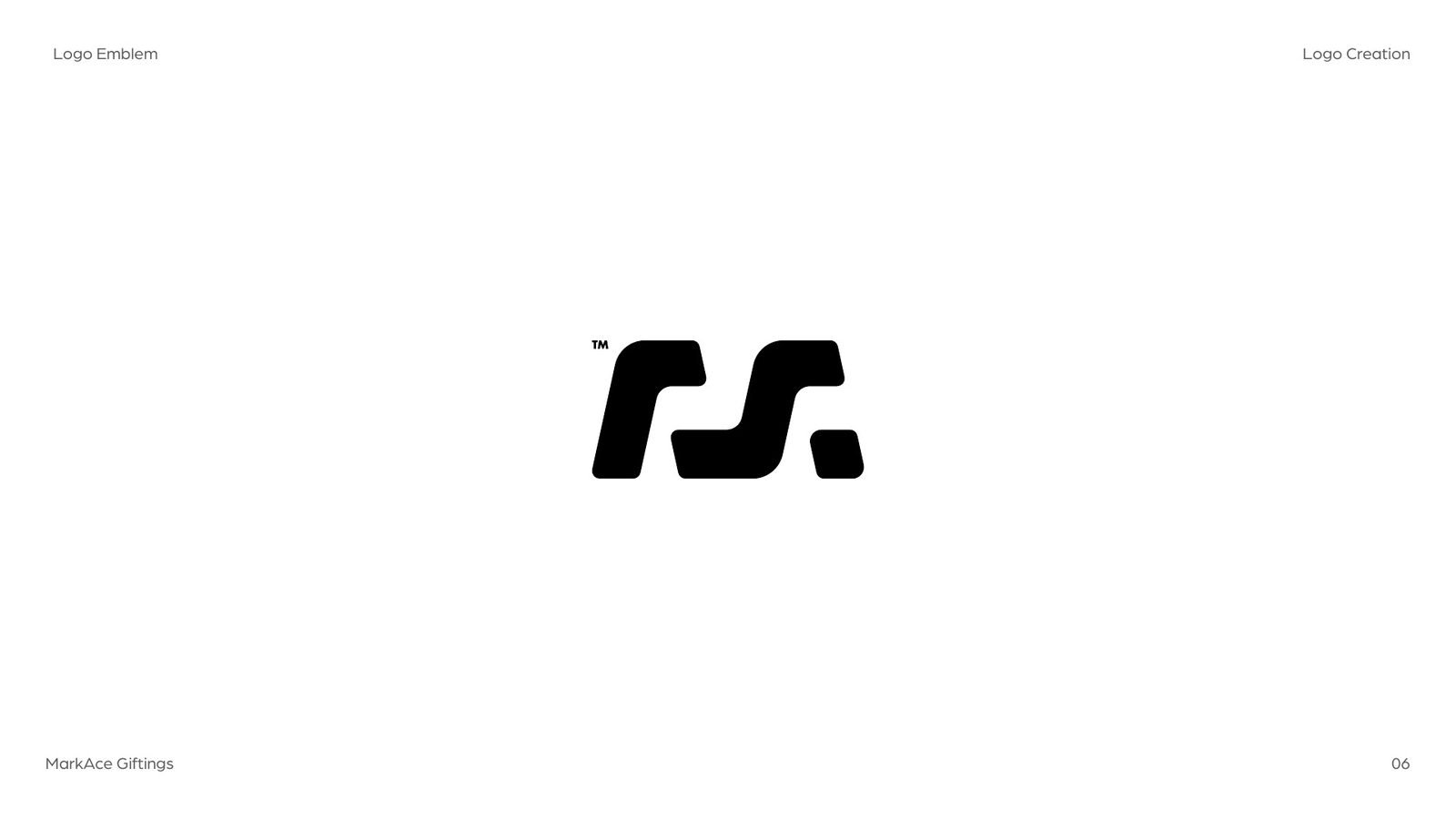
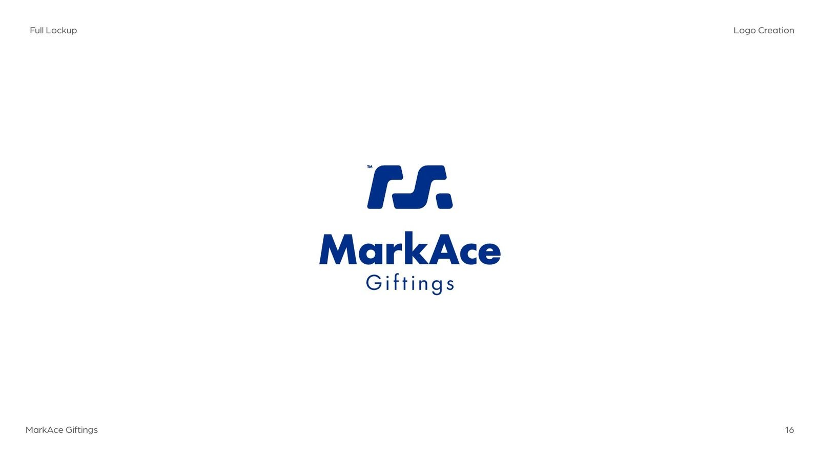
The chosen shape is a chain link drawn with soft, continuous curves: connection is what MarkAce sells, and smoothness is how it should feel. Read it again and the link is also an M, with an A tucked into its second half.
04The logotype
A wordmark tuned to the mark.
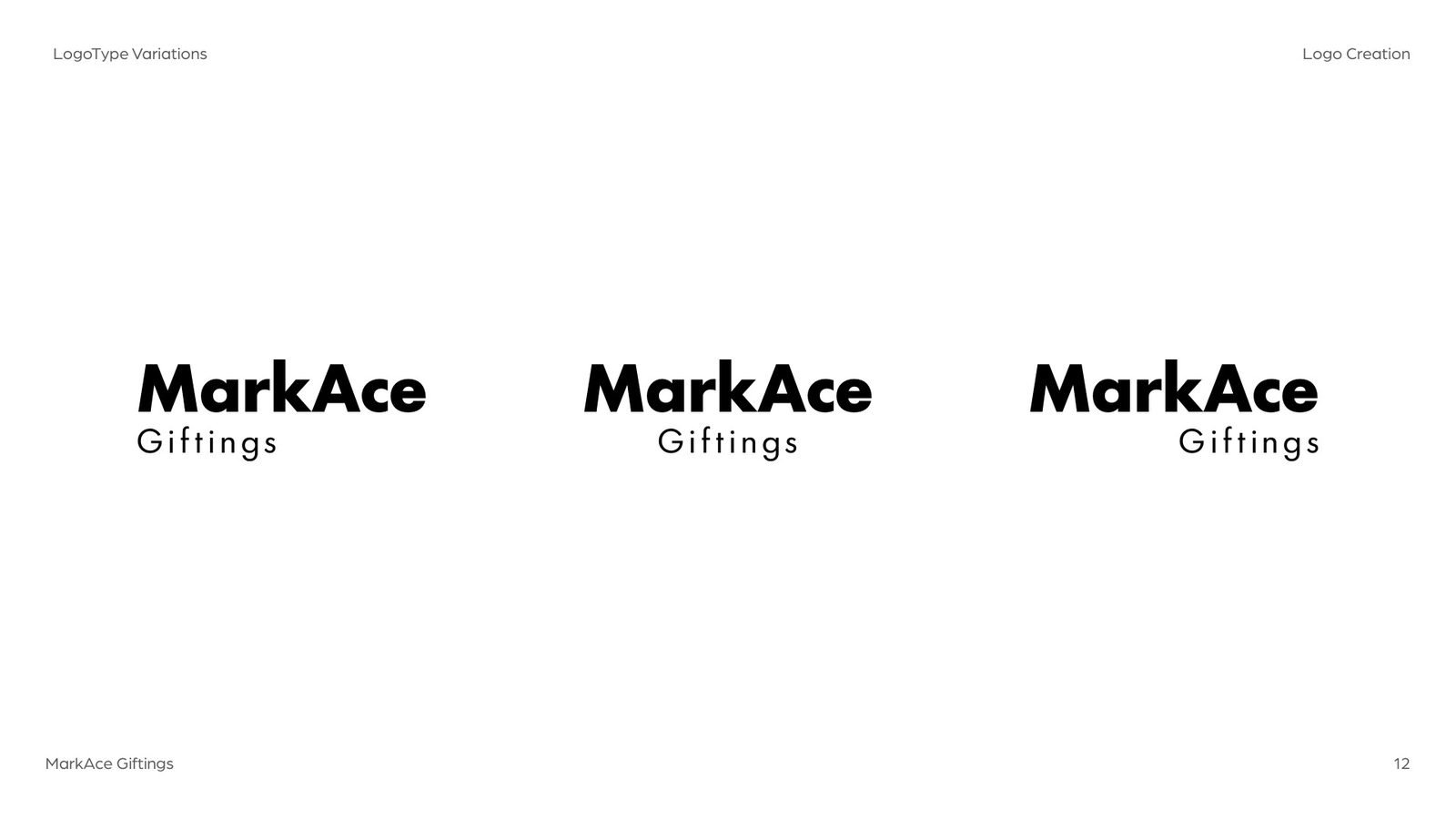
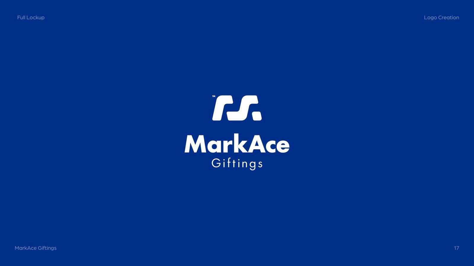
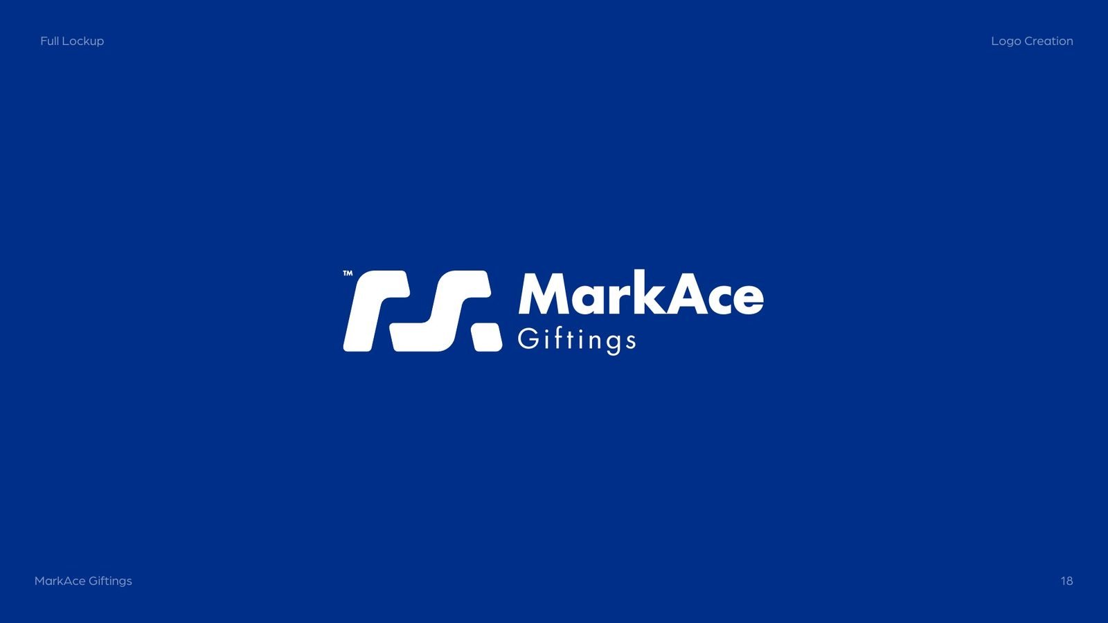
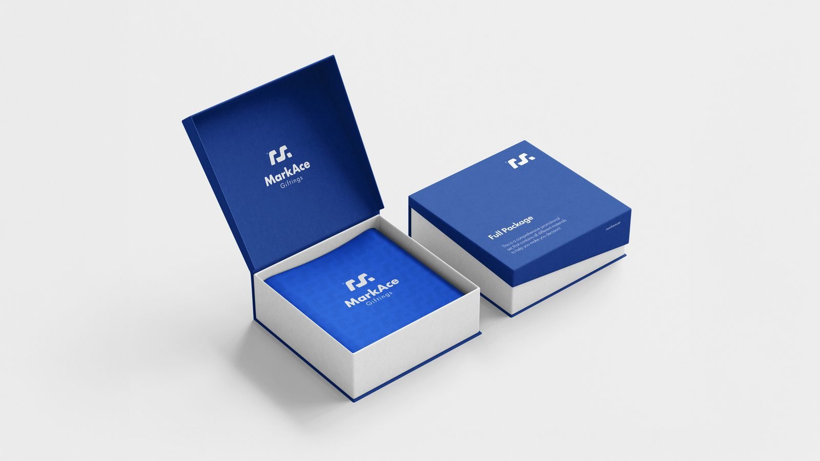
The letters were paired and adjusted to sit in balance with the emblem, then set as a stacked lockup, a horizontal lockup and a wordmark that can stand alone, in deep and bright MarkAce blue.
05In material
Pressed, debossed and boxed.
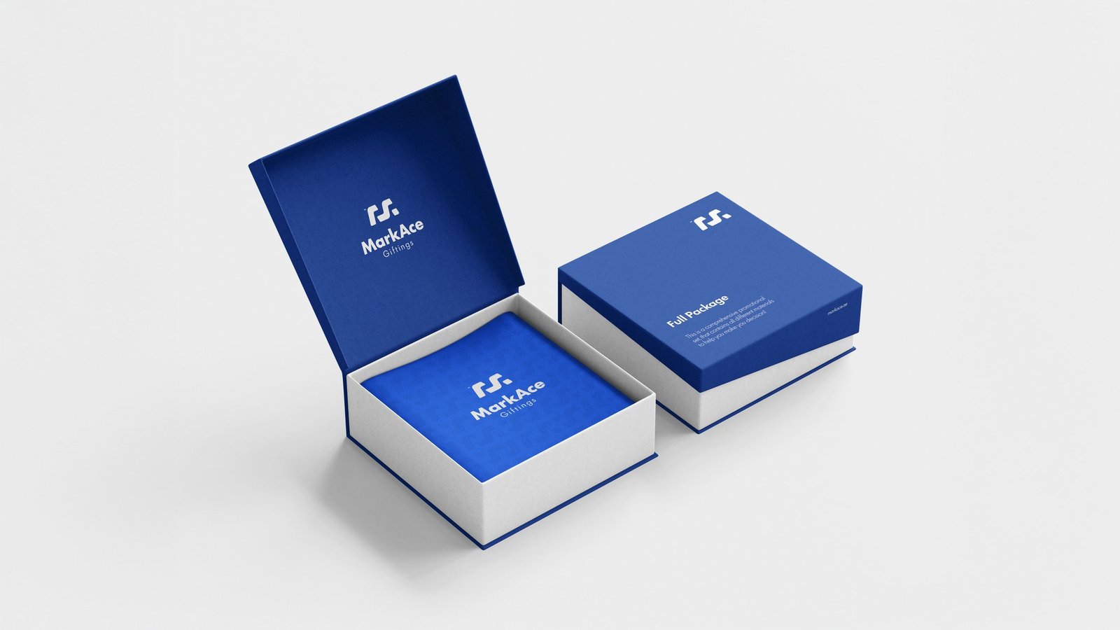
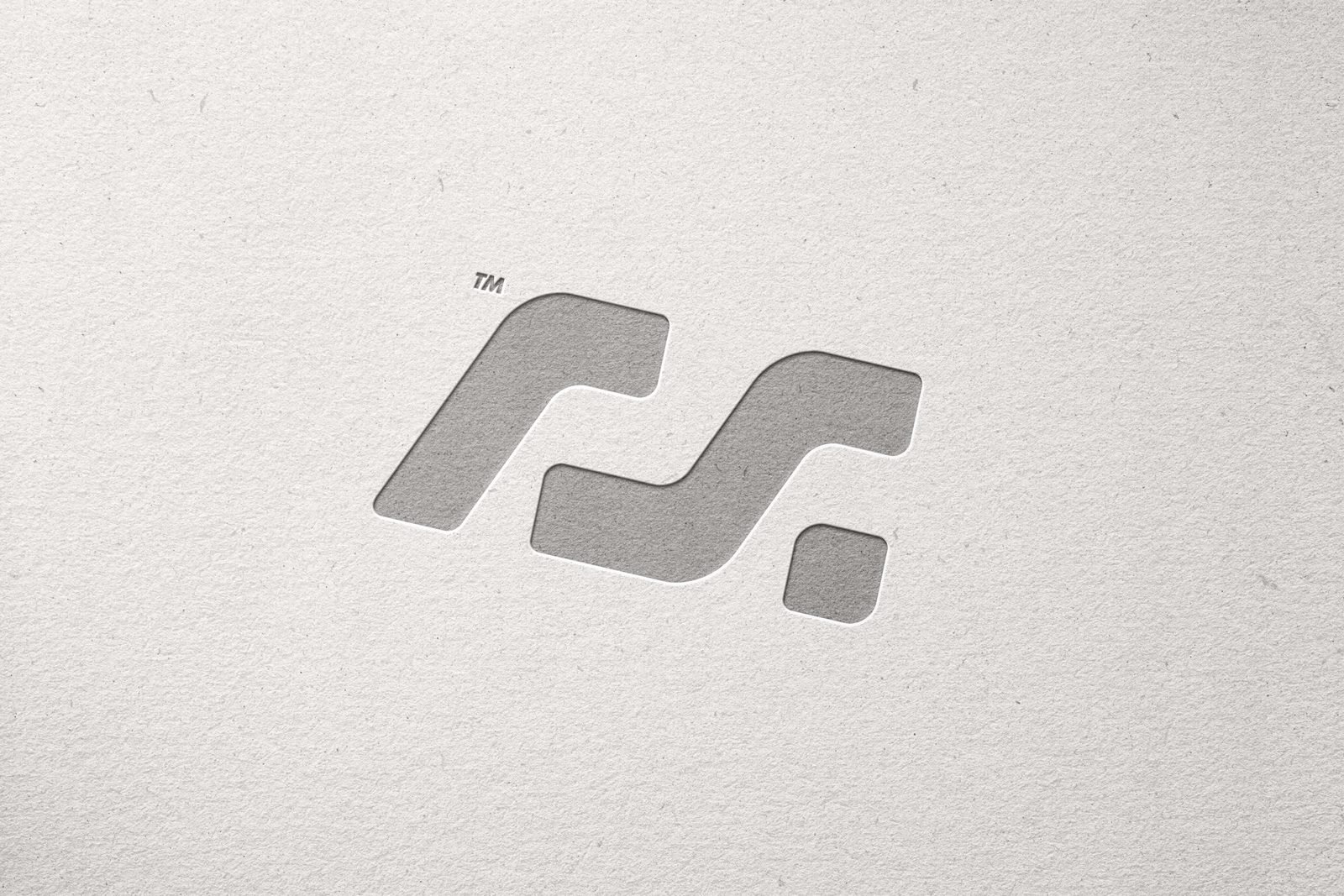
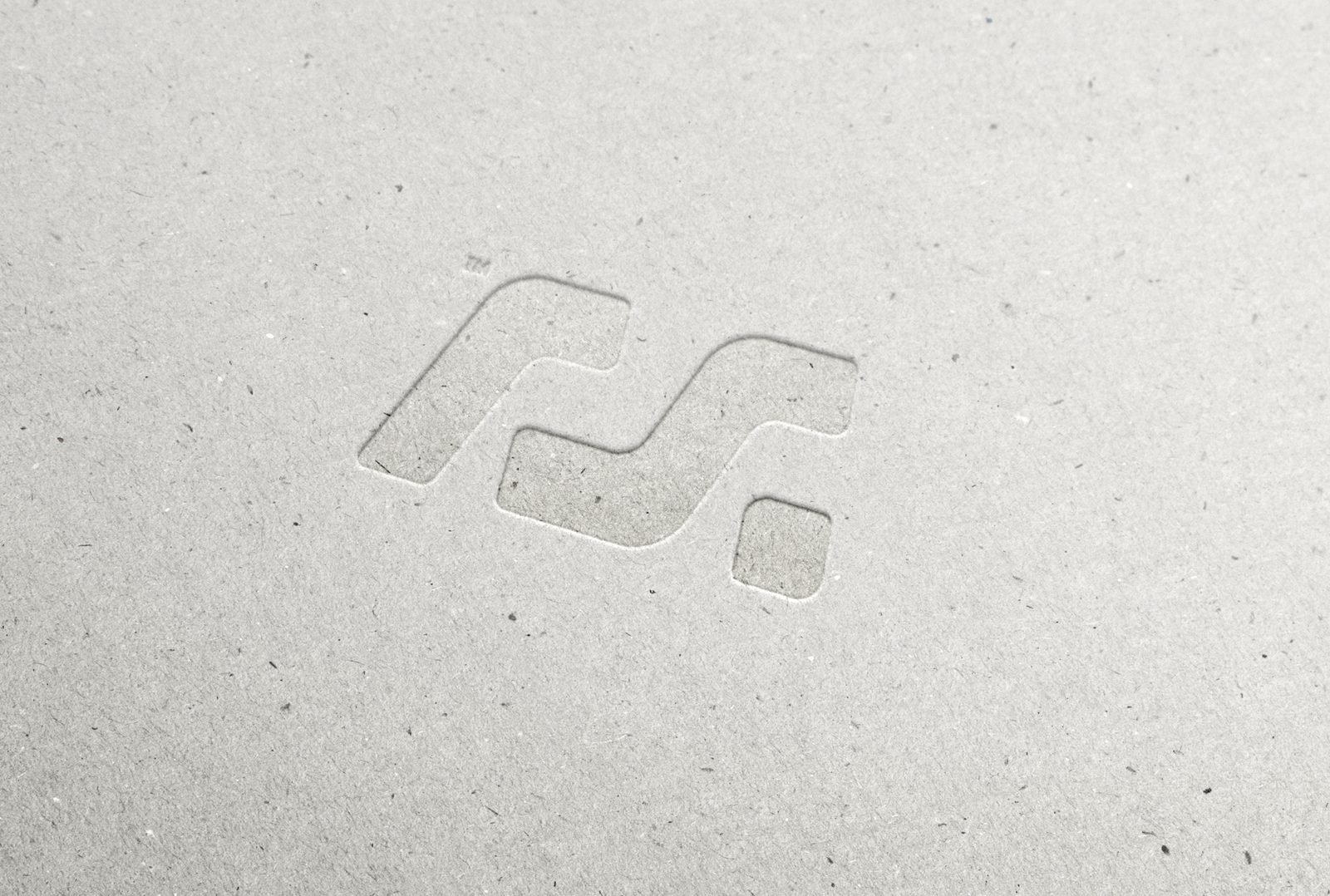
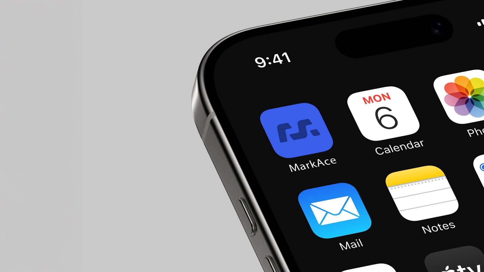
A gifting brand lives on paper, card and packaging, so we tested the mark where it will actually be touched: debossed stock, pressed board, concrete, a gift box and the phone home screen.

06The company profile
The new voice, in print.
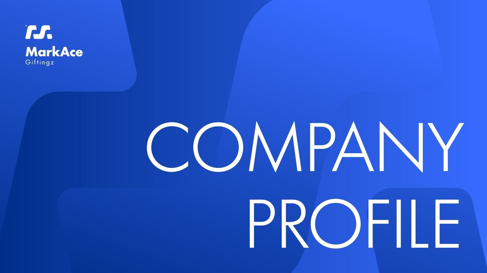
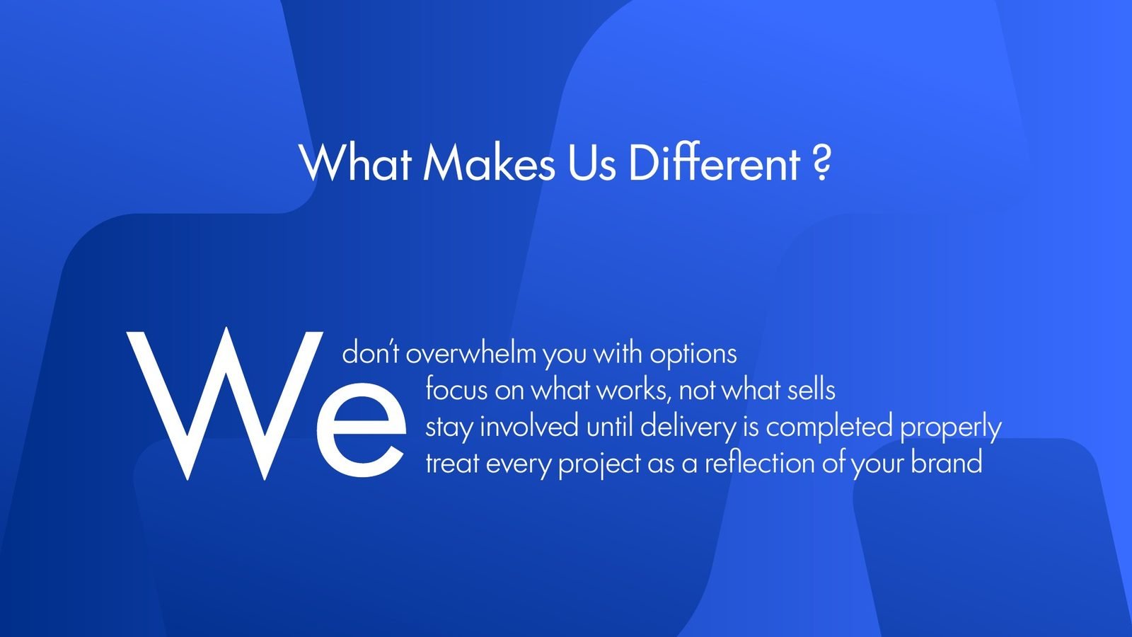
We carried the identity into the company profile: big blue fields, light type and the mark cropped large, with the six service lines laid out as one clear system.
The result
A strategic roadmap, a mark that reads as a link, an M and an A, and a logotype family in MarkAce blue, carried into packaging, digital and the company profile.
- Strategic roadmap
- Brand archetype
- Concept sketches
- Logo emblem
- Logotype & lockups
- Deboss & material tests
- Gift box packaging
- App icon
- Company profile
Running a gifting or B2B services company?
Look like the partner you already are.
We help service companies turn years of quiet experience into a brand that clients read as strategy, not supply.
 BOOK A FREE CALLBOOK A FREE CALLBOOK A FREE CALLBOOK A FREE CALLBOOK A FREE CALLBOOK A FREE CALLBOOK A FREE CALLBOOK A FREE CALLBOOK A FREE CALL