
We open the doors.
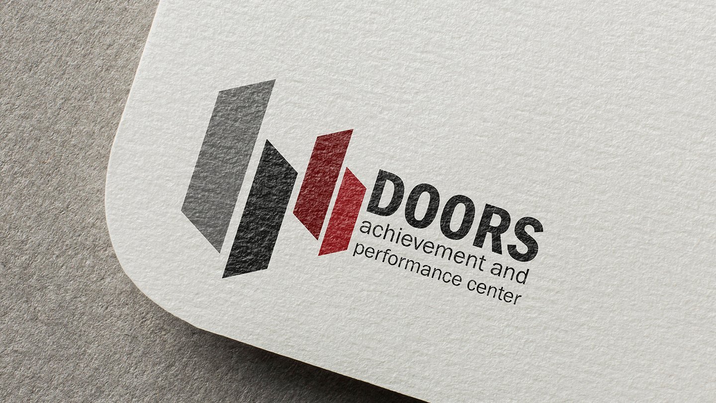
Logo, visual identity guidelines and social media for Doors, a learning centre preparing students for school certificate exams.
01The brief
A centre that opens doors.
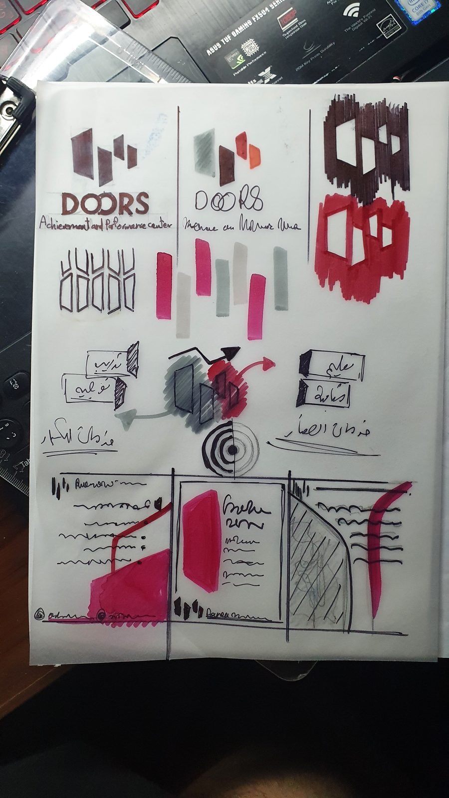
Doors is a learning centre preparing students for their school certificate exams and running workshops and summer programmes. The name already held the idea. We worked it out on paper first: panels, steps and arrows that read as a door opening and a student moving up.
We open the doors of success for you.
Brand line

02The mark
Three panels, swinging open.
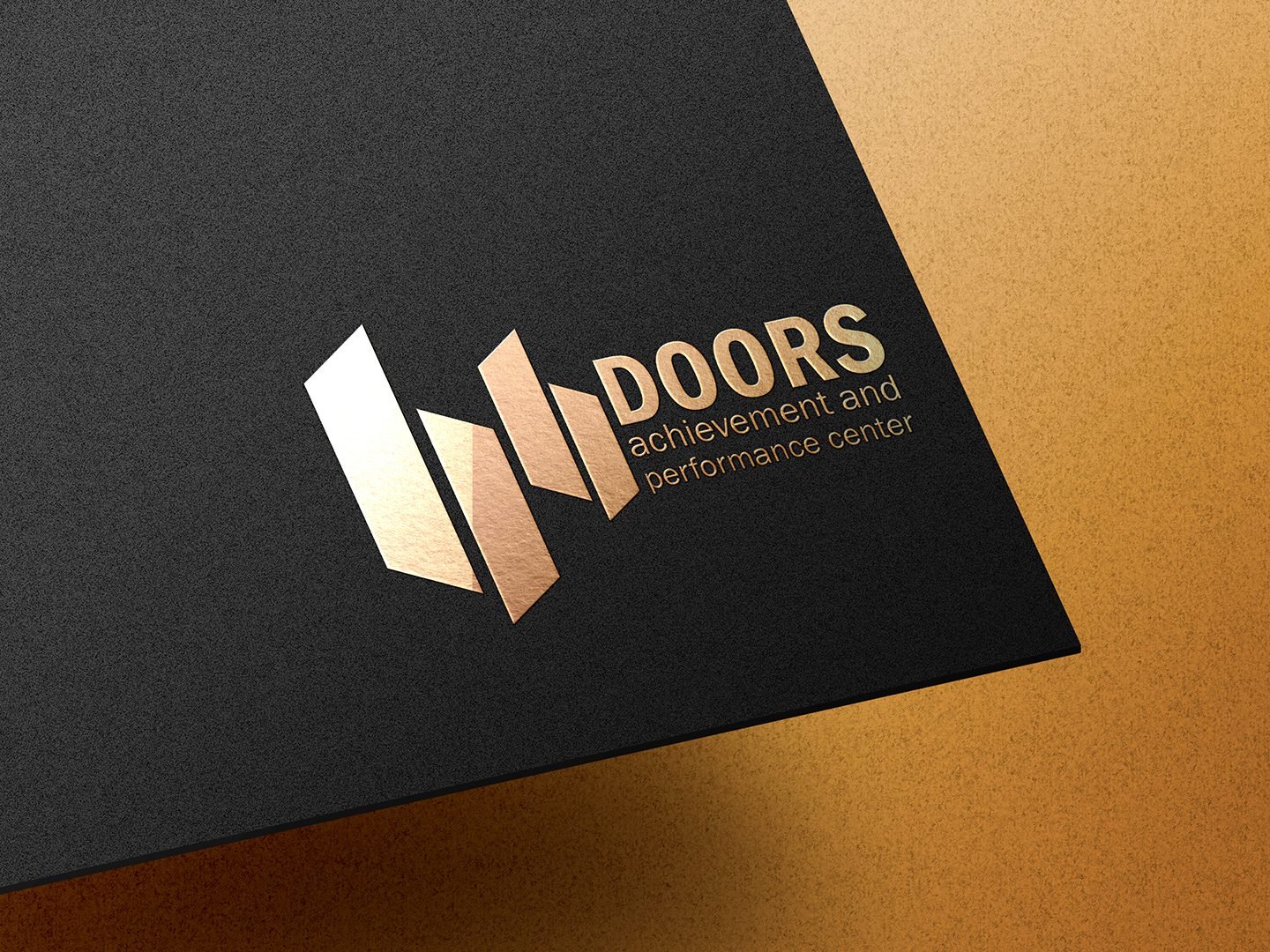
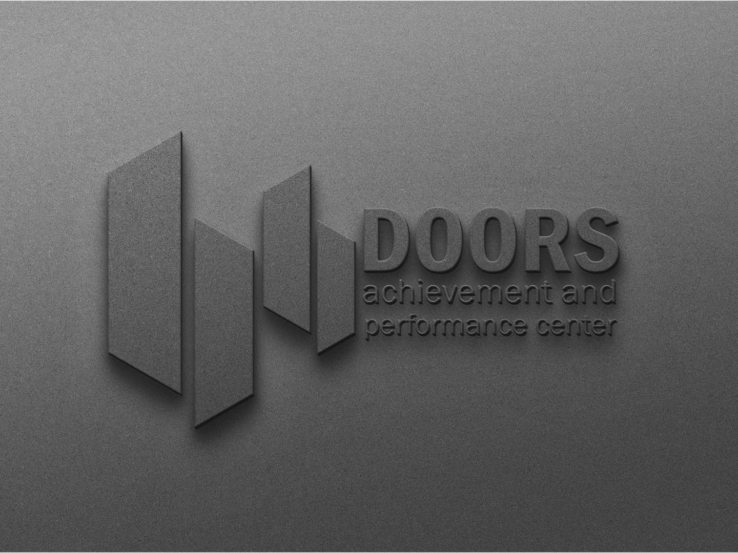
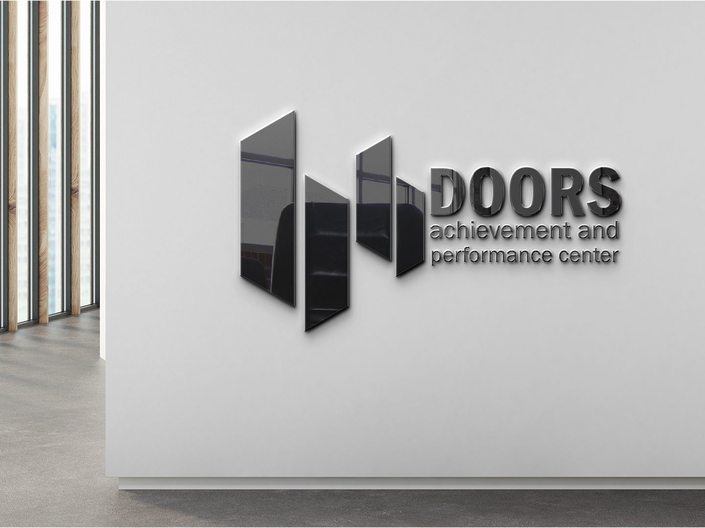
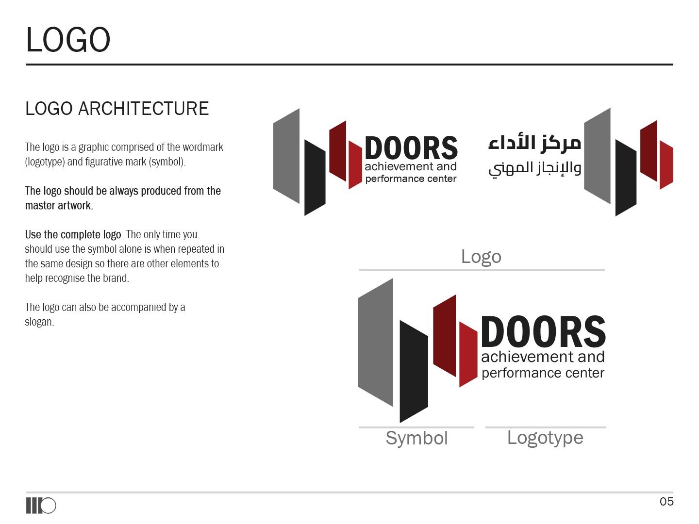
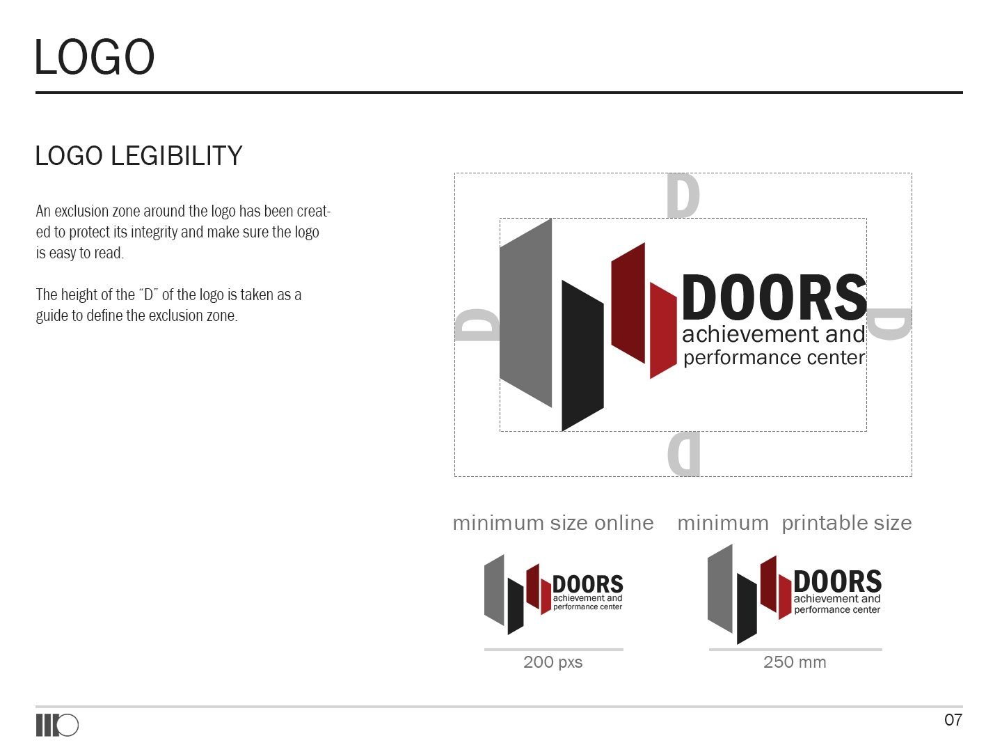
Three angled panels, like doors caught mid-swing, step from grey to red. The symbol sits beside a condensed wordmark in English and Arabic, and holds up embossed, foiled, printed or cut as a sign.
03The rulebook
Simple rules a small team can follow.
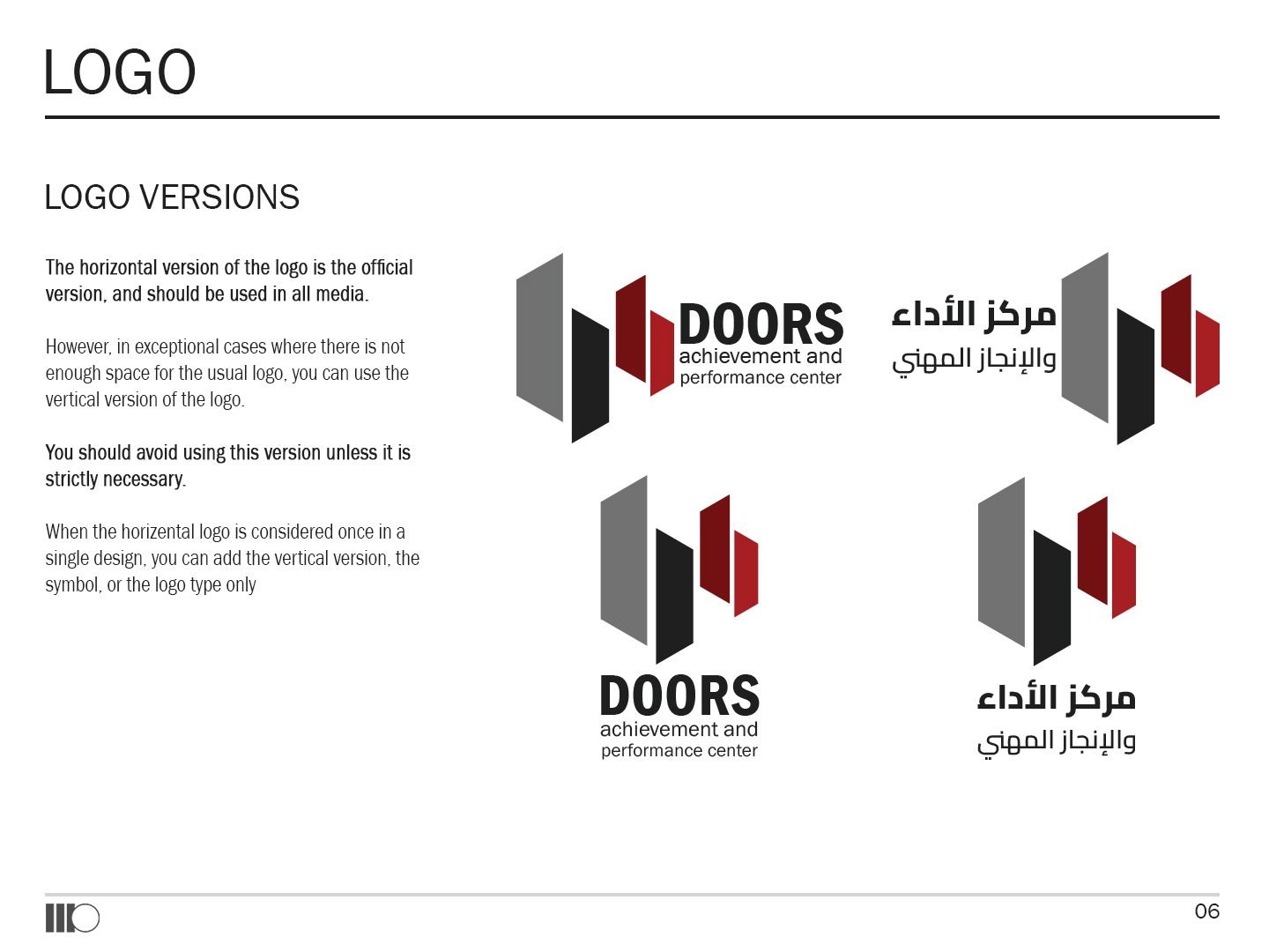
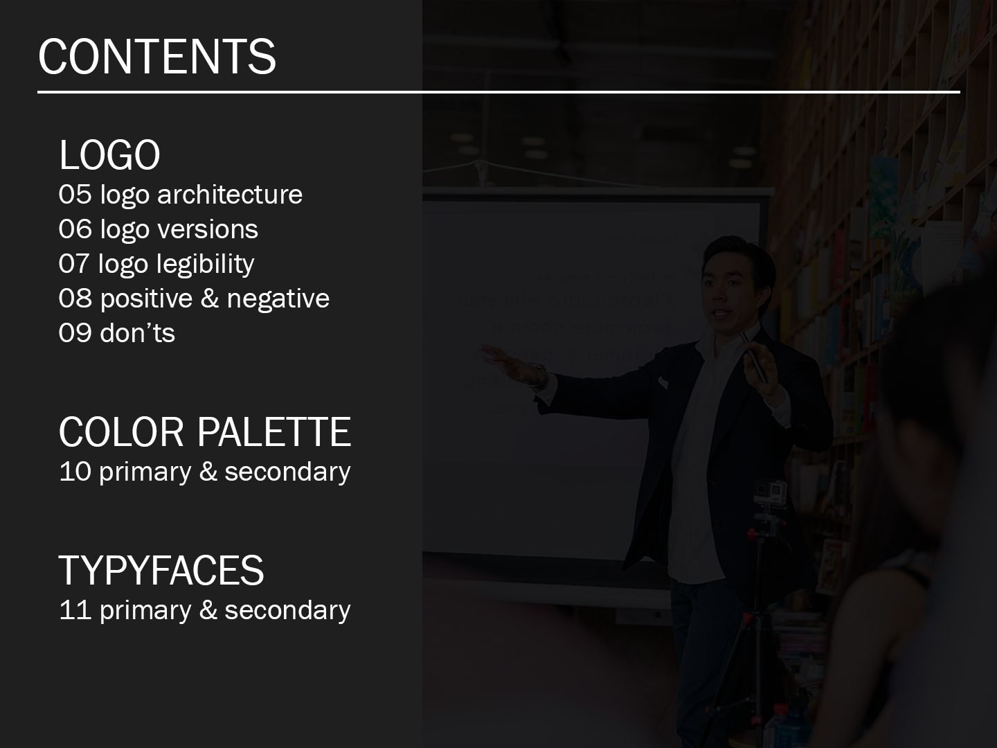
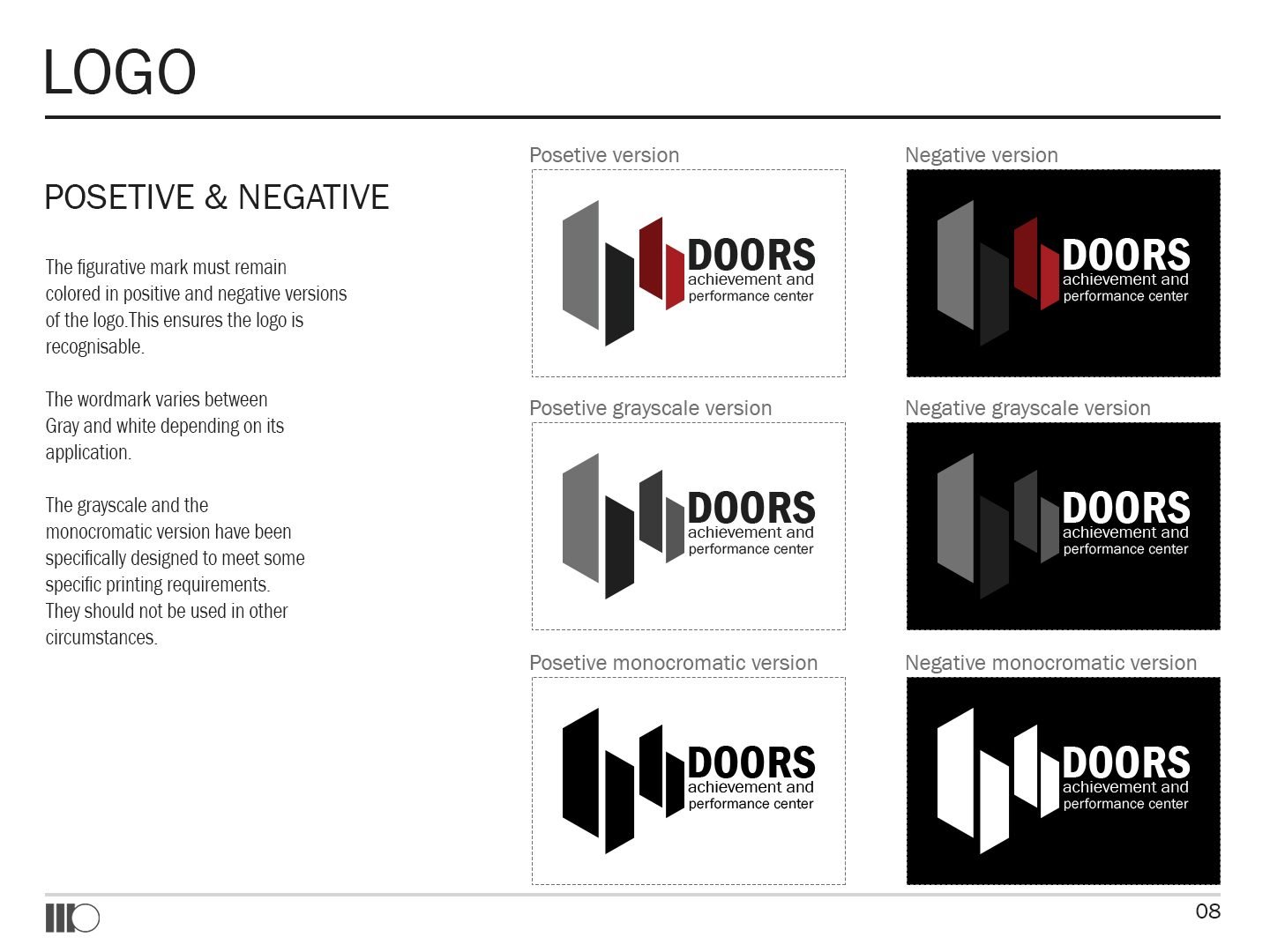
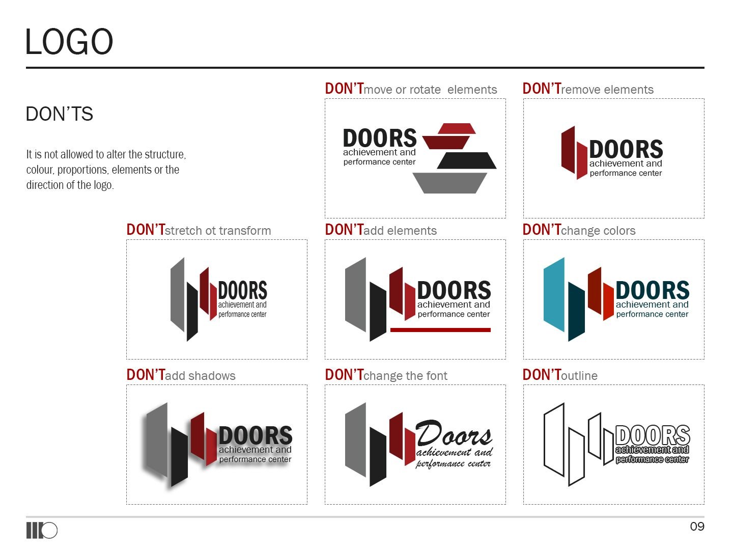
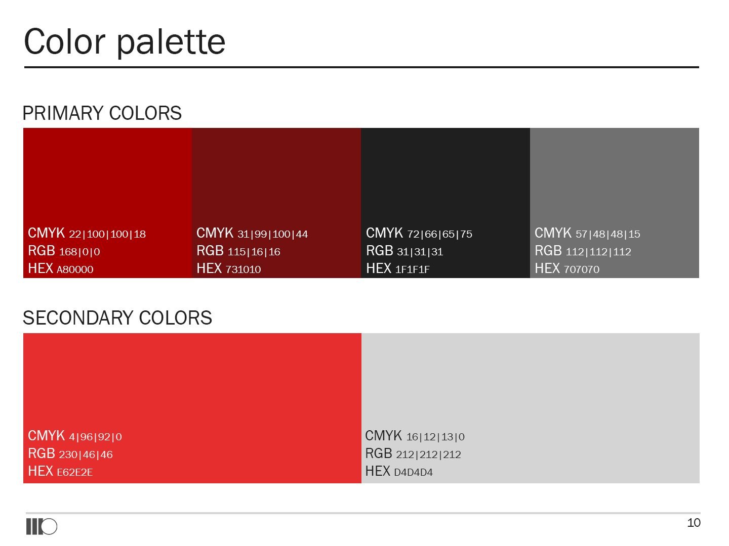
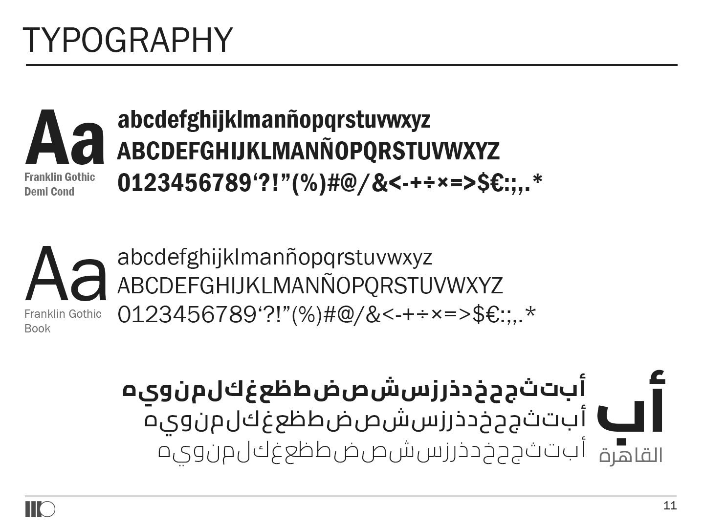
A twelve-page guideline in English sets out the logo versions, legibility, clear space, positive and negative use, what not to do, the red-and-grey palette, and the typefaces: Franklin Gothic for Latin and Cairo for Arabic.
Colour
- Doors Red#A80000
- Deep Red#731010
- Bright Red#E62E2E
- Charcoal#1F1F1F
- Grey#707070
- Light Grey#D4D4D4
Type
- Franklin Gothic
- Cairo

04In the feed
The same panels, every season.
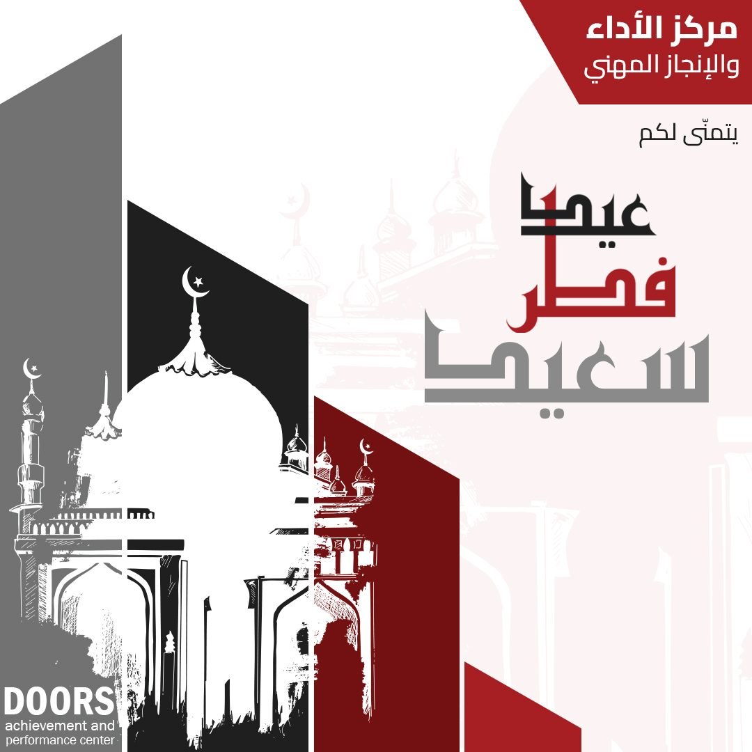
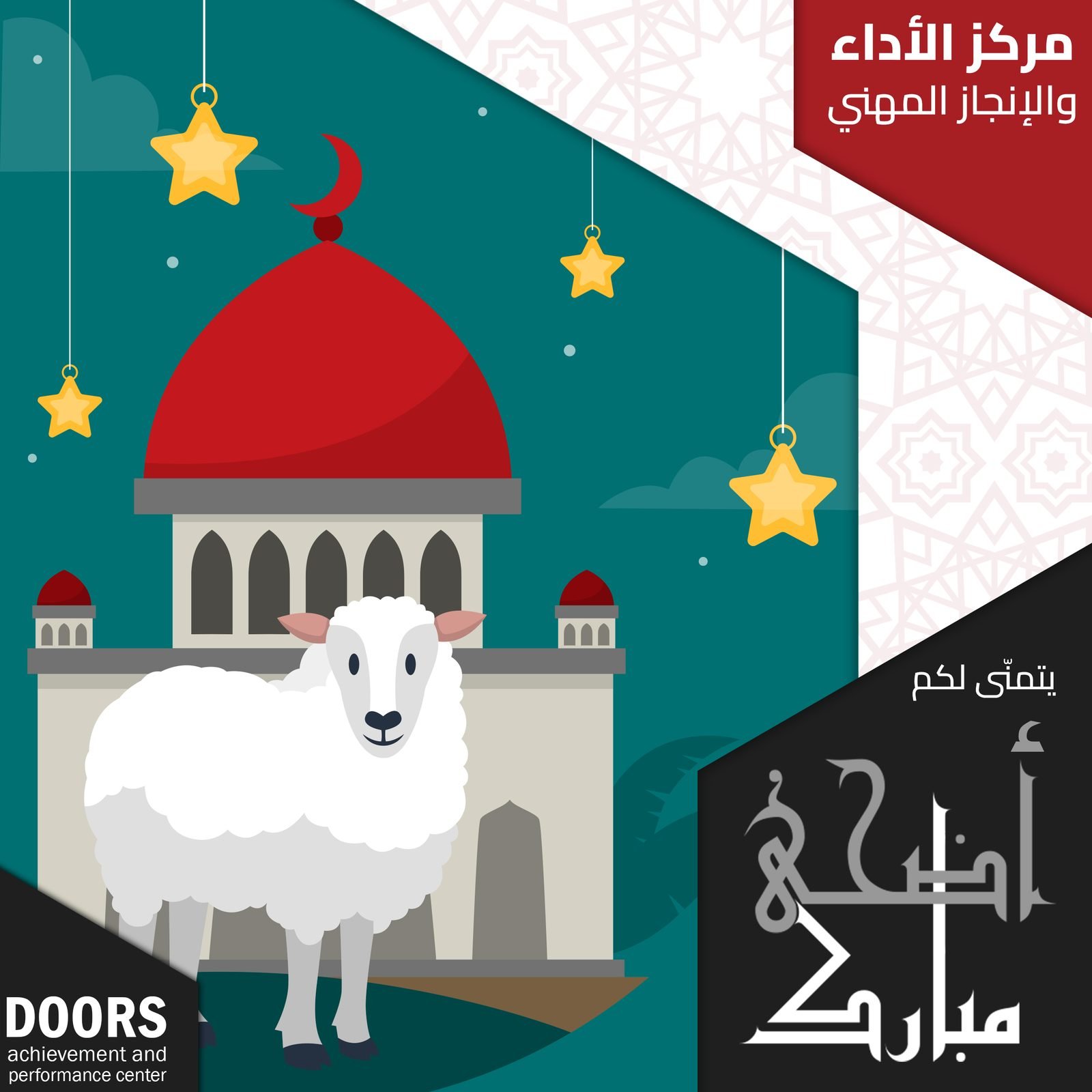
The panels became a frame for the centre’s social media: a cover and profile picture for launch, then greetings for Eid al-Fitr and Eid al-Adha built from the same red, grey and angled shapes.


The result
A clear, confident mark the centre can put on a wall, a certificate or a phone screen, with a short rulebook that keeps it consistent. The angled panels carry the brand into every post and greeting.
- Concept sketches
- Logo, English & Arabic
- Horizontal & vertical versions
- Colour palette
- Typography
- Visual identity guidelines
- Logo mockups
- Facebook cover & profile
- Eid greetings
Running a training or education centre?
The right brand fills seats before the first lesson.
Learning and training centres work with us on a name, a mark and the posts that fill their classes.

 BOOK A FREE CALLBOOK A FREE CALLBOOK A FREE CALLBOOK A FREE CALLBOOK A FREE CALLBOOK A FREE CALLBOOK A FREE CALLBOOK A FREE CALLBOOK A FREE CALL