
Three cities, one healthy emirate.
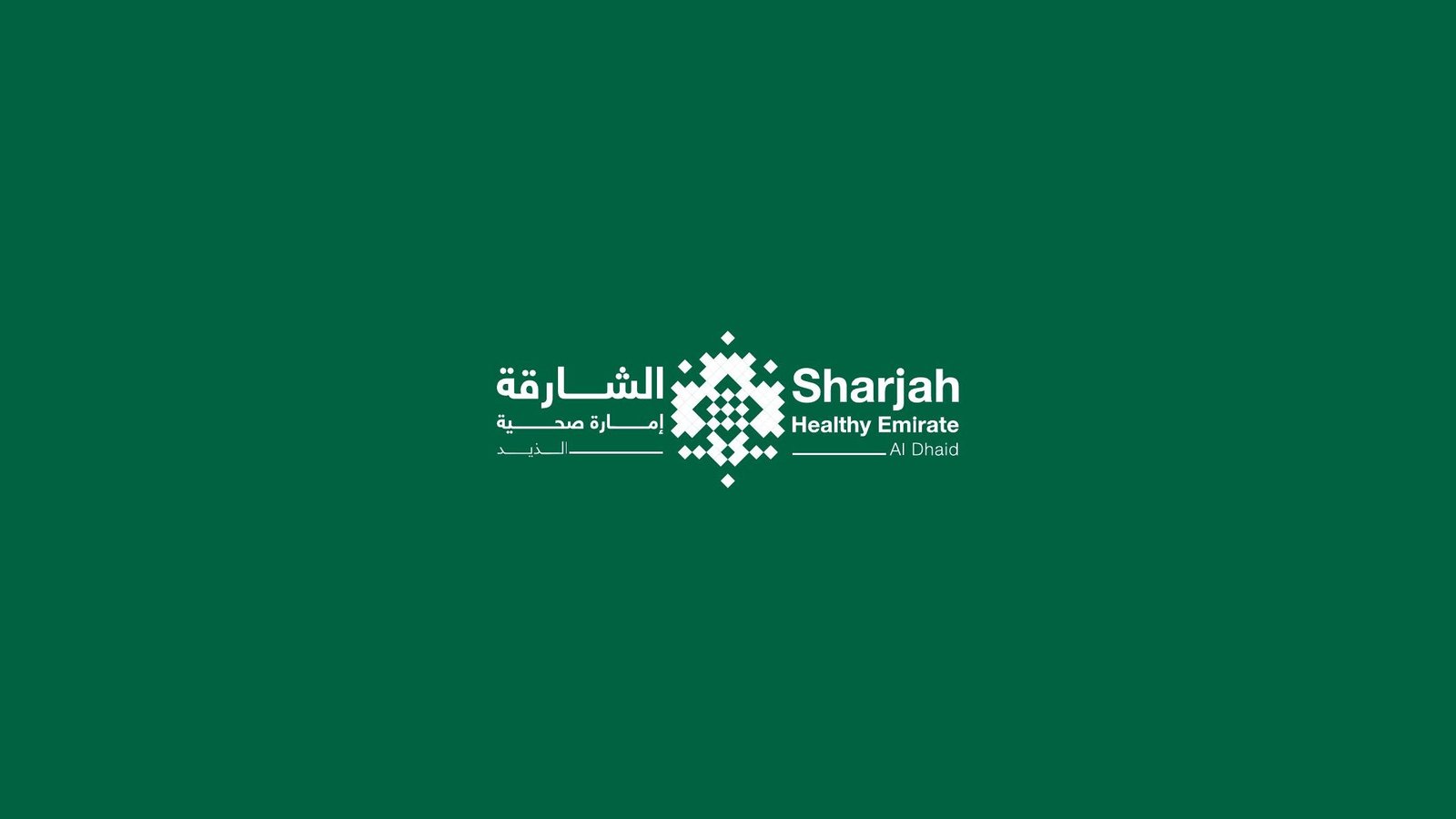
A logo concept for Sharjah Healthy Emirate, proposed within the Sharjah Health Authority’s brand rules, with lockups for Al Dhaid, Kalba and Khorfakkan.
01The exploration
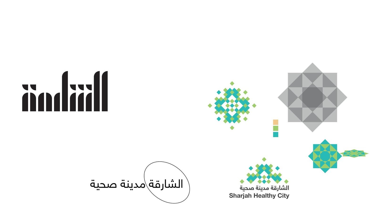
From an eight-point star to pixels.
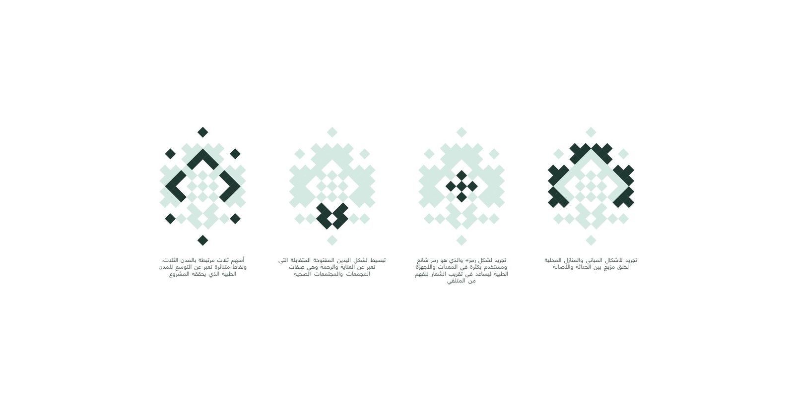
Sharjah’s healthy cities programme was growing to cover Al Dhaid, Kalba and Khorfakkan. We proposed a logo for it, working within the Sharjah Health Authority’s brand rules. The sketches started from the eight-point star of local geometry and broke it into small squares, like tilework.
02The concept
Four ideas in one grid.
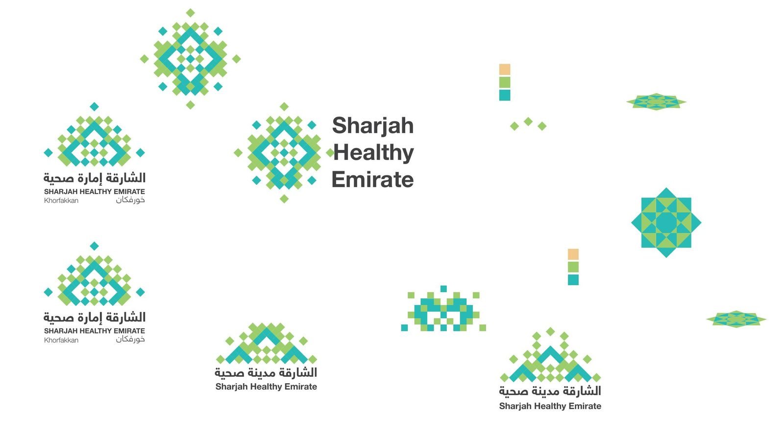
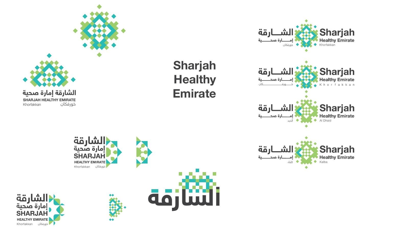
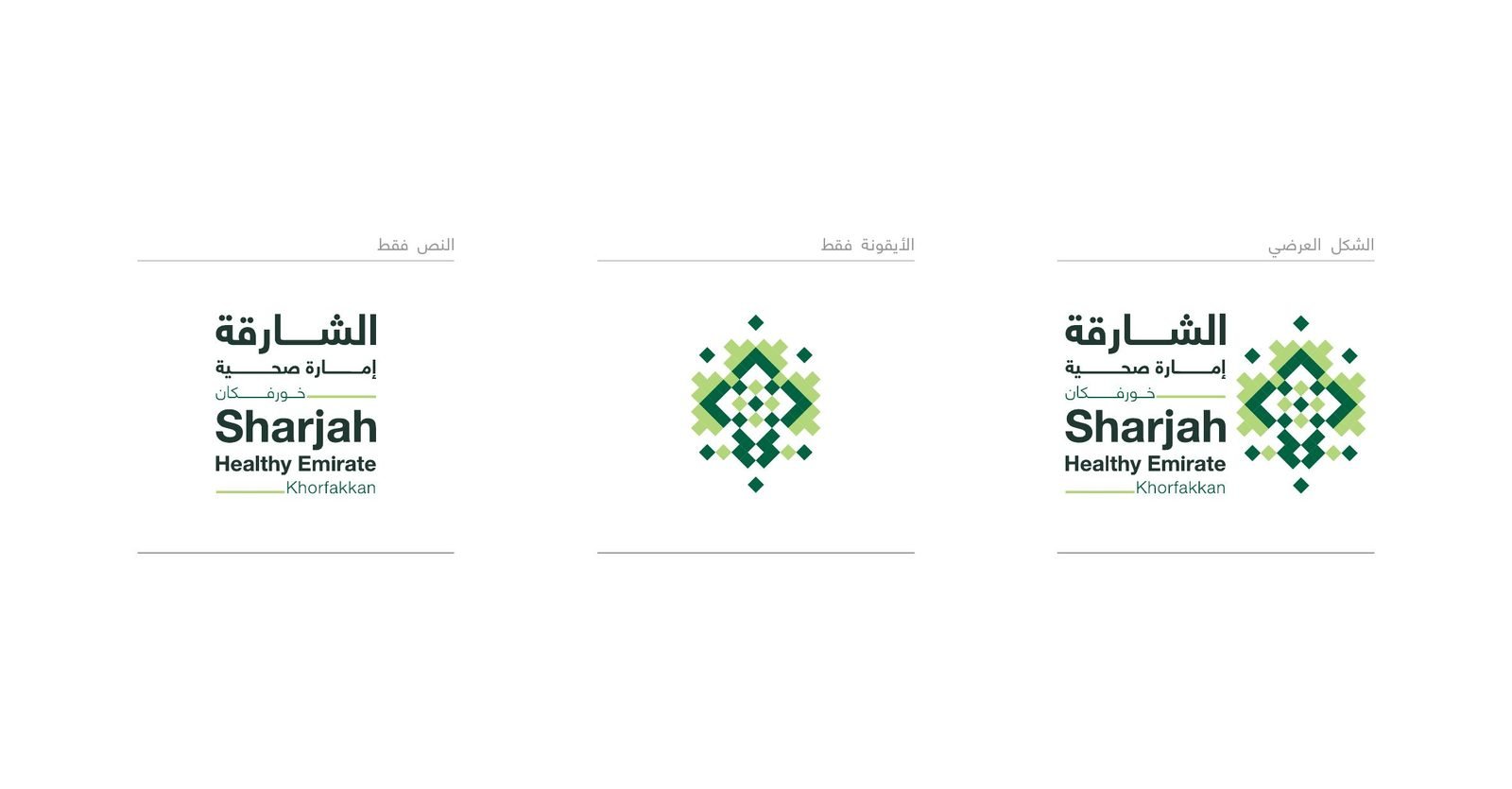
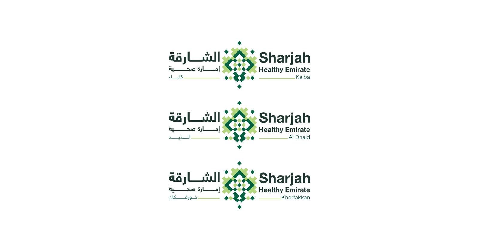
The proposed mark layers four ideas in one grid of squares: three arrows for the three cities, two open hands for care, a plus sign for medicine, and the outline of local houses. Each city gets its own lockup under the same Arabic and English name.
Colour
- Health Green#016241
- Mint#D4E9E2
- Deep Green#1F3832
- Fresh Green#DFF9BA
- Leaf#B3D67A
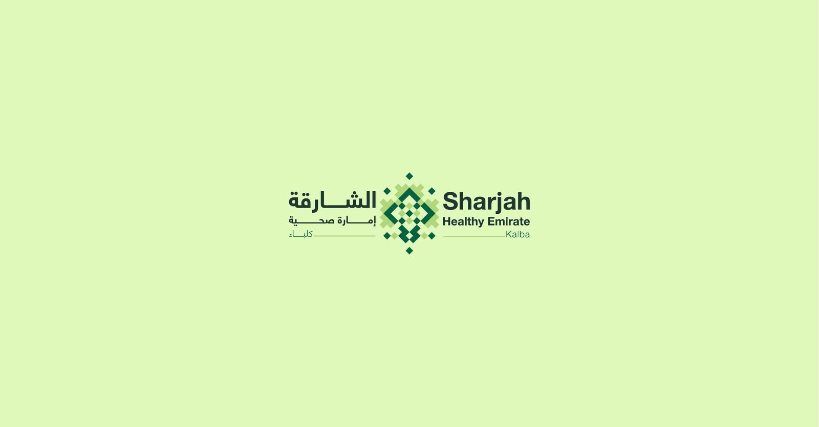
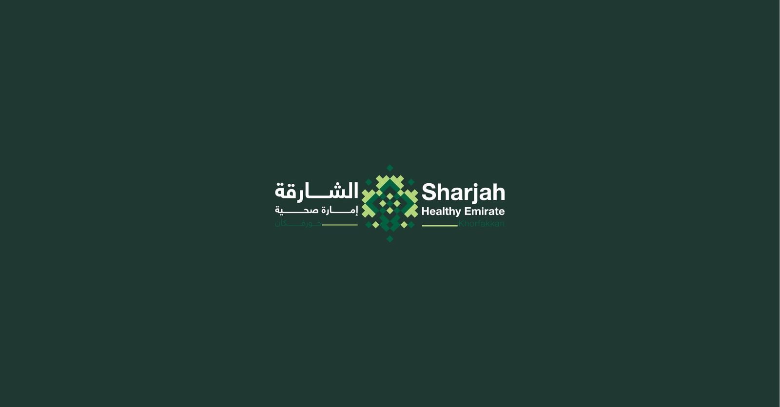
The result
A proposed mark that holds three cities, care and local heritage in one simple grid, with a lockup for each city ready to test against the authority’s guidelines.
- Concept sketches
- Logo concept
- Icon
- Arabic & English lockups
- City lockups
- Colour palette
- Colour versions
A government programme that needs a clear name?
One mark that many places can share.
Government teams work with us on programme identities that respect a parent brand and still stand on their own.
 BOOK A FREE CALLBOOK A FREE CALLBOOK A FREE CALLBOOK A FREE CALLBOOK A FREE CALLBOOK A FREE CALLBOOK A FREE CALLBOOK A FREE CALLBOOK A FREE CALL