
Built to be seen on site.
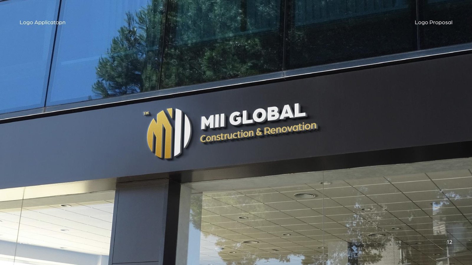
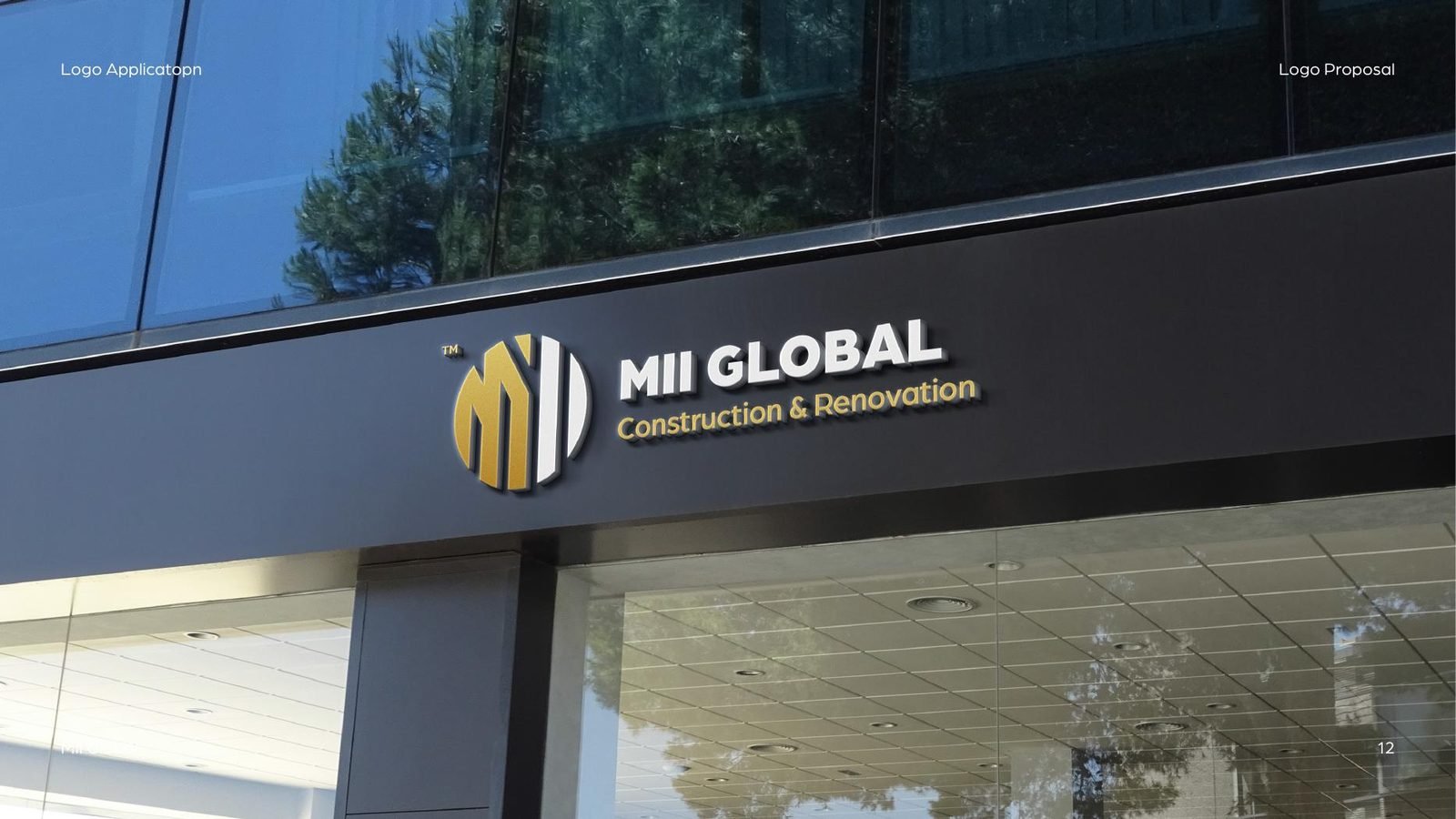
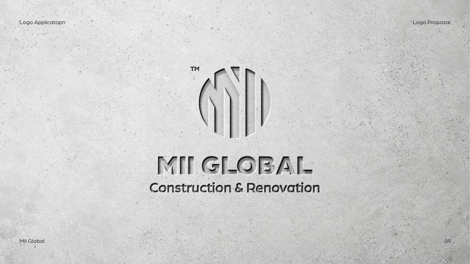
Two logo proposals for MII Global, a construction and renovation company, each shown on signage, helmets and print.
01Option one
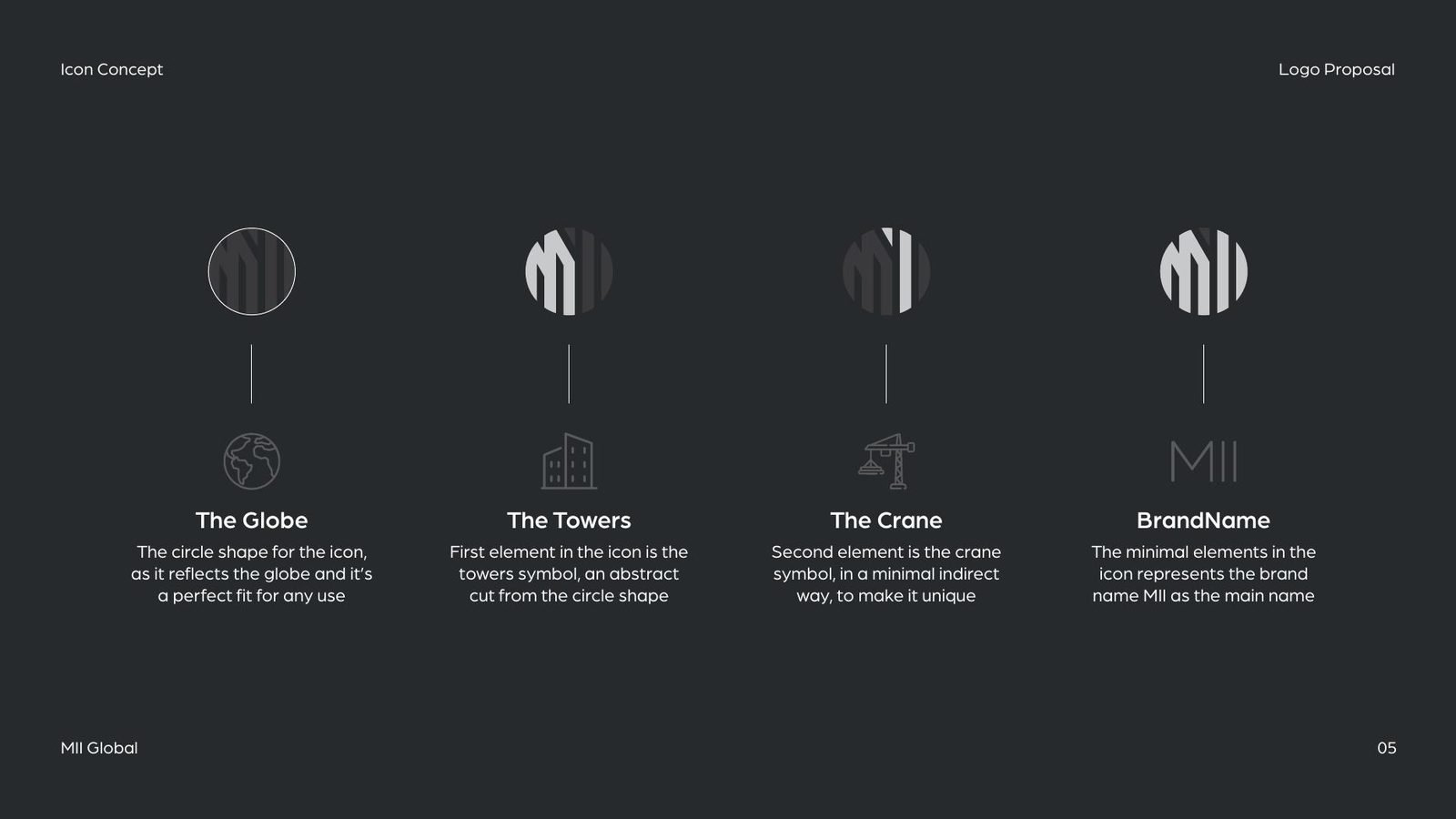
A globe, towers and a crane.
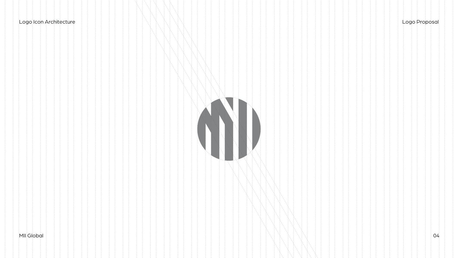
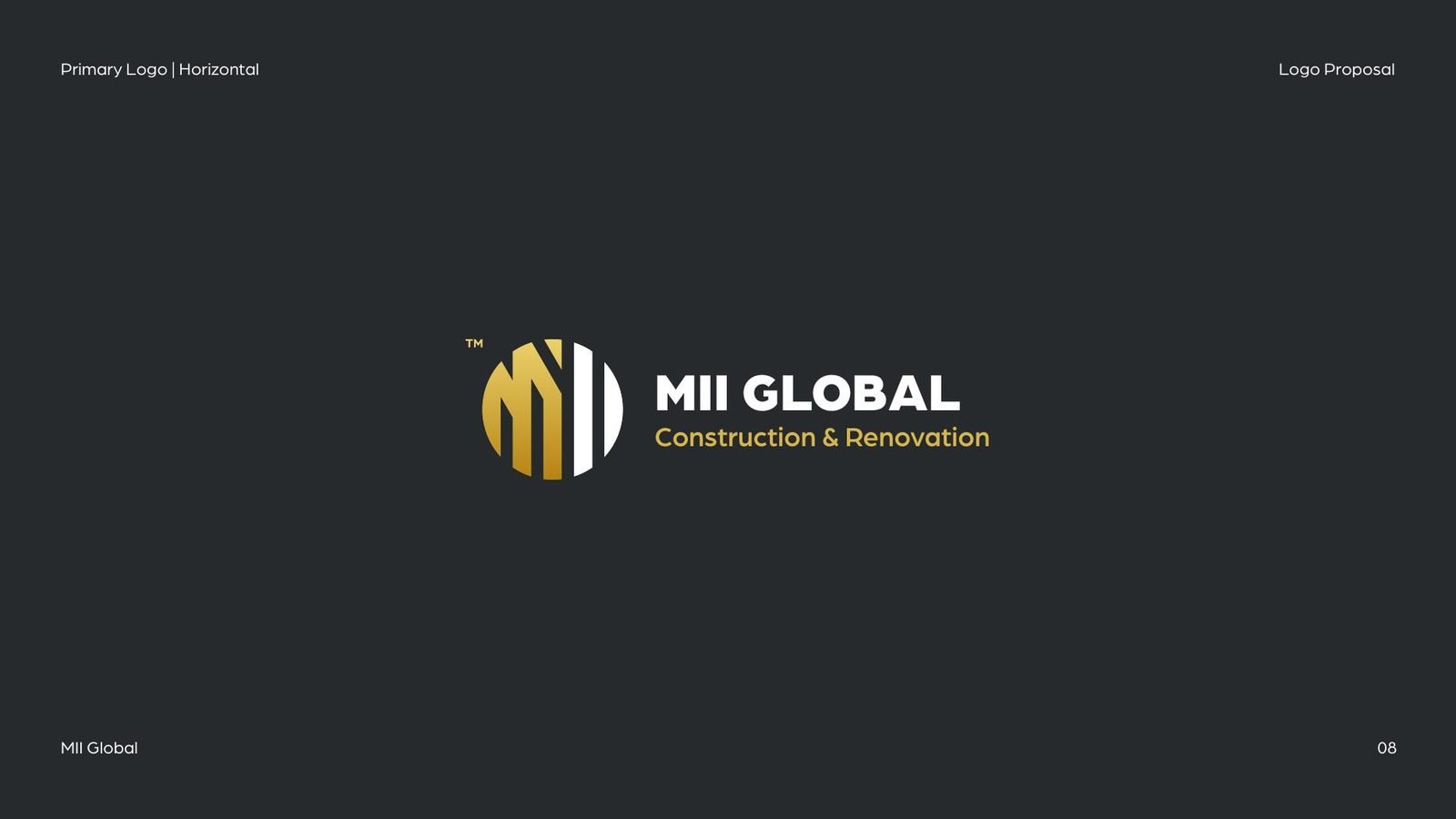
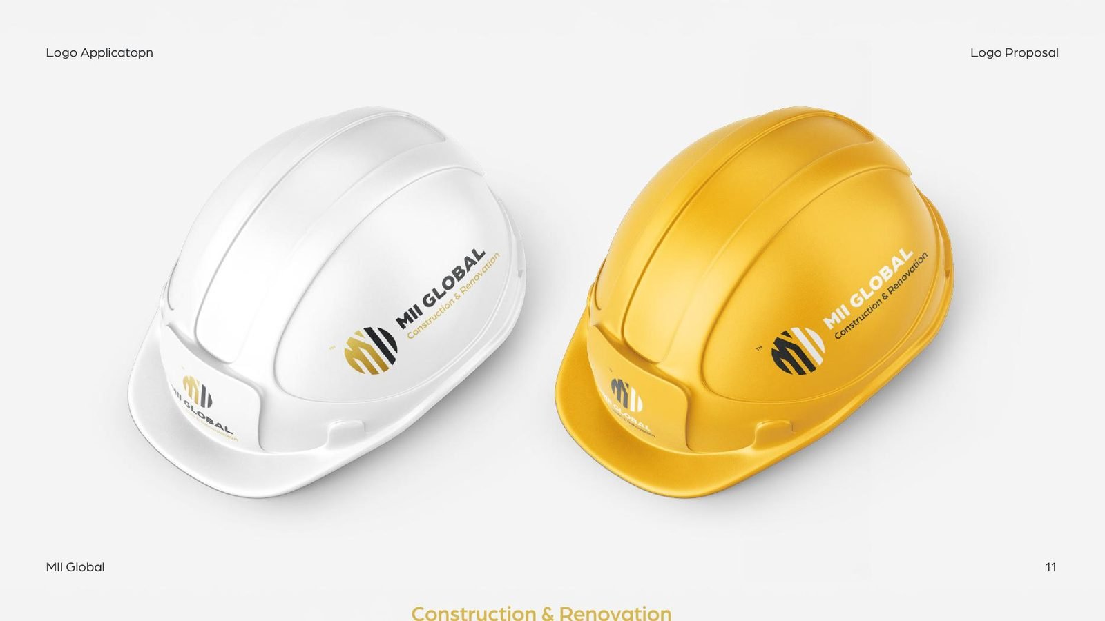
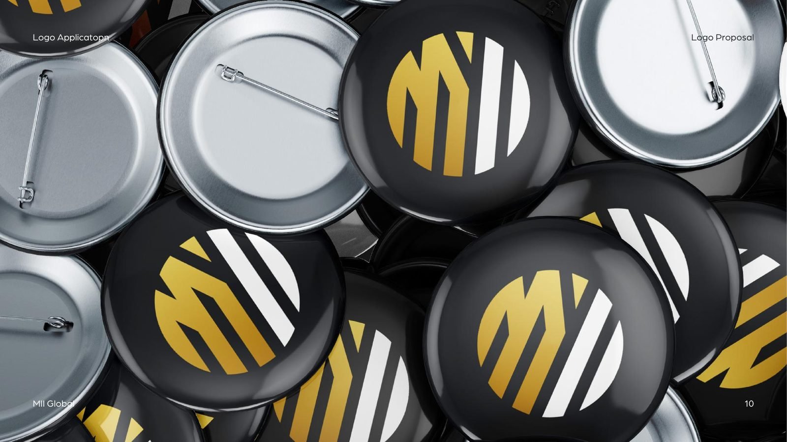
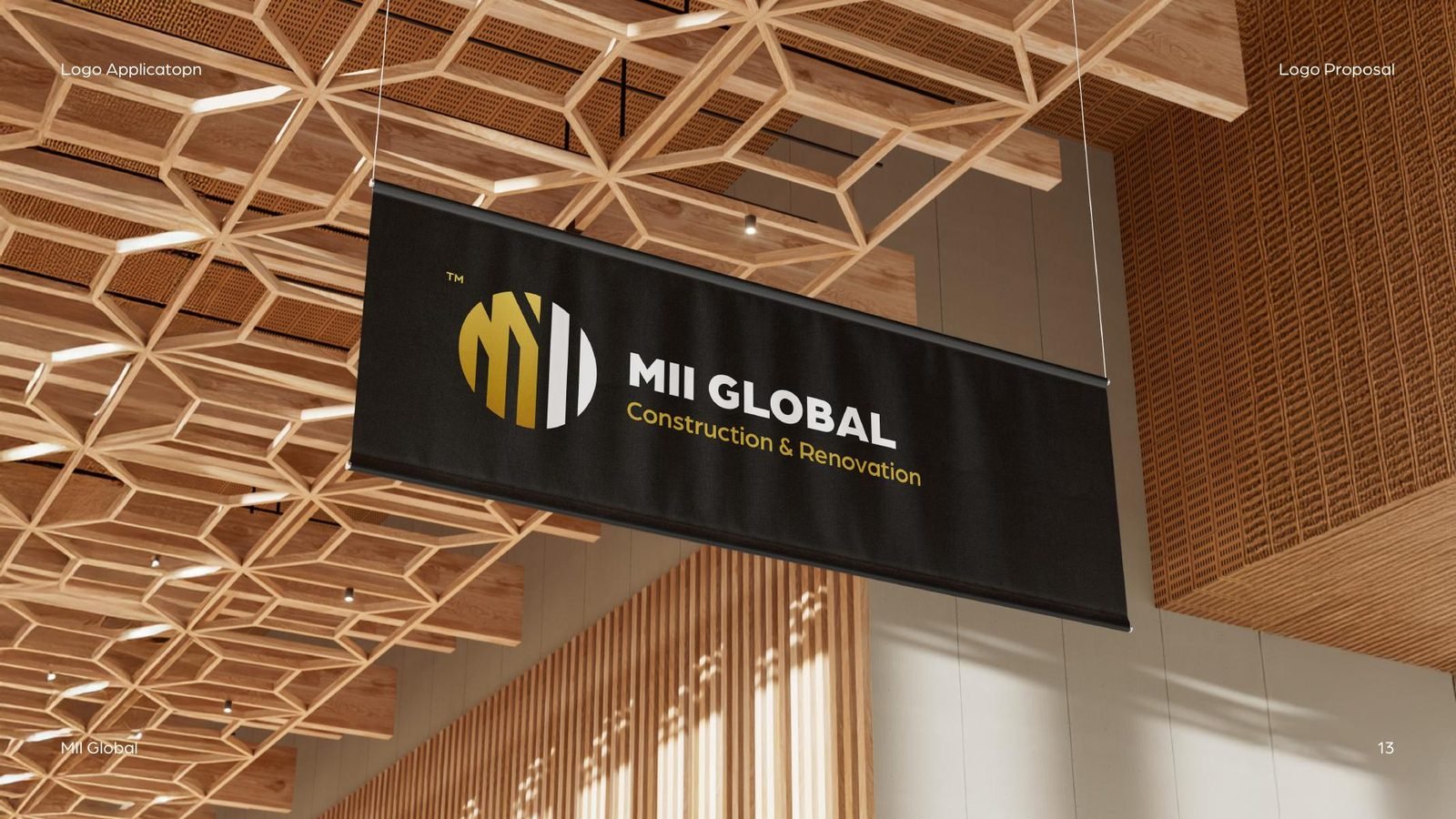
MII Global works in construction and renovation. The first proposal builds the icon from a circle, for the globe, cut into vertical strokes that read as towers and, more quietly, as a crane. Read together, the strokes also spell the initials MII. Gold on charcoal keeps it solid and premium.
02Option two
The name as architecture.
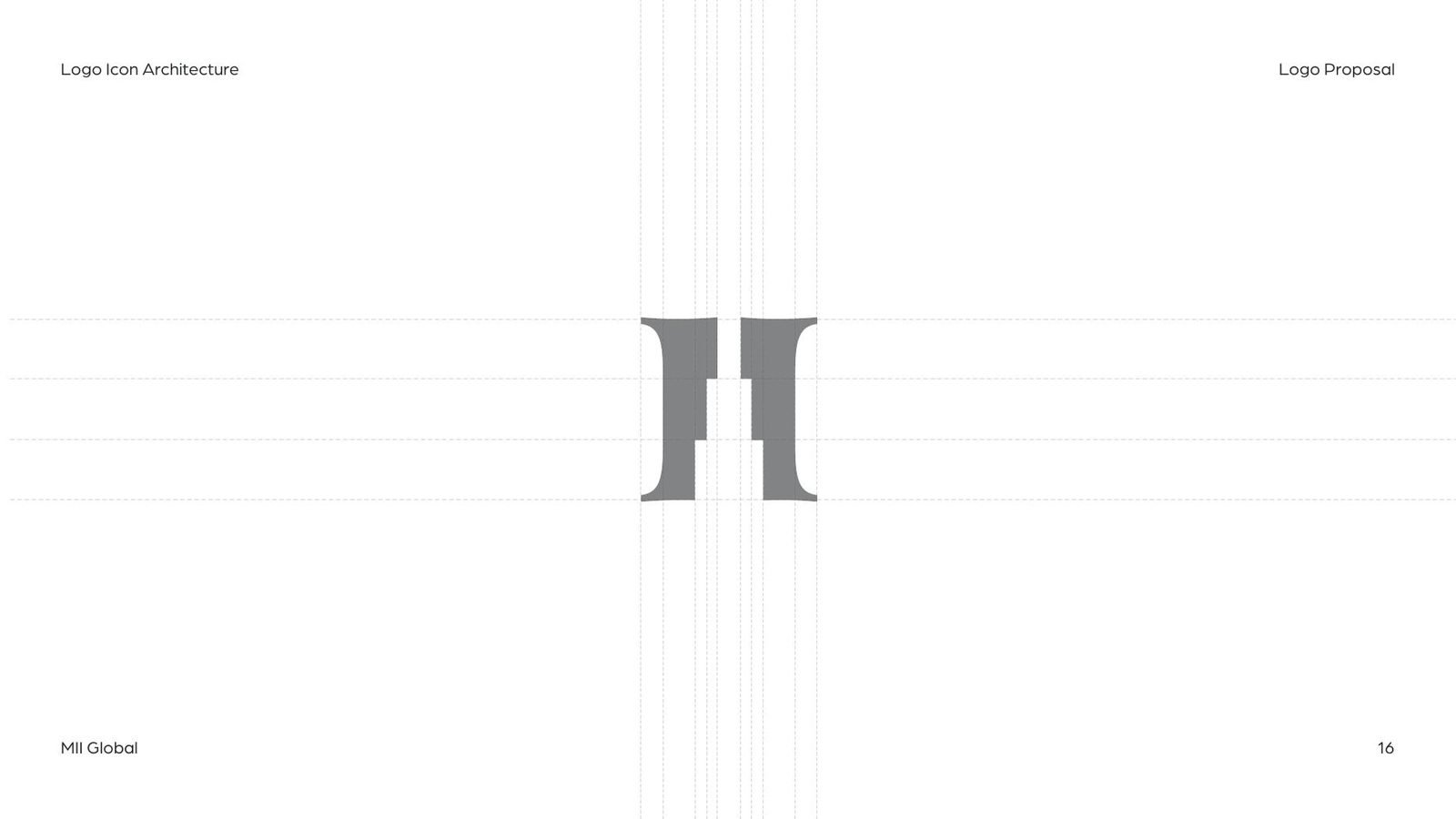
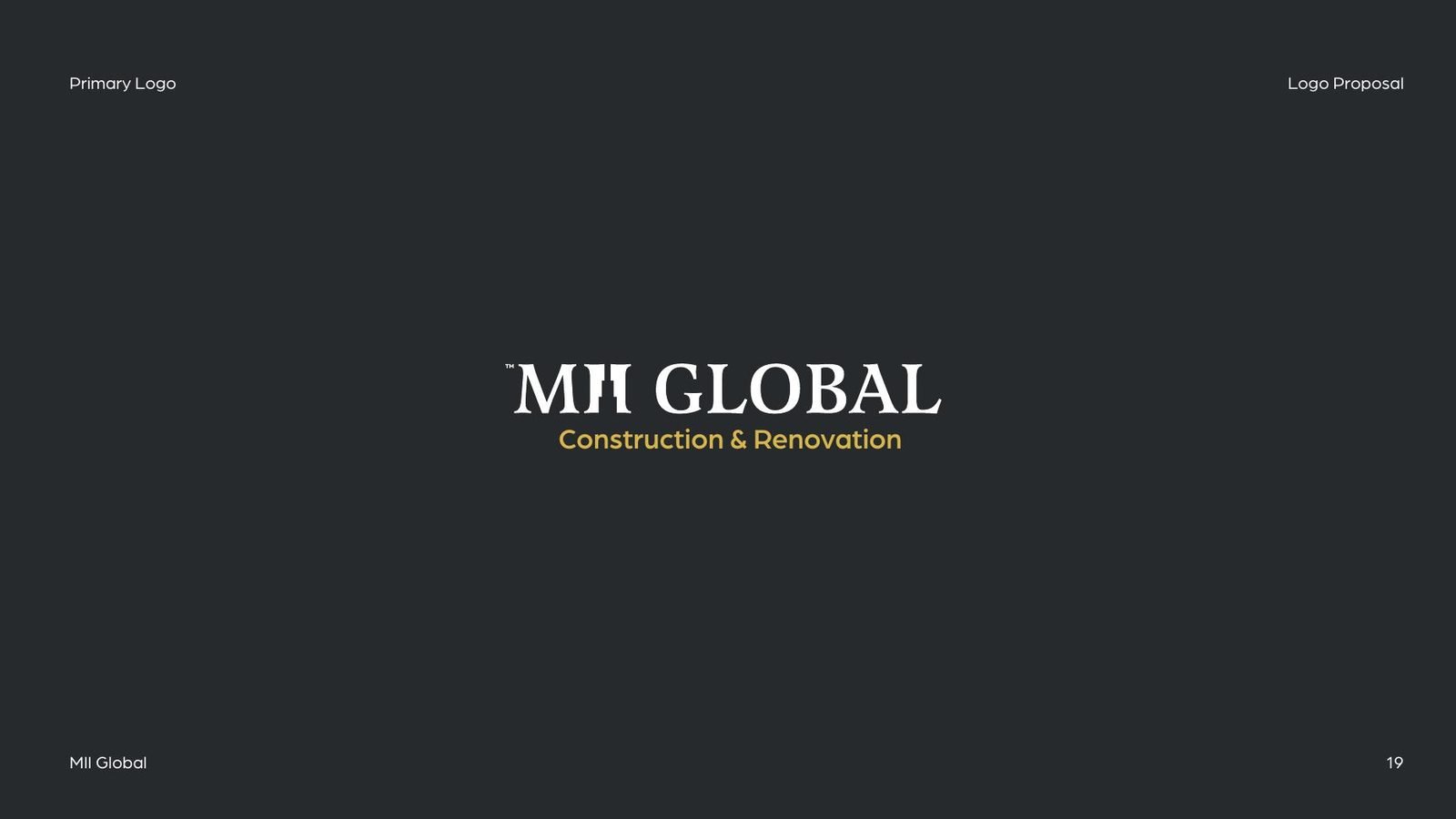
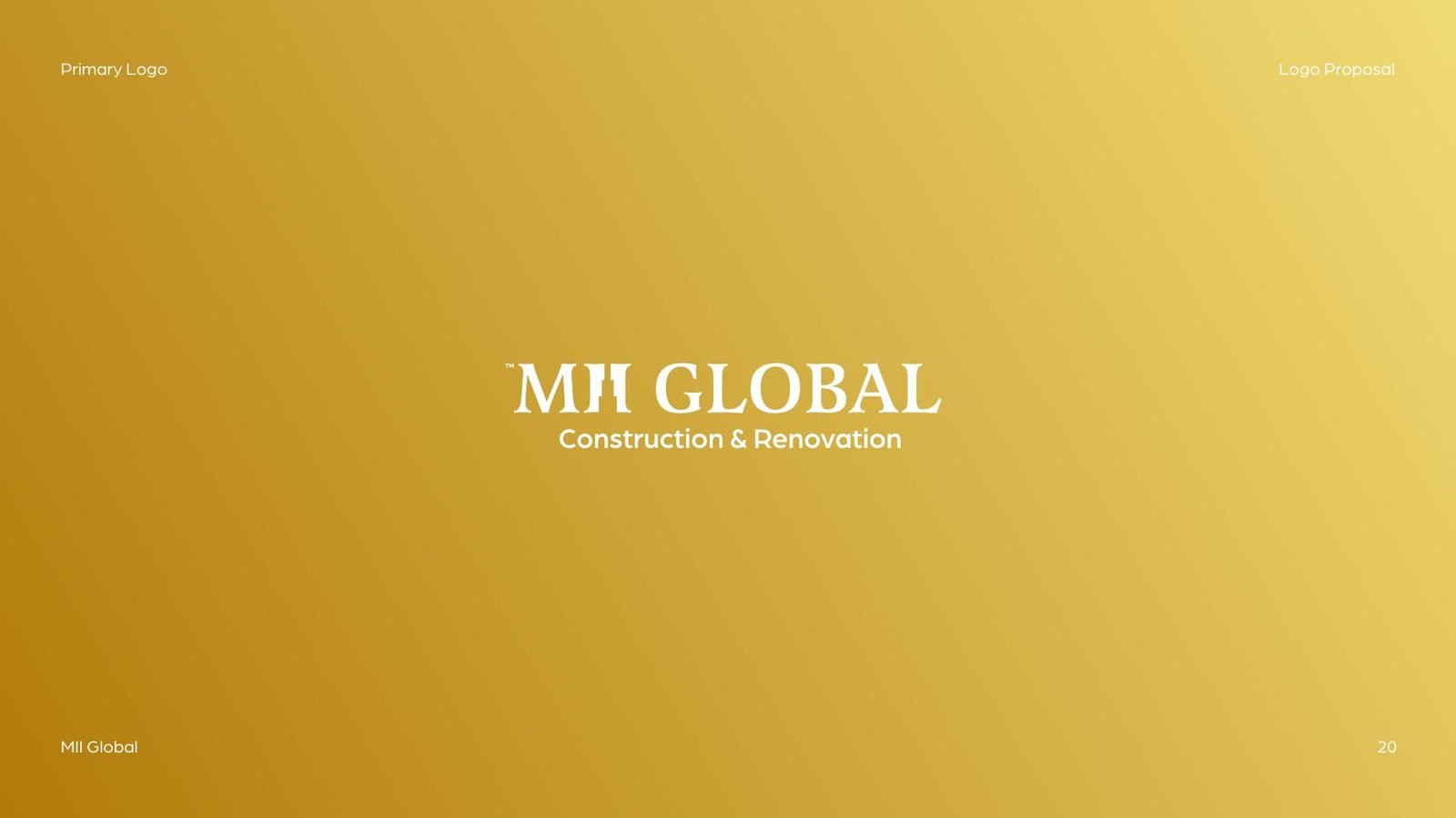
The second proposal moves the idea into the letters themselves. The two I’s of MII are joined like a pair of columns under one beam, set in a serif wordmark that feels built rather than drawn. It works in white on charcoal and on a warm gold ground.
03On site
Made for helmets and hoardings.
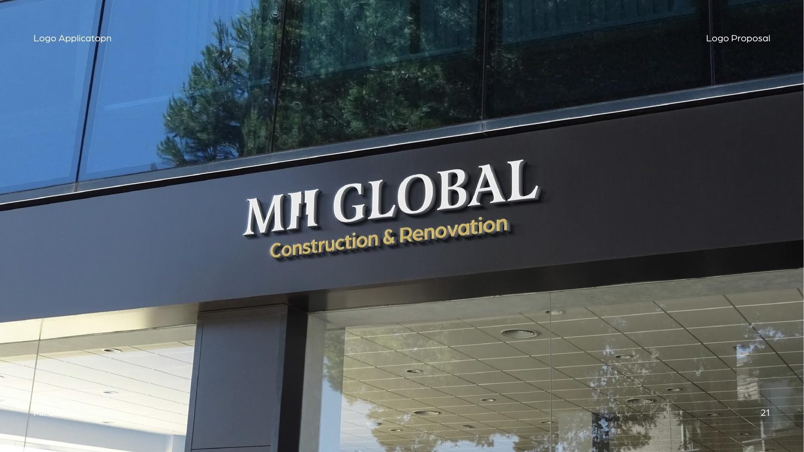
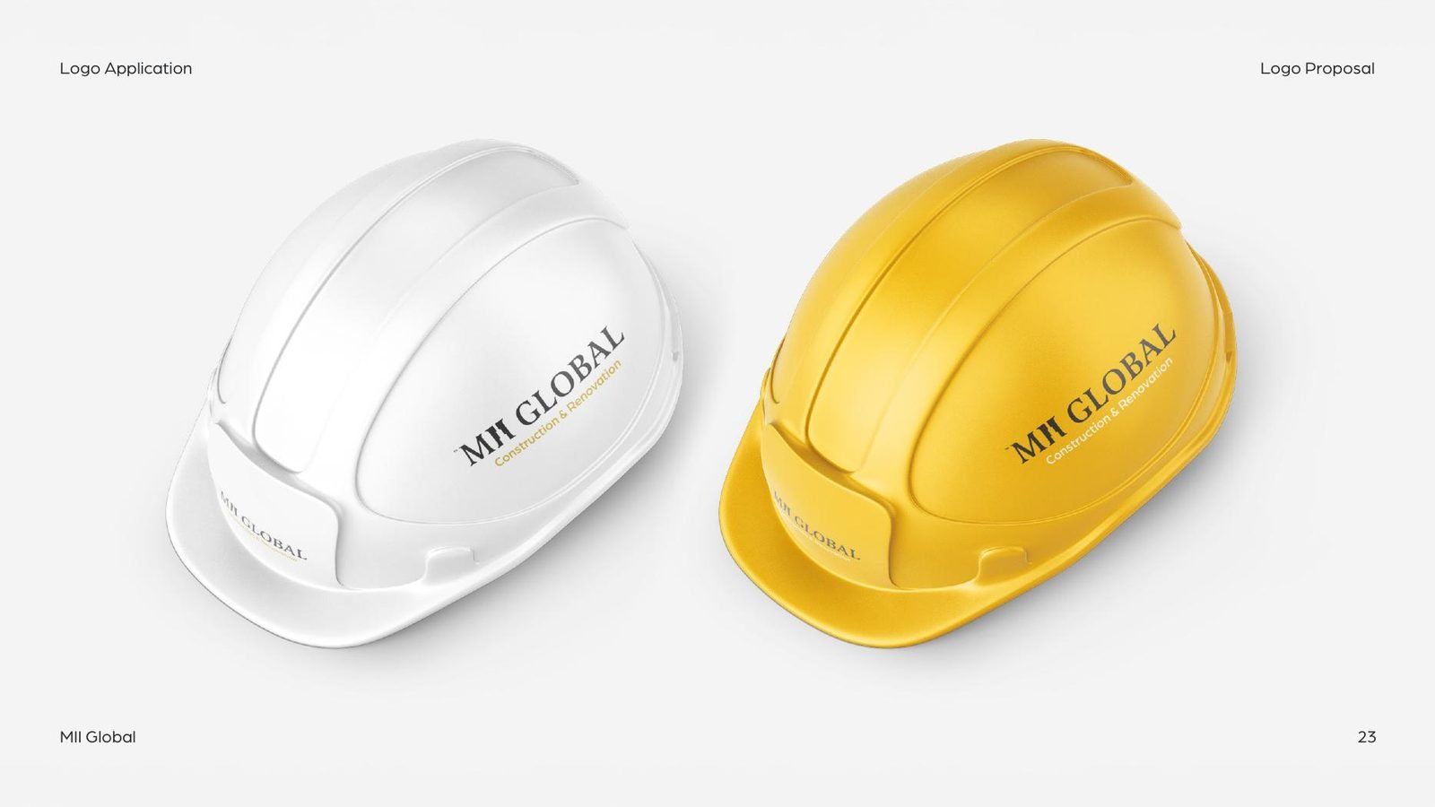
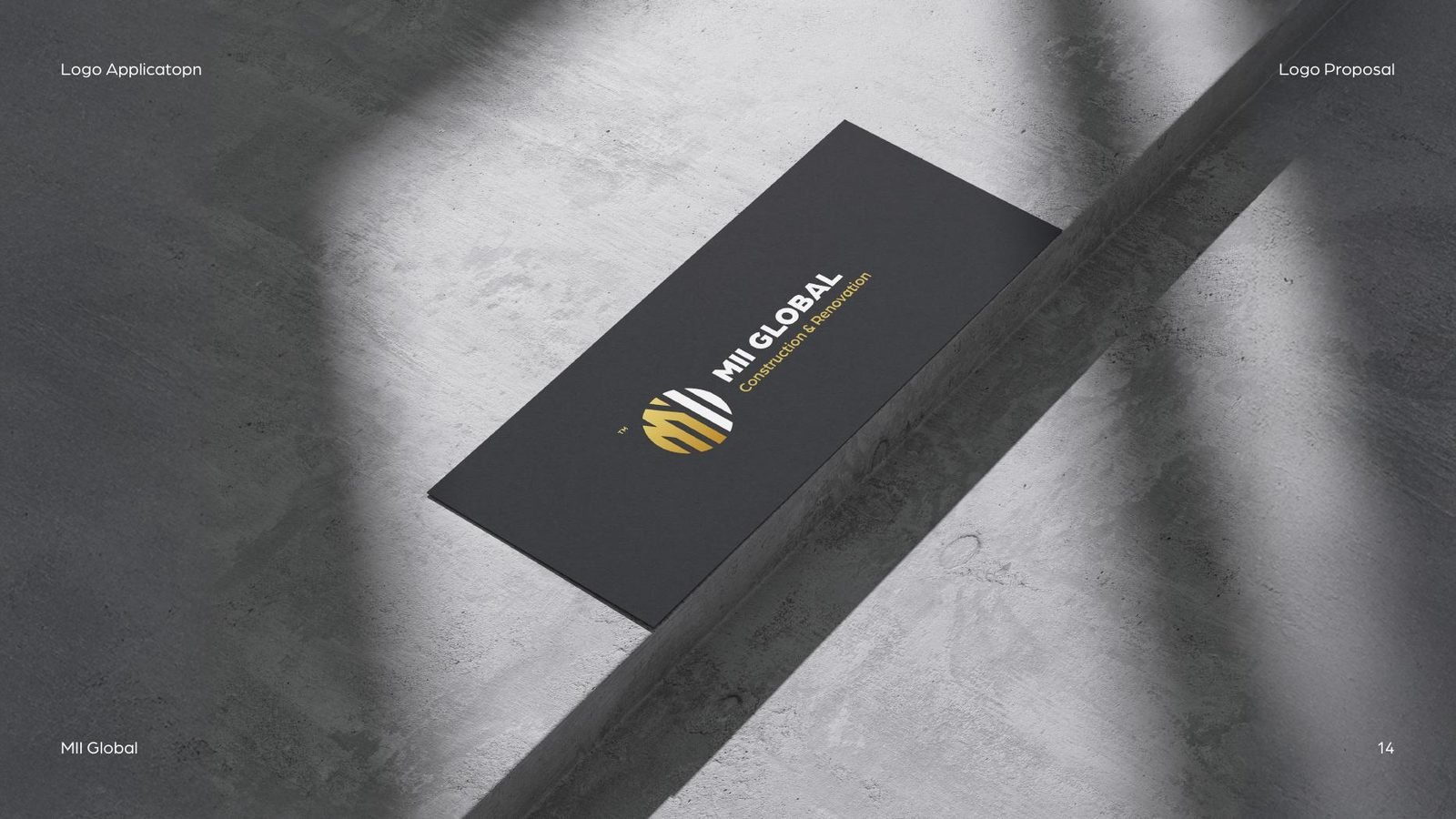
Both options were tested where a construction brand actually lives: on site signage, building fronts, helmets, business cards and badges, so the client could judge each mark in real conditions rather than on a blank page.
The result
Two distinct directions, one symbolic and one typographic, presented with real-world applications so the choice could be made with confidence.
- Logo proposal presentation
- Icon concept
- Icon construction grids
- Vertical & horizontal lockups
- Wordmark option
- Signage mockups
- Safety helmet mockups
- Business card
- Pin badges
Running a construction or renovation company?
A mark that holds up on site and on paper.
Construction firms work with us on logos and identities that look as solid as the work they deliver.

 BOOK A FREE CALLBOOK A FREE CALLBOOK A FREE CALLBOOK A FREE CALLBOOK A FREE CALLBOOK A FREE CALLBOOK A FREE CALLBOOK A FREE CALLBOOK A FREE CALL