
Five stars, in one word.
Visual identity proposal for Khams, the Community Development Authority’s Dubai Social Services Classification: four bilingual logo directions with palettes and plaques.
01The brief
A rating people can read.
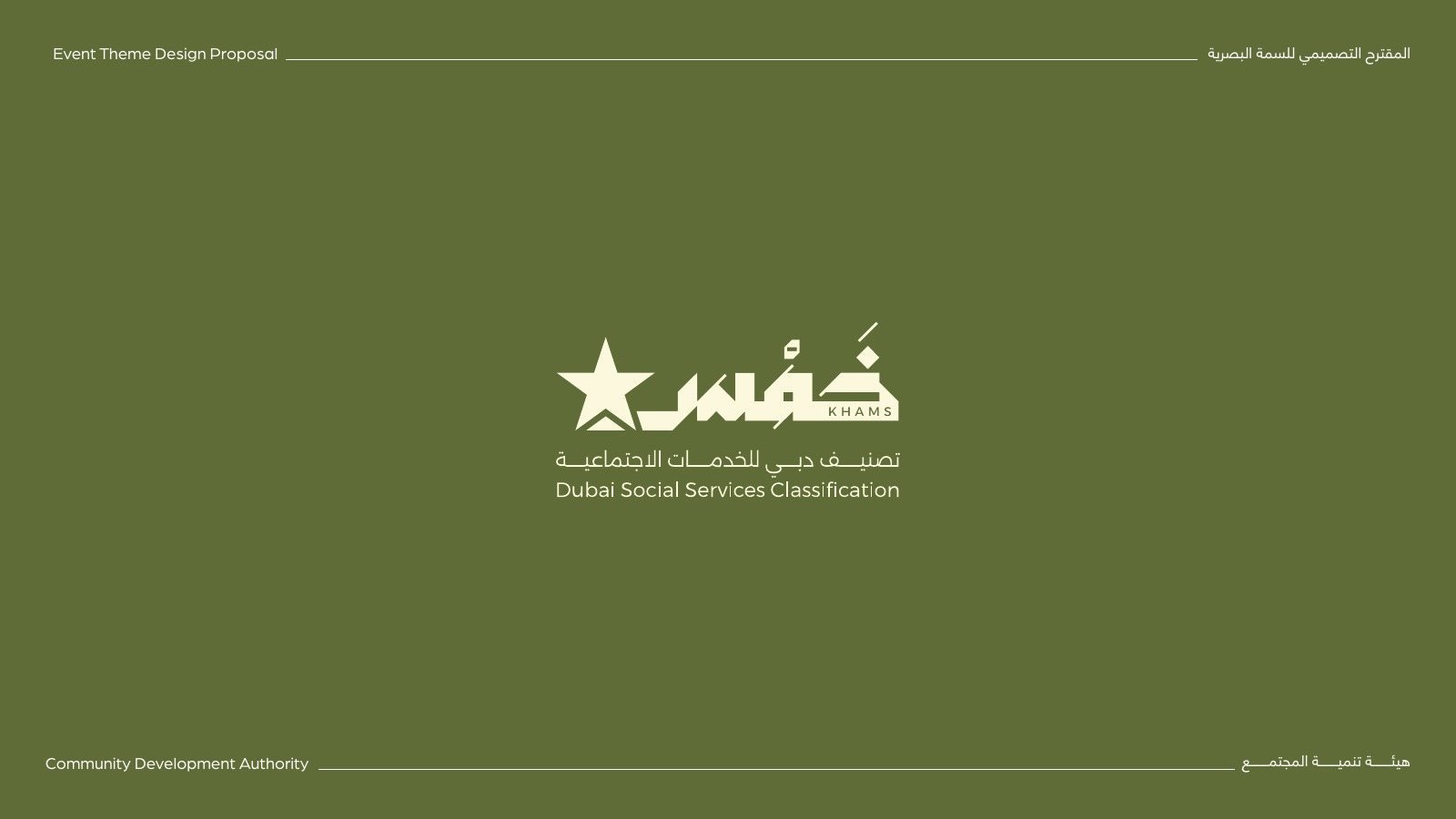
Khams, خمس, is the Dubai Social Services Classification from the Community Development Authority: a rating that gives social service providers up to five stars. Through Emirian Production, we proposed its visual identity, a bilingual mark that had to read as a classification at a glance and sit on a plaque at a centre’s entrance.
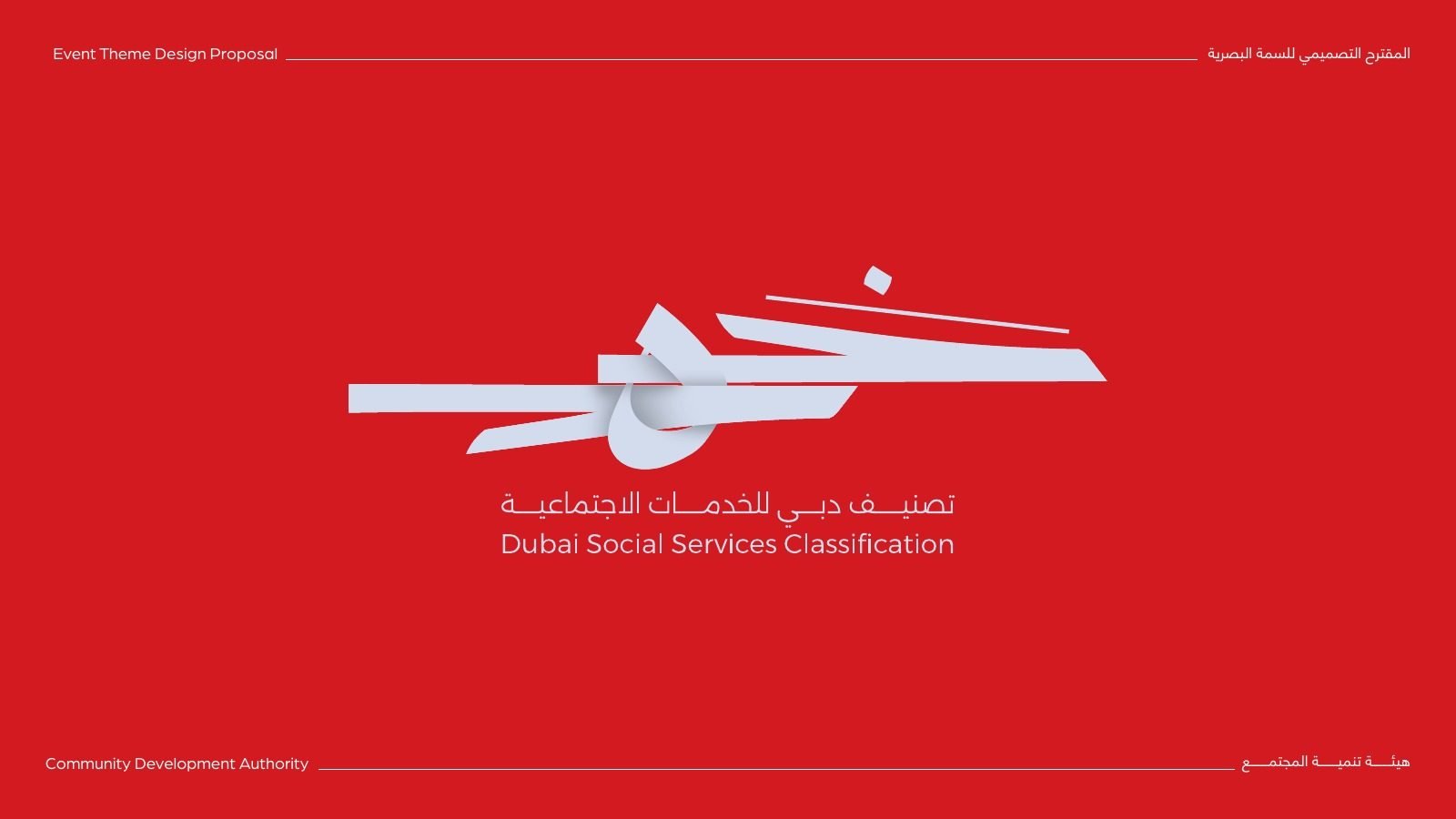
خمس. Dubai Social Services Classification.
Name and descriptor
Arabic first
The word خمس leads every option, with the English name and descriptor set beneath it.
A star in the mark
Each direction finds its own way to bring a star, or five, into the letters.
02Four directions
One name, four ways in.
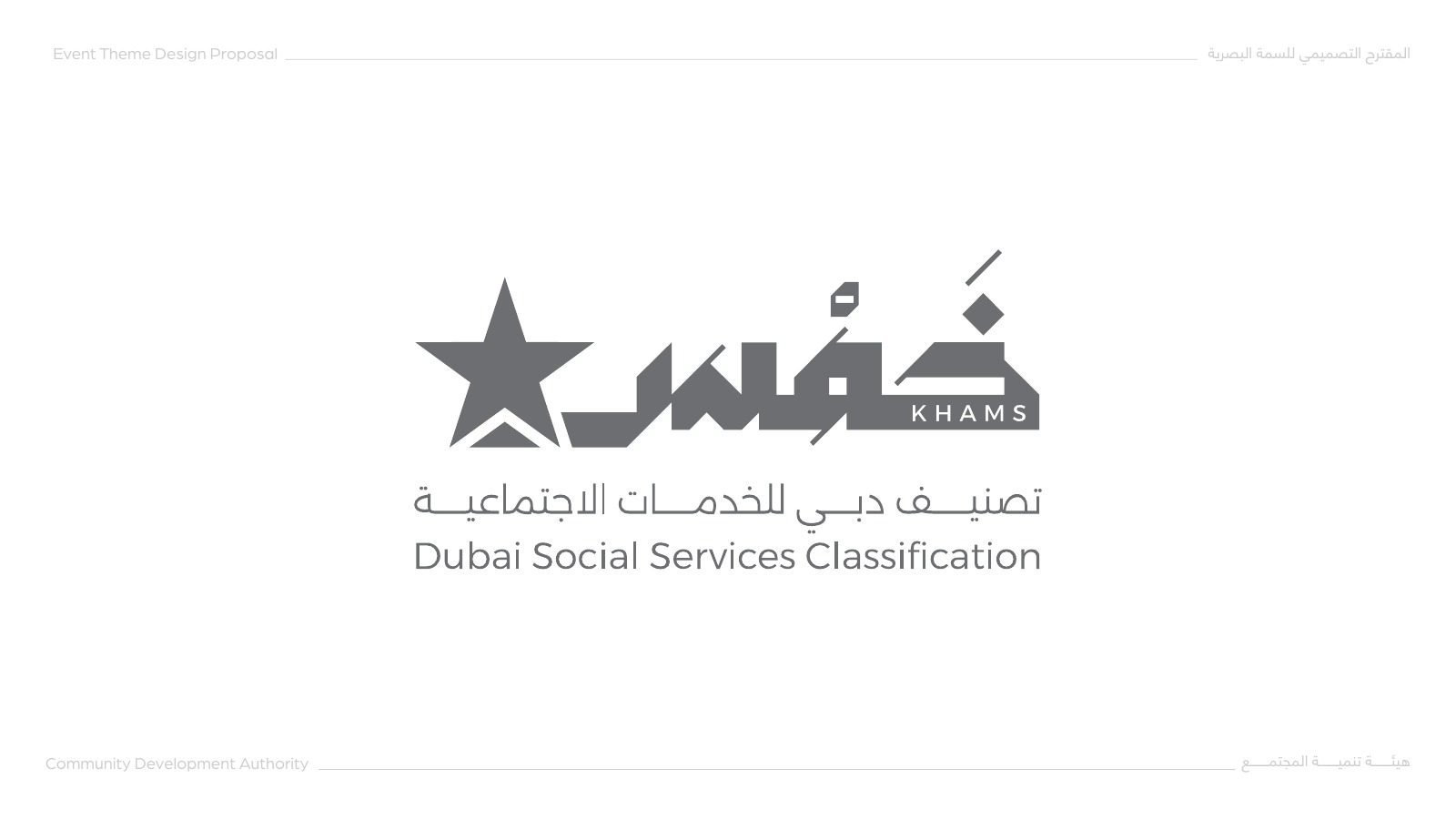
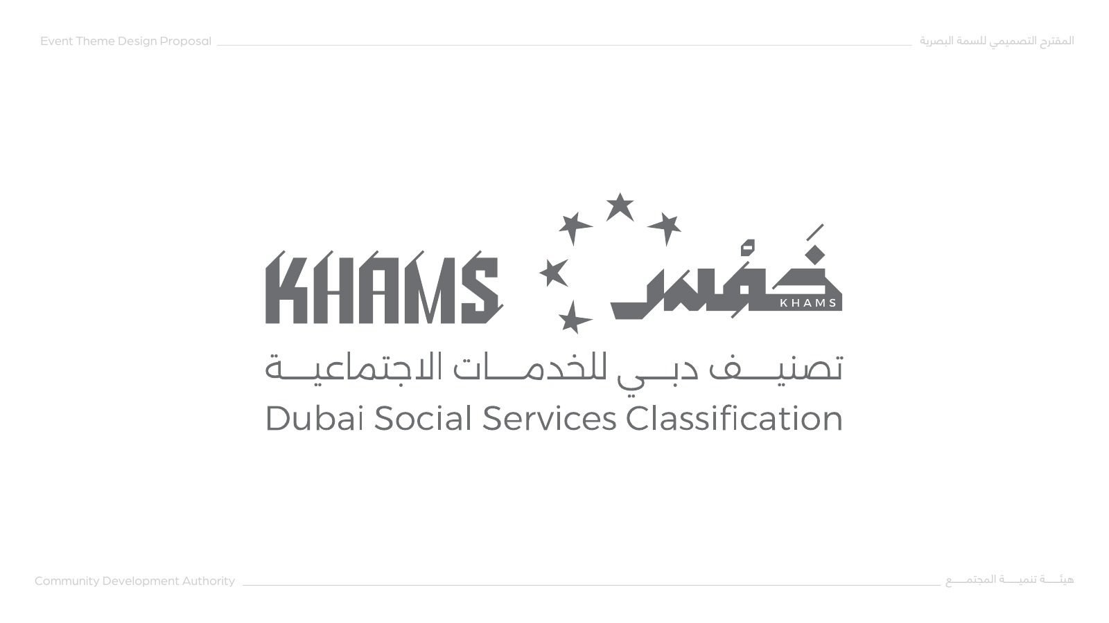
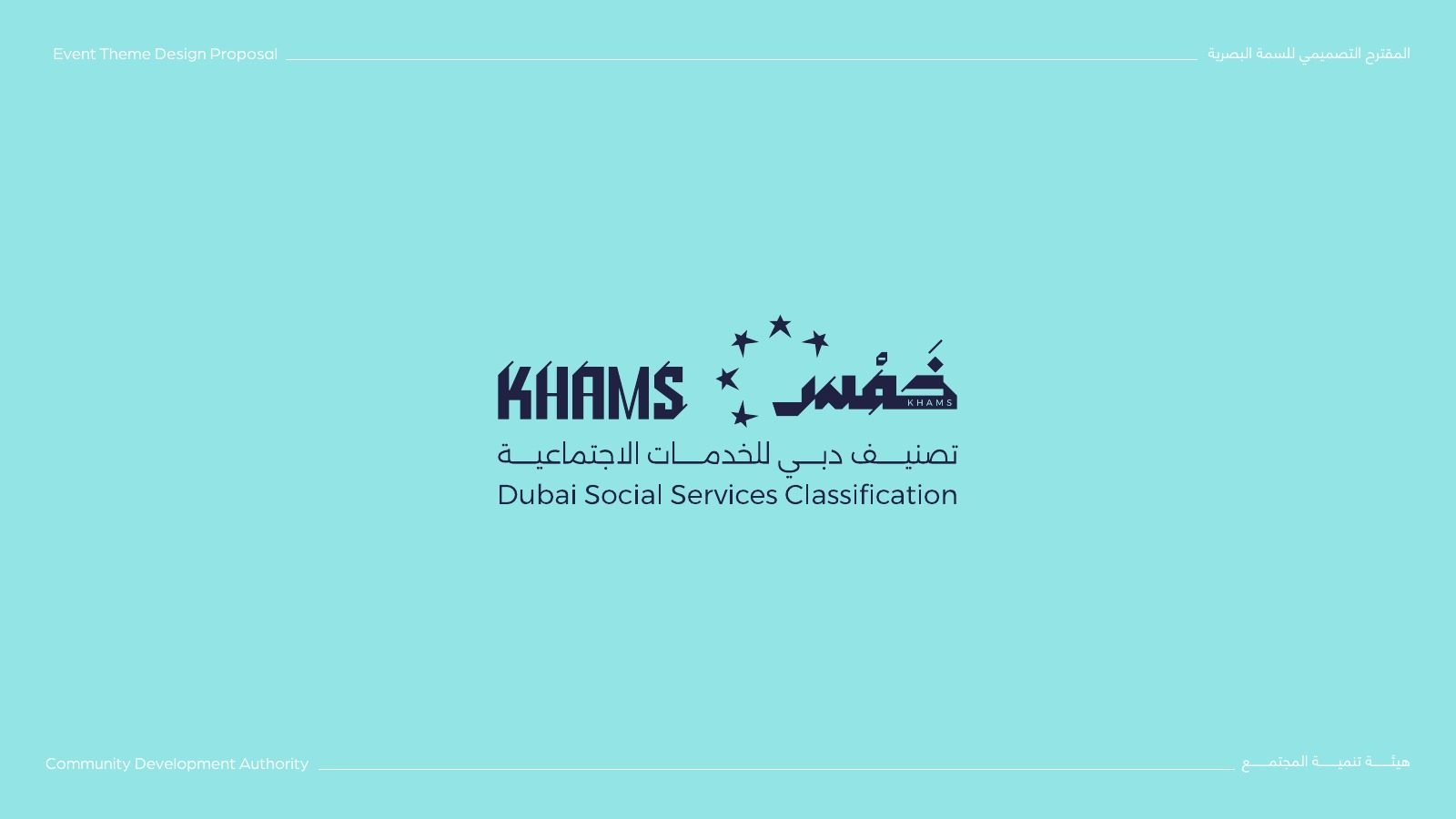
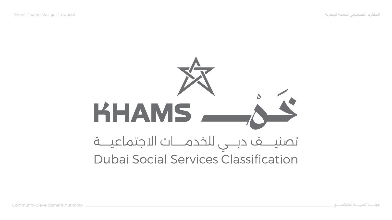
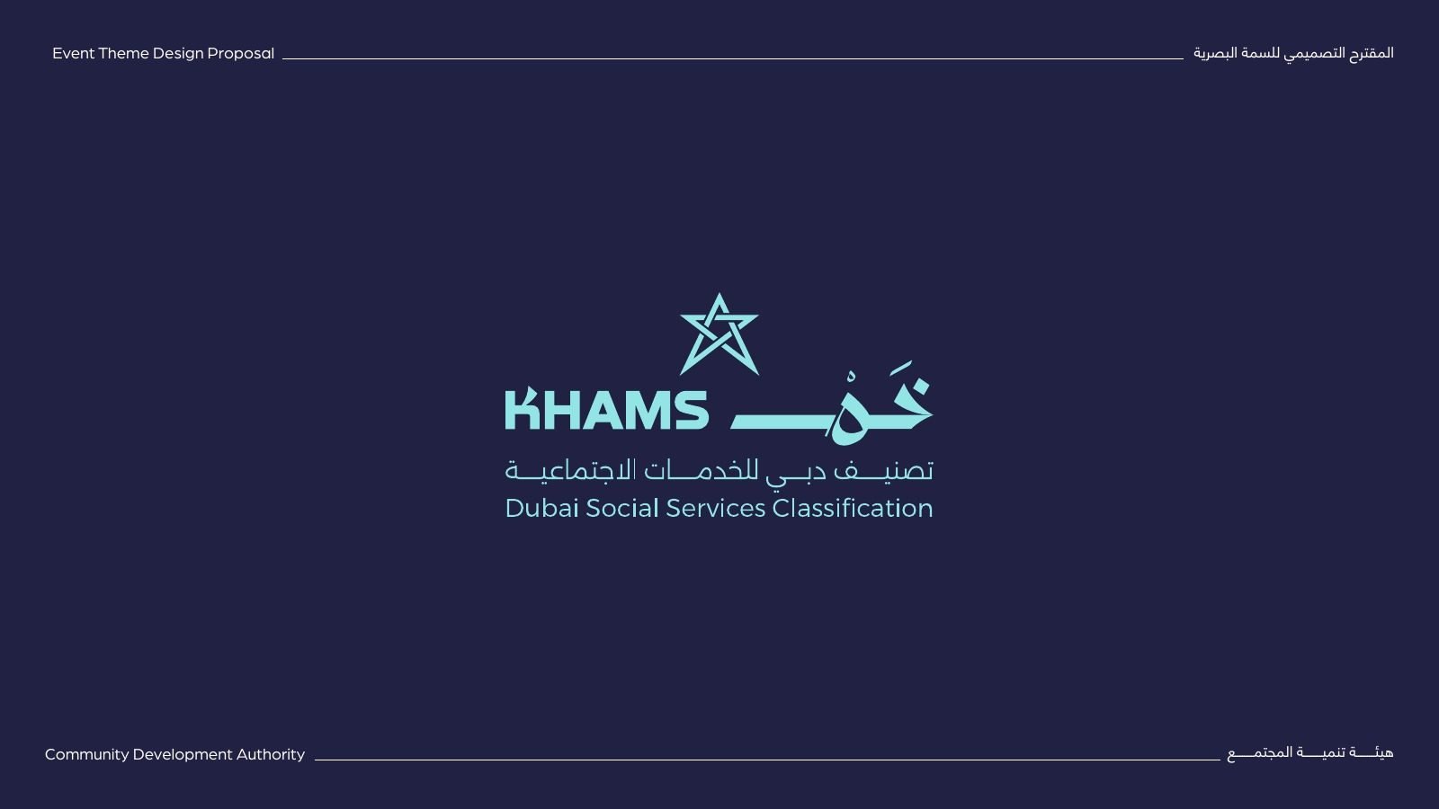
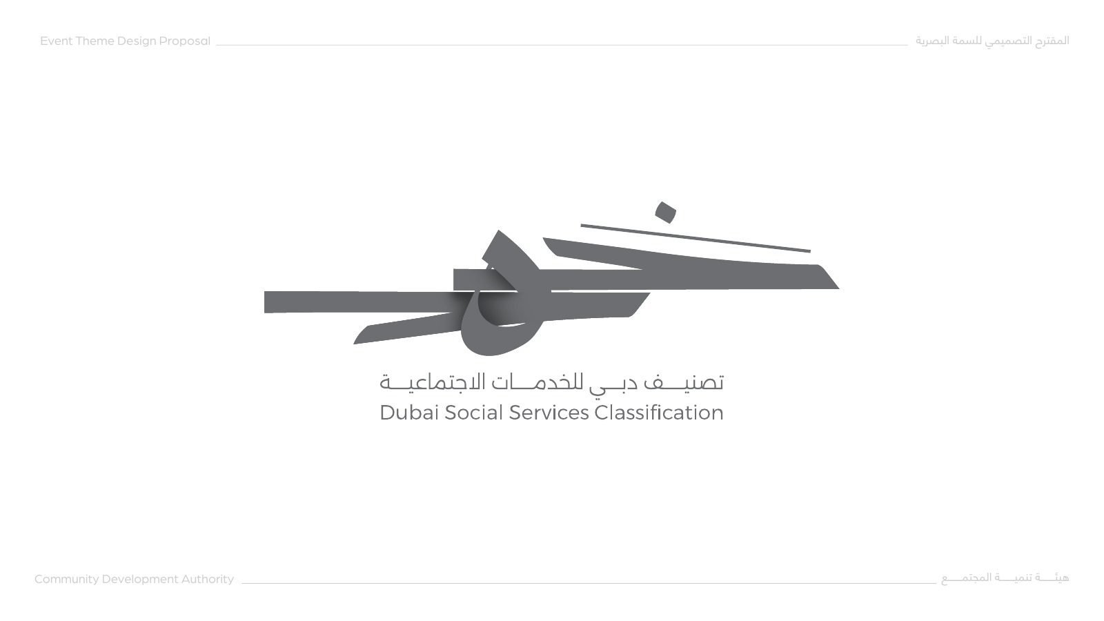
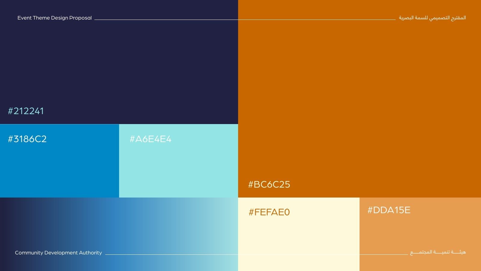
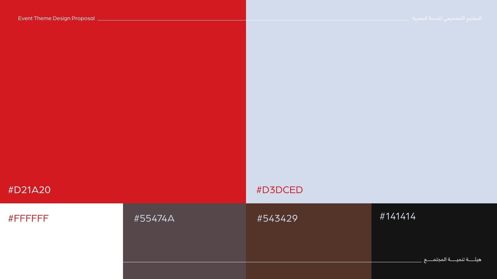
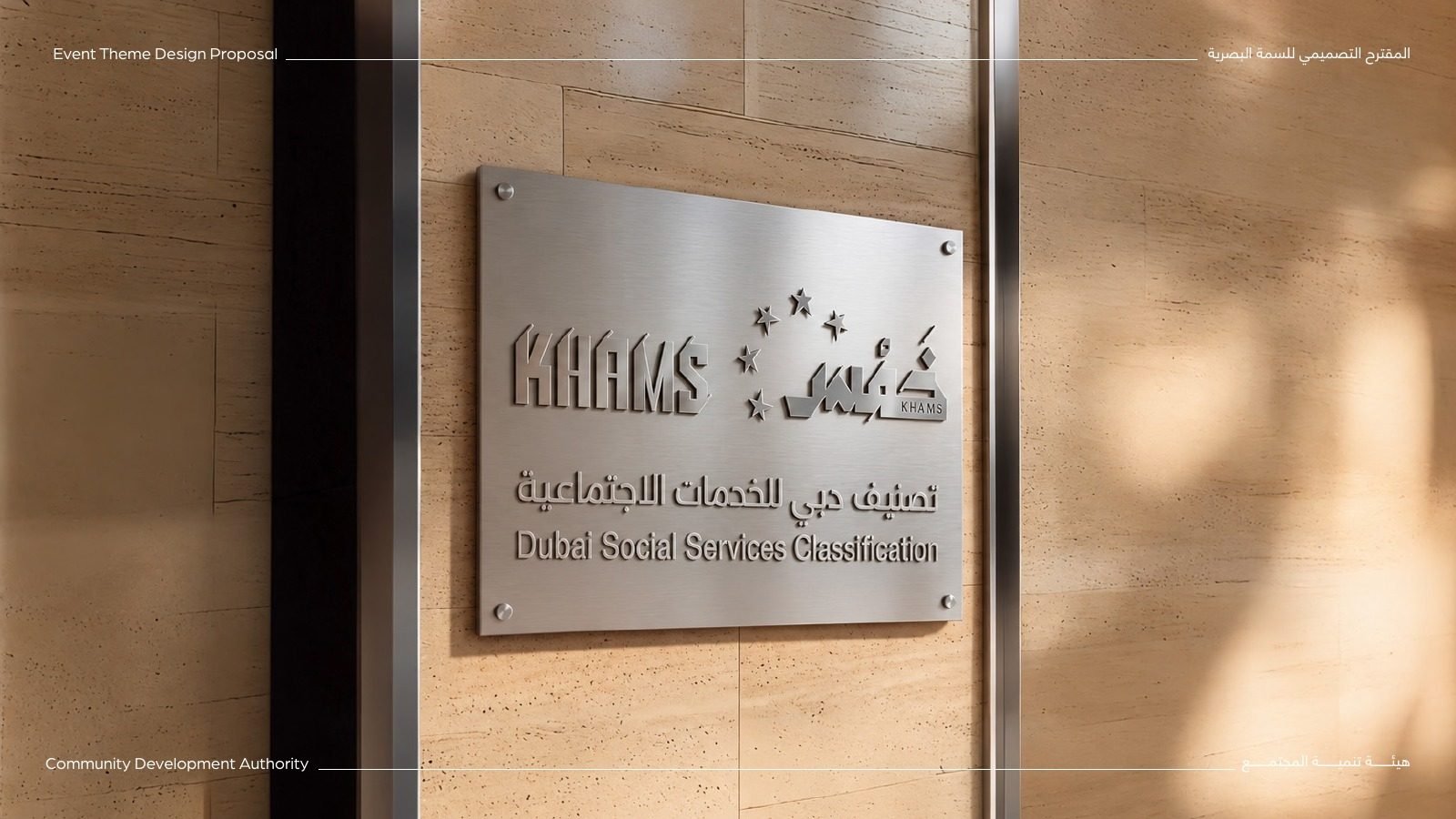
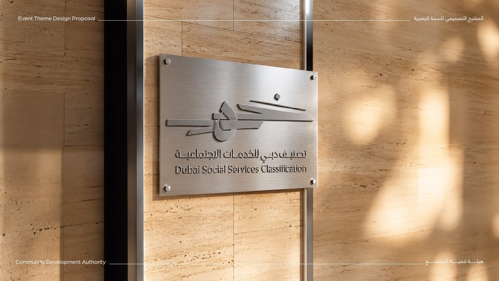
We presented four options. A bold star leading the word in olive and copper. A Latin KHAMS paired with a ring of five stars. A lighter mark with one star above the type in navy and blue. And a calligraphic stroke in red, the most expressive of the four.
03Colour and place
Built for a wall plaque.
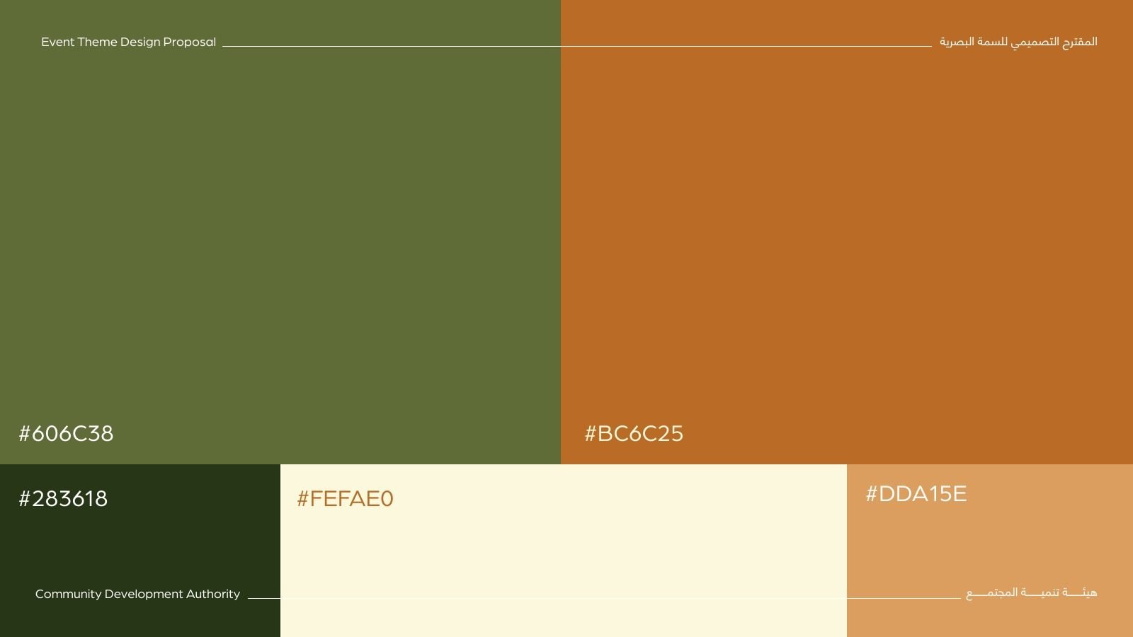
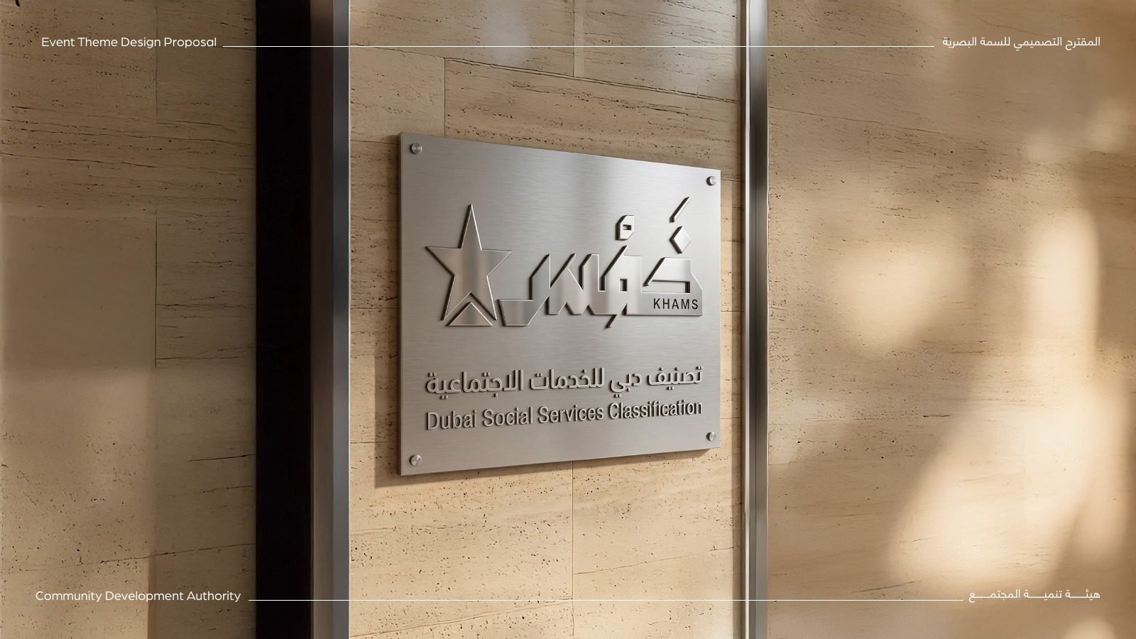
Each direction came with its own palette and was shown where a rating lives: on a brushed-metal plaque beside a centre’s door.
The result
Four distinct, bilingual directions for one rating system, each shown in colour and on the plaque it would live on.
- Logo concepts, four options
- Bilingual lockups
- Colour palettes
- Plaque mockups
- Identity proposal deck
Launching a government programme or rating?
A clear mark for a public promise.
We design bilingual identities for government initiatives, built to read at a glance on a screen, a certificate or a wall.
 BOOK A FREE CALLBOOK A FREE CALLBOOK A FREE CALLBOOK A FREE CALLBOOK A FREE CALLBOOK A FREE CALLBOOK A FREE CALLBOOK A FREE CALLBOOK A FREE CALL